- Cómo empezar a usar Airtable
- Introducción a los aspectos básicos de Airtable
- Cómo comunicarse con el equipo de soporte de Airtable
- Pantalla de inicio de Airtable
- Glosario de terminología de Airtable
- Airtable technical requirements
- Diferencias entre las funciones de Airtable para escritorio y para móvil
- Atajos de teclado de Airtable
- Cómo usar Markdown en Airtable
- Adding descriptions in Airtable
- Finding Airtable IDs
- Automatizaciones de Airtable
- Descripción general de automatizaciones
- Guías de automatizaciones
- Guías de automatizaciones integradas
- Guías de automatizaciones en Airtable
- Linking existing records using automations
- Conditional groups of automation actions
- Repeating groups of Airtable automation actions
- Creating recurring records using automations
- How to delay Airtable automation runs
- Prevent automations from triggering by mistake
- Use automations to timestamp status updates
- Desencadenantes de automatizaciones
- Desencadenantes de Airtable
- Airtable automation trigger: When record matches conditions
- Airtable automation trigger: When a form is submitted
- Airtable automation trigger: When record created
- Desencadenante de automatización de Airtable: cuando se actualiza un registro
- Airtable automation trigger: When record enters view
- Desencadenante de automatización de Airtable: a una hora programada
- Airtable automation trigger: When webhook received
- Airtable automation trigger: When a button is clicked
- Airtable automation trigger: When email received
- Desencadenantes integrados
- Desencadenantes de Airtable
- Acciones de automatización
- Acciones en Airtable
- Acción de automatización de Airtable: enviar correo electrónico
- Airtable automation action: Create record
- Airtable automation action: Update record
- Airtable automation action: Find records
- Airtable automation action: Sort list
- Acción de automatización de Airtable: ejecutar un script
- Airtable automation action: Generate with AI
- Acciones integradas
- Airtable automation actions: Slack
- Airtable automation actions: Google Workspace
- Airtable automation action: Send MS Teams message
- Airtable automation actions: Outlook
- Airtable automation actions: Jira Cloud
- Airtable automation actions: Jira Server / Data Center
- Airtable automation actions: Salesforce
- Airtable automation action: Create post in Facebook Pages
- Airtable automation actions: GitHub Issues
- Airtable automation action: Hootsuite post
- Airtable automation action: Send Twilio SMS
- Acciones en Airtable
- Bases de Airtable
- Using Airtable Cobuilder
- Descripción general de las bases de Airtable
- Creating and duplicating bases in Airtable
- Structuring your Airtable bases effectively
- Moving Airtable bases between workspaces
- Tables in Airtable
- Crear enlaces para compartir bases de Airtable
- Importing third-party data into Airtable
- Uso de las perspectivas
- Troubleshooting Airtable base performance
- Versiones beta de Airtable
- Colaboración en Airtable
- Asistencia de Airtable Enterprise
- Información general
- External badging in Airtable
- Creating and using Airtable components
- Ask an Expert beta overview
- Data residency at Airtable
- Descripción general de los grupos de usuarios en Airtable
- API de Enterprise de Airtable
- Creating and managing data retention policies in Airtable
- eDiscovery APIs in Airtable
- Airtable and data loss prevention
- Acceder a los registros de auditoría de Enterprise en Airtable
- Configuración de Jira Server/Data Center para conectarse con Airtable
- Panel de Administración de Enterprise
- Descripción general del panel de administración de Enterprise
- Usuarios: panel de administración de Enterprise en Airtable
- Detalles del usuario en el panel de administración de Airtable
- Grupos: panel de administración de Airtable
- Espacios de trabajos: panel de administración de Enterprise de Airtable
- Bases: panel de administración de Enterprise en Airtable
- Interfaces: Panel de administración de Enterprise en Airtable
- Data sets - Airtable admin panel
- Managed apps - Airtable admin panel
- Components - Airtable admin panel
- Informes: panel de administración de Enterprise en Airtable
- Airtable admin panel settings
- Guía práctica de Enterprise
- Gestionar a los admins de Enterprise en el panel de administración
- Uso de organizaciones
- Organizational branding for apps in Airtable
- Enterprise Hub in Airtable
- Enterprise Hub : Org unit assignment with user groups
- Desactivar, retirar el acceso y reactivar usuarios desde el panel de administración
- Gestionar el acceso de usuario a espacios de trabajo y bases
- Airtable Enterprise Key Management
- Custom terms of use
- SSO en Enterprise
- Información general
- Extensiones de Airtable
- Descripción general de las extensiones
- Extensiones por Airtable
- Extensiones integradas
- Campos de Airtable
- Descripción general de los campos
- Archivo adjunto
- Campos basados en fecha
- Fórmula
- Empezar a usar fórmulas
- Fundamentos de fórmulas
- Soluciones frecuentes: principiante
- Soluciones habituales: intermedias
- Soluciones habituales: avanzado
- Campo de texto largo
- Campos de registros vinculados
- Campos con números
- Otros campos
- Campos de compilación, búsqueda y recuento
- Campos de selección y colaborador
- Integración con Airtable
- API
- Getting started with Airtable's Web API
- Crear tokens de acceso personal
- Airtable Webhooks API Overview
- Service accounts overview
- API web de Airtable: usar filterByFormula o parámetros para ordenar
- Airtable API Deprecation Guidelines
- Airtable API: Common troubleshooting
- Managing API call limits in Airtable
- Enforcement of URL length limit for Web API requests
- Servicios de integración
- Third-party integrations via OAuth overview
- Troubleshooting disconnected OAuth integrations in Airtable
- Options for integrating with Airtable
- Third-party integrations - Common troubleshooting
- Low-code integrations - Common troubleshooting
- Integrating Airtable with external calendar applications
- Visualizing records from Airtable in Tableau
- Visualizing Airtable records in Microsoft Power BI & Power Query
- Integrating HubSpot with Airtable
- Using Zapier to integrate Airtable with other services
- Using Zapier's Multi-Step Zaps to find and update records
- Using IFTTT to integrate Airtable with other services
- Integrating with AWS Lambda & DynamoDB
- Herramientas para desarrolladores
- API
- Diseñador de Interfaces de Airtable
- Descripción general
- Diseños de página
- Elementos
- Adding and removing elements in interfaces
- Adding layouts to interfaces
- Formatting elements in interfaces
- Interface element: Button
- Interface element: Calendar
- Interface element: Chart
- Interface element: Filter
- Interface element: Gallery
- Interface element: Grid
- Interface element: Kanban
- Interface element: Number
- Interface element: Record picker
- Interface element: Text
- Interface element: Timeline
- Aprendizaje y recursos
- Gestión de Airtable
- Política de Airtable
- Registros de Airtable
- Sincronización de Airtable
- Vistas de Airtable
- Espacios de trabajo de Airtable
- Impresión
- Compartir
- OscuroLigero
- PDF
Airtable extensions: Chart
- Actualizado en 13 Aug 2024
- 4 Minutos para leer
- Impresión
- Compartir
- OscuroLigero
- PDF
All paid plans | |
| |
Platform(s) | Web/Browser, Mac app, and Windows app |
Related reading | |
Extension - Extensions are modular components that add visuals or functionality to a base, and were shown in the base's dashboard. Users can create custom extensions, or they can use extensions created by Airtable or other open-source extensions. |
Setting up a chart extension
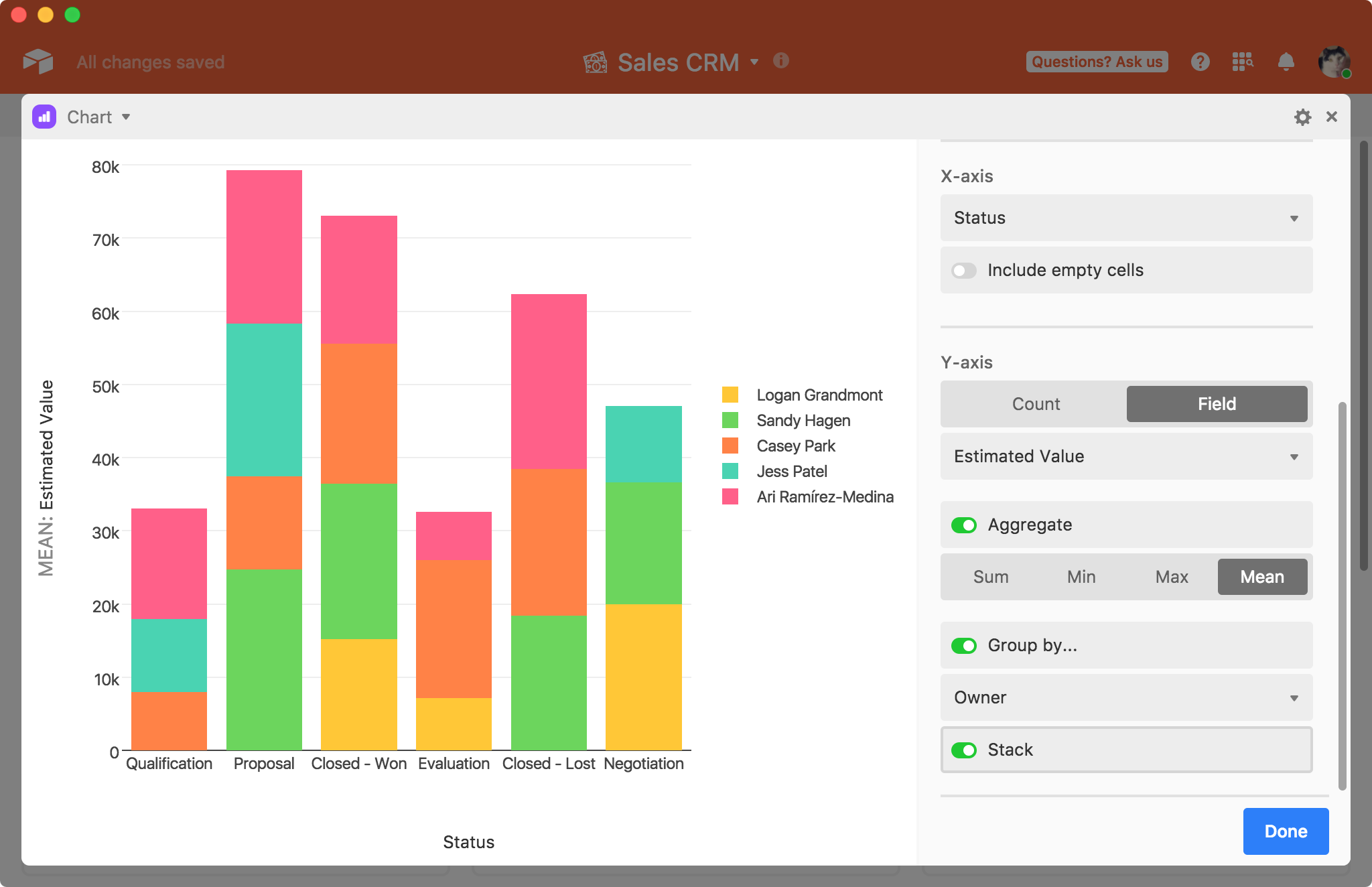
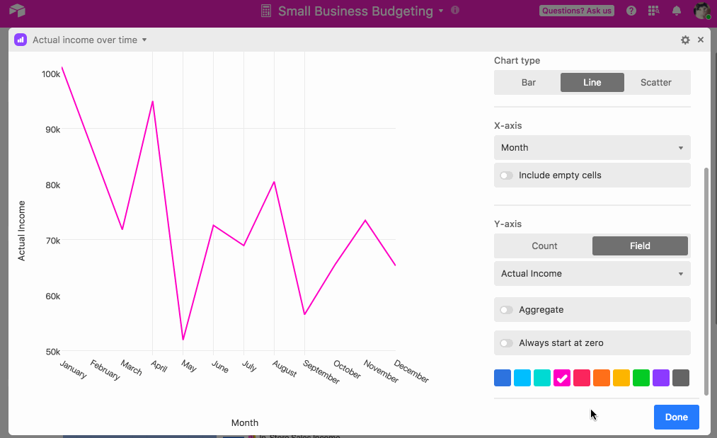
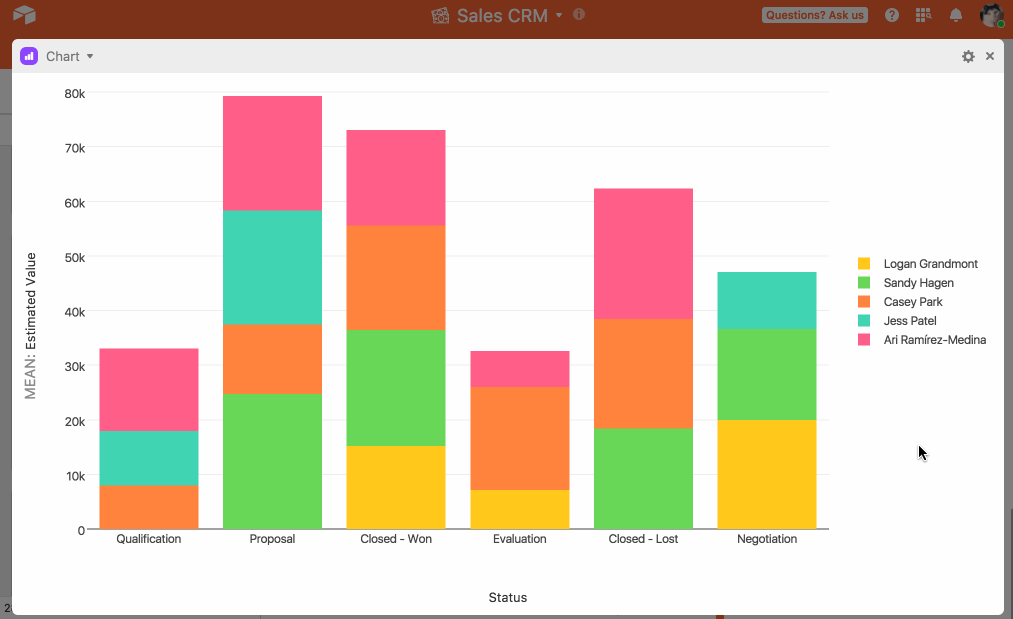
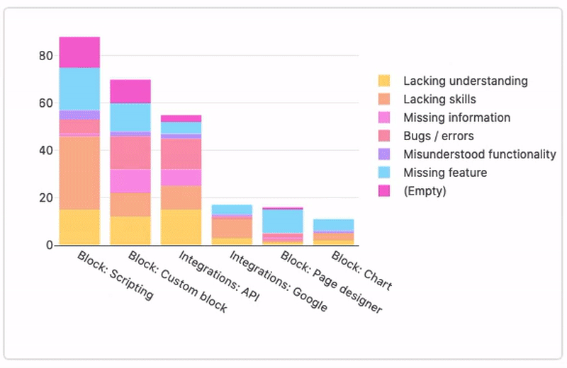
Learn how the chart extension can be set up to visually display understandings from records in a base. The chart extension lets you visualize records in multiple chart types including bar chart, line chart, scatter plot, pie chart, and donut chart.
Installing the chart extension
When you first install a chart extension, it'll automatically open the new extension's settings page. From the settings, you can select the desired table and view you wish to visualize.
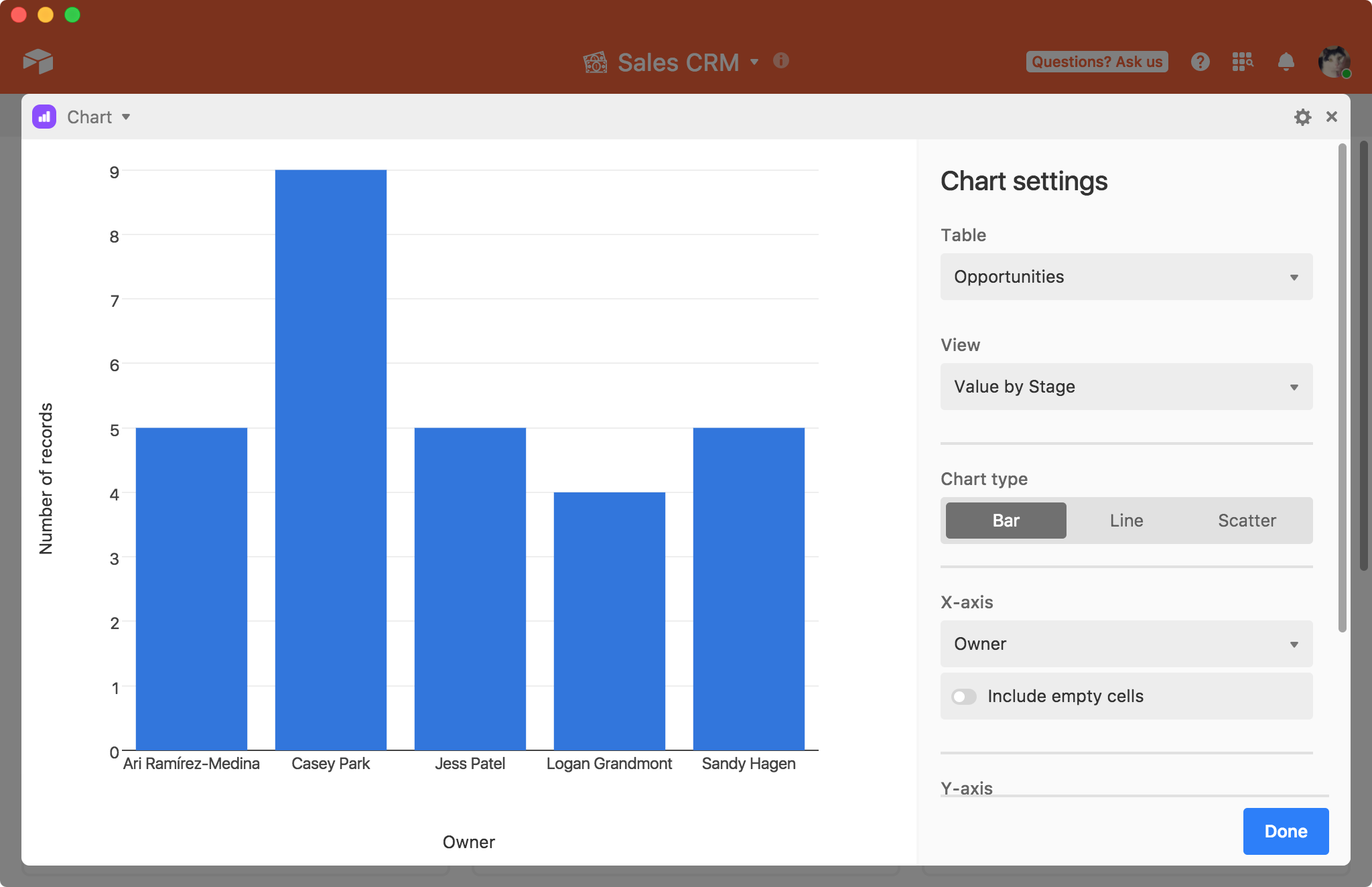
Choosing a chart type
Next, you can pick which of the chart types you want to use: bar, line, scatter, pie, or donut. Here's some general tips on how to pick the correct chart.
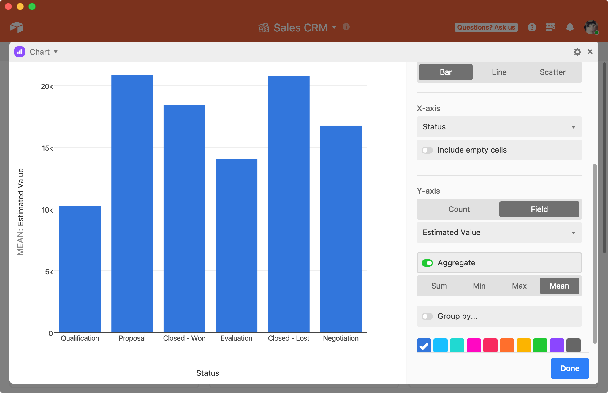
Bar charts are generally used to compare specific X-axis values, like the number of assignments each collaborator has in a project management base.
Line charts are most often used to track changes over time, but they can also be used for when there is some other sequence, like stages in a pipeline.
Scatter plots are most useful for showing how much one variable is affected by another variable.
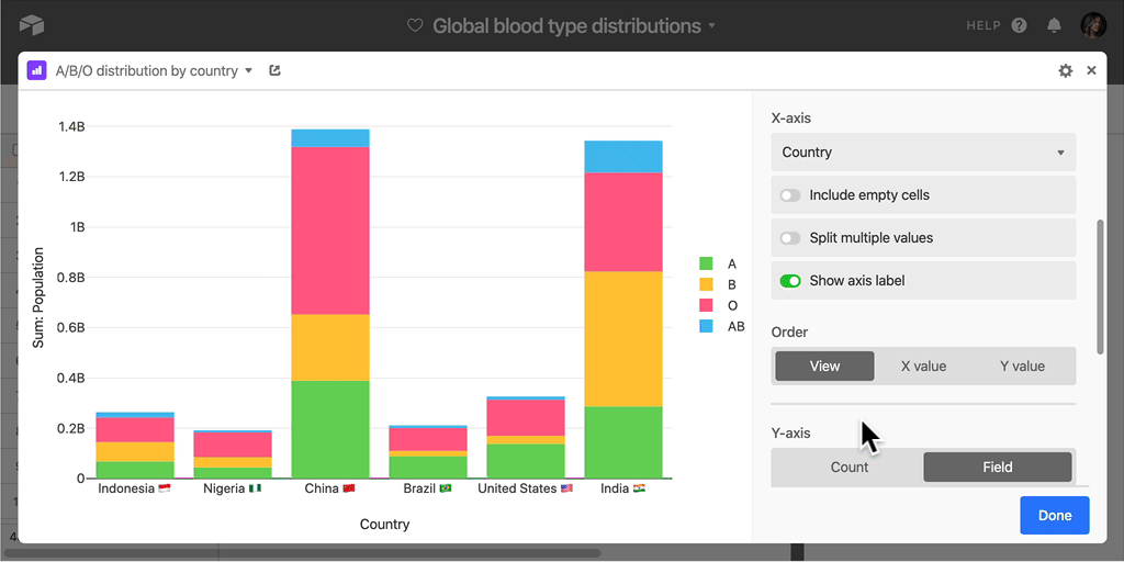
Pie and donut charts are both useful in situations where you want to compare the relative proportions of a data set's constituent subsets.
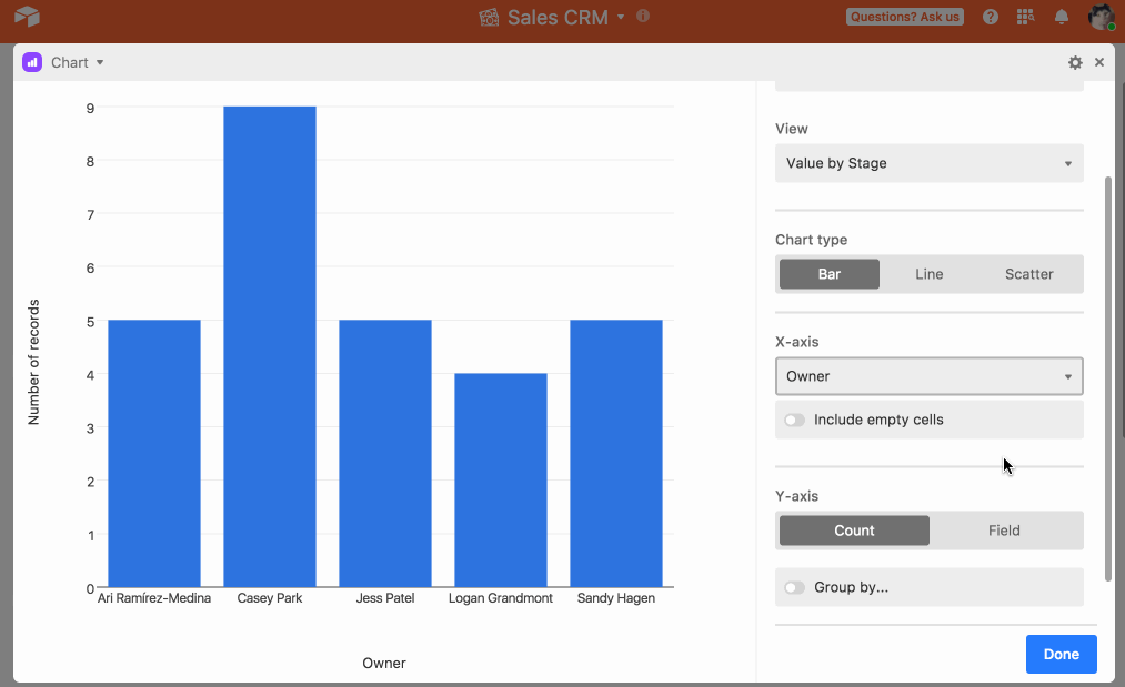
Configure the x-axis
Once you've picked a chart, you'll need to pick a field for your chart's X-axis.
Certain field types offer additional customization choices for the X-axis. For example, if you pick a date field as the X-axis, you'll have the option to bucket the date values by week, month, quarter, and so on. You can also choose to whether or not to include data from cells that are empty in the specified field by selecting the "Include empty cells" option.
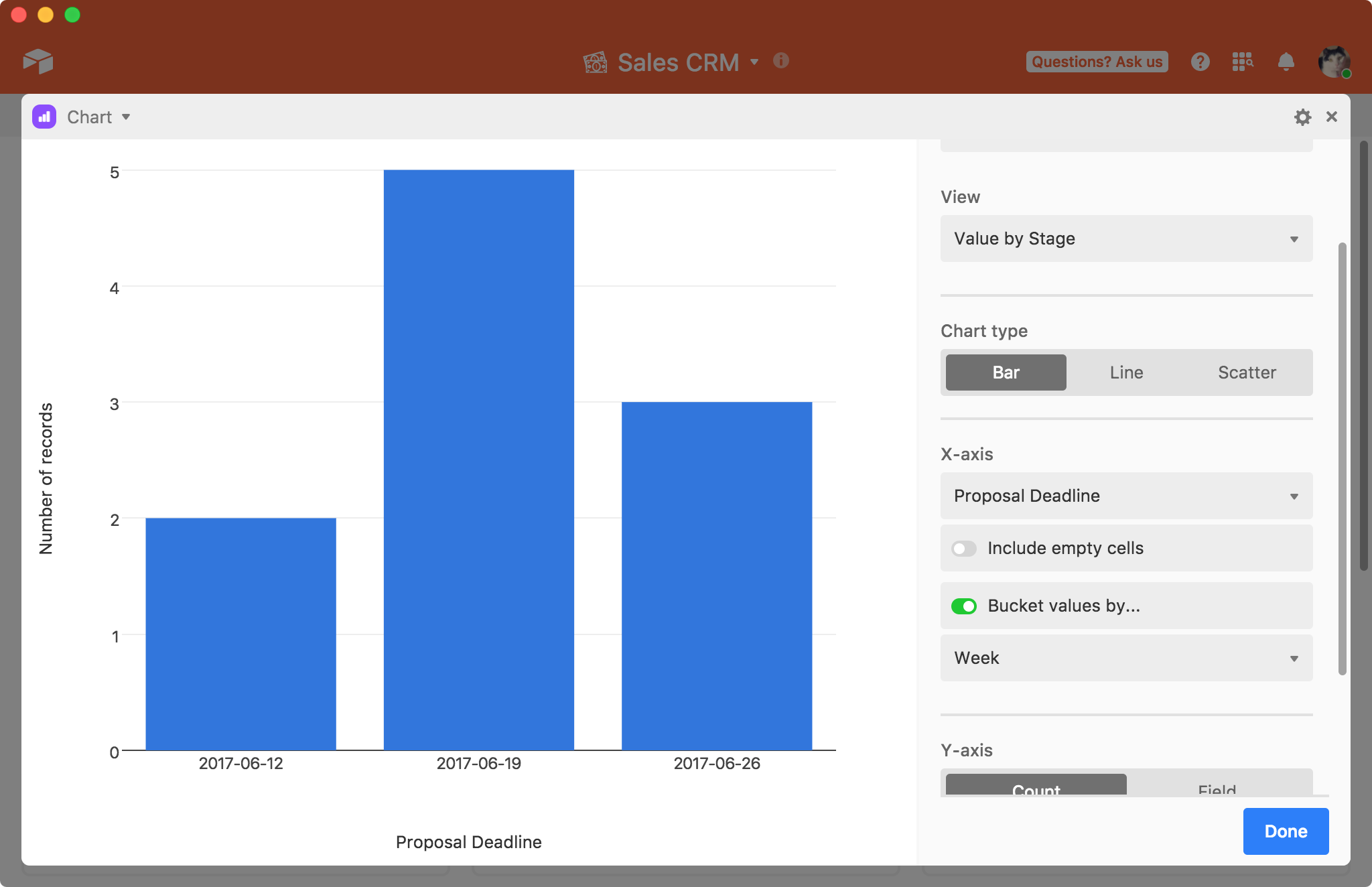
Once you've set up the X-axis, you'll need to set up the Y-axis.
Configure the y-axis
By default, the Y-axis is configured to show Count. This means that the chart will plot the number of records that have each X value on the Y-axis. To use one of your other fields for the Y-axis, click the Field option. Note that you have to pick a numeric field.
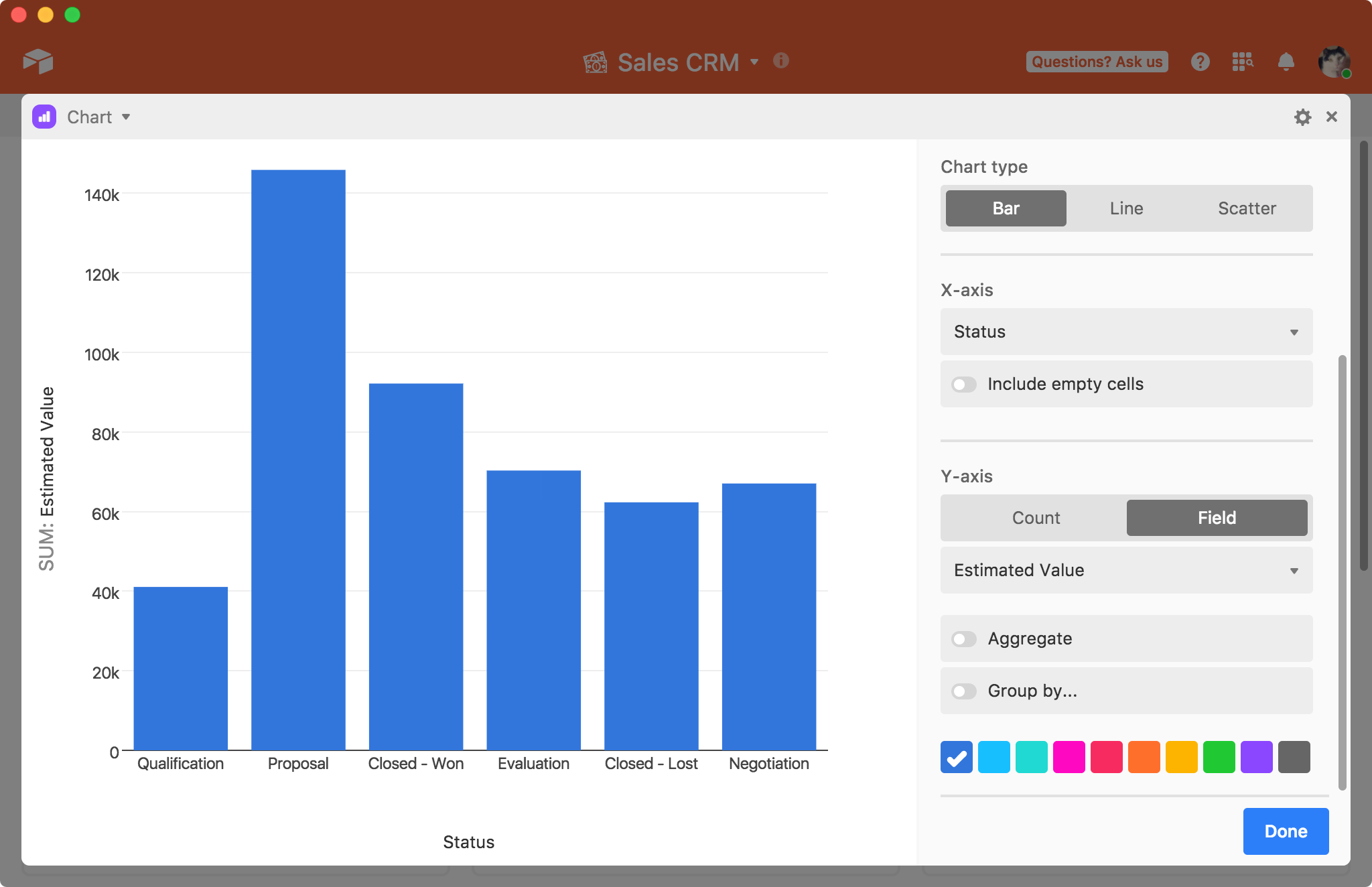
You can either plot all of the values in the field, which is useful for a scatter plot, or you can aggregate the values to show the sum, minimum, maximum, or mean of all of the values, which is more useful for line or bar charts.
Sorting
For a bar, line, or scatter chart, you can sort using one of the following options.
View: Order in view
X value: X-axis value (numerical order for number types, alphabetical for string, order of select options for single select / split multi select)
Y value: Y-axis value (ie count, summary value, etc)
Grouping
You can also choose to group by a third field, if you have any single select or single collaborator fields. Choosing to group your records will introduce individual colors for each group, giving you more options for visually distinguishing between different bars, points, and lines.
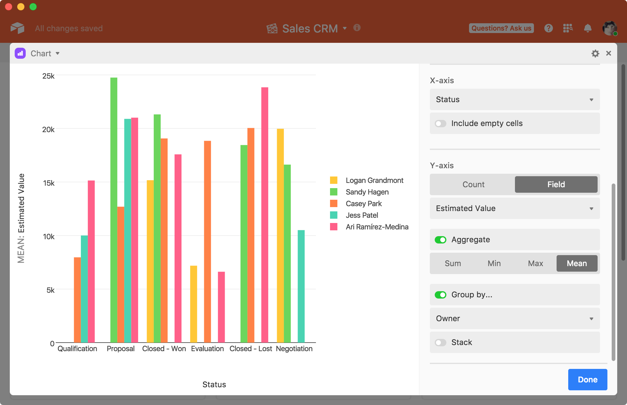
Here's another example showing multiple lines plotted by using the grouping option.
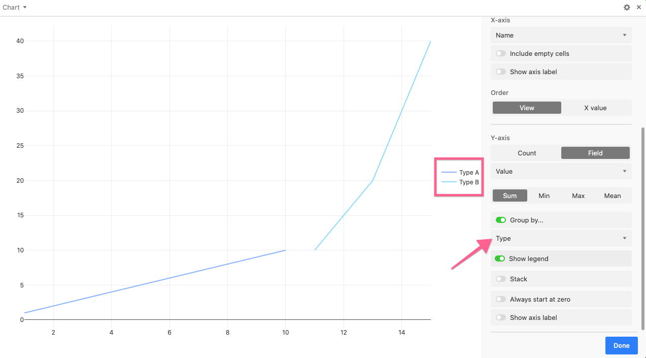
The stack option stacks the different groups on top of each other.
For line graphs and scatter plots, you also have the option of setting the Y-axis to always start at zero.
Interacting with a chart
Once you're done configuring the chart, you can hover over points on the chart to get more information about the underlying data (note that we don't otherwise display the values as labels). Clicking on a point or bar will bring up the relevant record, or a relevant list of records.
You can also double-click an item in the legend for a quick drill down.
On a line chart or scatter plot, you can zoom in by clicking and dragging your mouse to define a range.
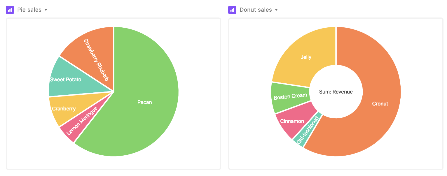
You can also make pie and donut charts with chart extension. A pie chart is used in situations when you want to illustrate proportionality: the arc lengths of the pie slices represent the relative proportions of the data set's constituent subsets. A donut chart is pretty similar to a pie chart, but—as you might guess—it has a hole in the middle.
Supported fields for chart extensions
Field type | x-axis support | y-axis support |
---|---|---|
Autonumber | ✅ | |
Barcode | ✅ | |
Checkbox | ✅ | |
Count | ✅ | ✅ |
Created time | ✅ | |
Currency | ✅ | ✅ |
Date | ✅ | |
Duration | ✅ | |
✅ | ||
Formula | ✅ | ✅ |
Last modified | ✅ | |
Linked record | ✅ | |
Long text | ✅ | |
Lookups | ✅ | ✅ 1 |
Multiple select | ✅ | |
Number | ✅ | ✅ |
Percent | ✅ | ✅ |
Phone number | ✅ | |
Rating | ✅ | ✅ |
Rollup | ✅ | ✅ 1 |
Single line text | ✅ | |
Single select | ✅ | |
URL | ✅ | |
User | ✅ |
1 Must be looking up or rolling up a value that is formatted numerically.
Attachment, Button, Created by, and Last modified by fields are unsupported in the chart extension.
FAQs
Can you plot values?
Currently, the chart extension cannot display more than one field value per record that it's plotting.
Is there a way to separately identify overlapping scattered points in the scatter chart?
At the moment, the Chart Extension scatter option can result in overlapping points when one or more records' field values are close or identical, which can lead to one point covering up the other points on the chart. As an alternative, we recommend checking out the Vega-lite chart extension which can be used for more complex charting capabilities.
How can I sort or filter the Chart Extension's output?
It is possible to further sort or filter the records shown in a Chart Extension by modifying the underlying view that the extension references.
Can I export or print the chart I created using the Chart Extension?
Only the page designer and org chart extensions currently support exporting/printing at this time. As a workaround, we recommend using the screenshot function of your device to take a picture of your created chart.