Plan Availability | All paid plans |
Permissions |
|
Platform(s) | Web/Browser, Mac app, and Windows app |
Learn how the chart extension can be set up to visually display understandings from records in a base. The chart extension lets you visualize records in multiple chart types including bar chart, line chart, scatter plot, pie chart, and donut chart.
Adding a chart extension
Open your Airtable home screen.
Create or open the base where you want to install the chart extension.
Click Tools in the upper-right corner.
Click the Extensions option.
Click Add an extension.
Search for and locate the chart extension.
Click Add, then Add extension.
Setting up a chart extension
To choose a chart type:
Next, you can pick which of the chart types you want to use: bar, line, scatter, pie, or donut. Here's some general tips on how to pick the correct chart.
Bar charts are generally used to compare specific X-axis values, like the number of assignments each collaborator has in a project management base.
Line charts are most often used to track changes over time, but they can also be used for when there is some other sequence, like stages in a pipeline.
Scatter plots are most useful for showing how much one variable is affected by another variable.
Pie and donut charts are both useful in situations where you want to compare the relative proportions of a data set's constituent subsets.
Configure the x-axis
Once you've picked a chart, you'll need to pick a field for your chart's X-axis.
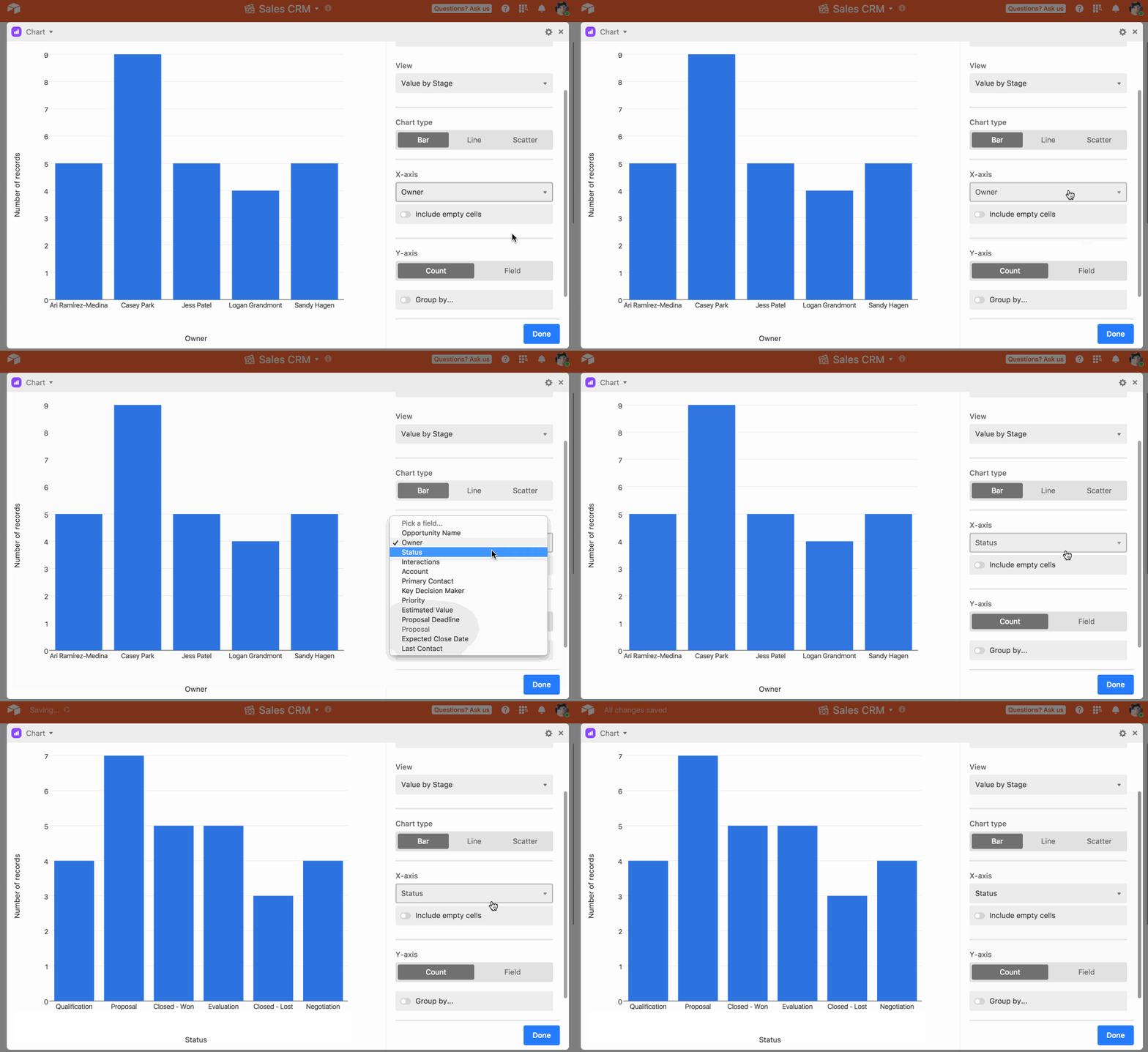
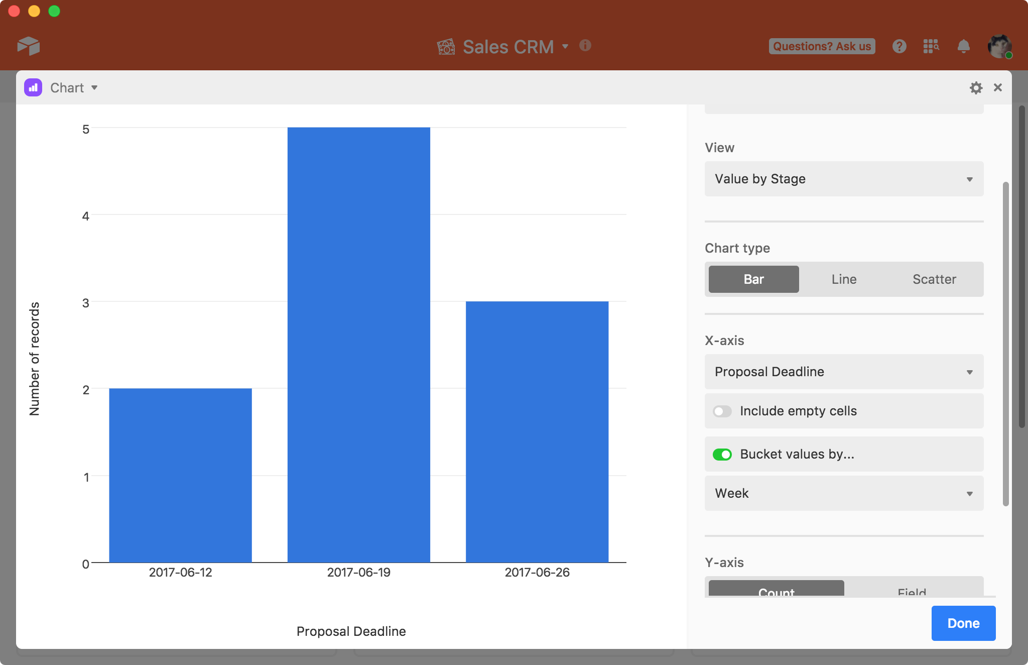
Certain field types offer additional customization choices for the X-axis. For example, if you pick a date field as the X-axis, you'll have the option to bucket the date values by week, month, quarter, and so on. You can also choose to whether or not to include data from cells that are empty in the specified field by selecting the "Include empty cells" option.
Once you've set up the X-axis, you'll need to set up the Y-axis.
Configure the y-axis
By default, the Y-axis is configured to show Count. This means that the chart will plot the number of records that have each X value on the Y-axis. To use one of your other fields for the Y-axis, click the Field option. Note that you have to pick a numeric field.
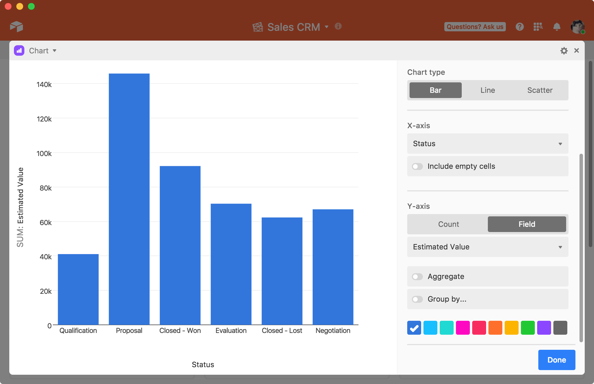
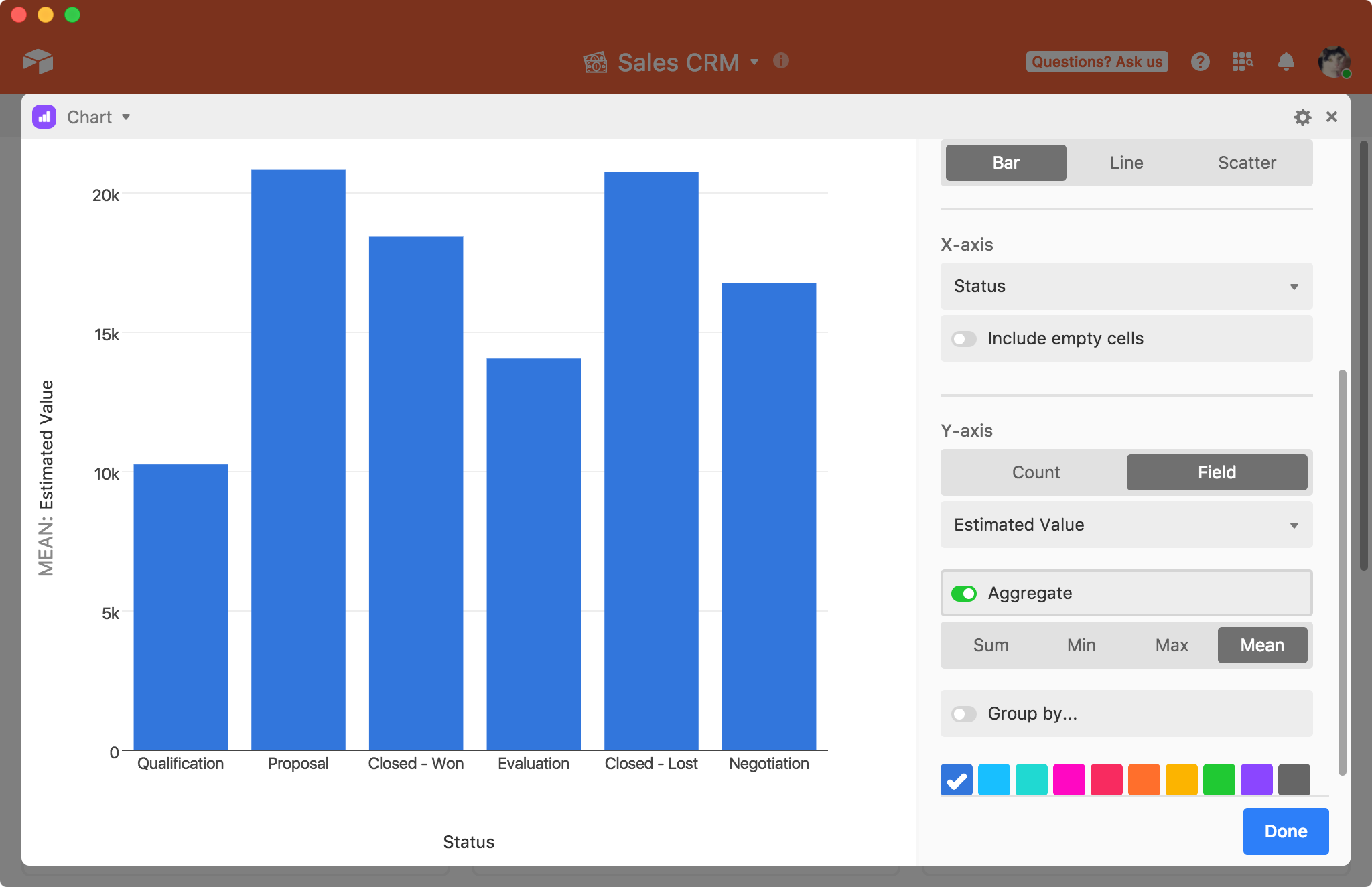
You can either plot all of the values in the field, which is useful for a scatter plot, or you can aggregate the values to show the sum, minimum, maximum, or mean of all of the values, which is more useful for line or bar charts.
Sorting
For a bar, line, or scatter chart, you can sort using one of the following options.
View: Order in view
X value: X-axis value (numerical order for number types, alphabetical for string, order of select options for single select / split multi select)
Y value: Y-axis value (ie count, summary value, etc)
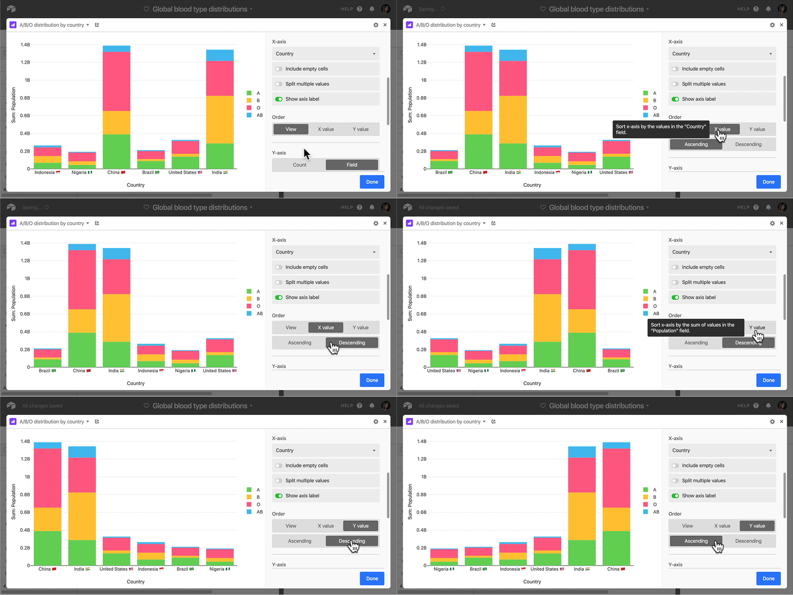
Grouping
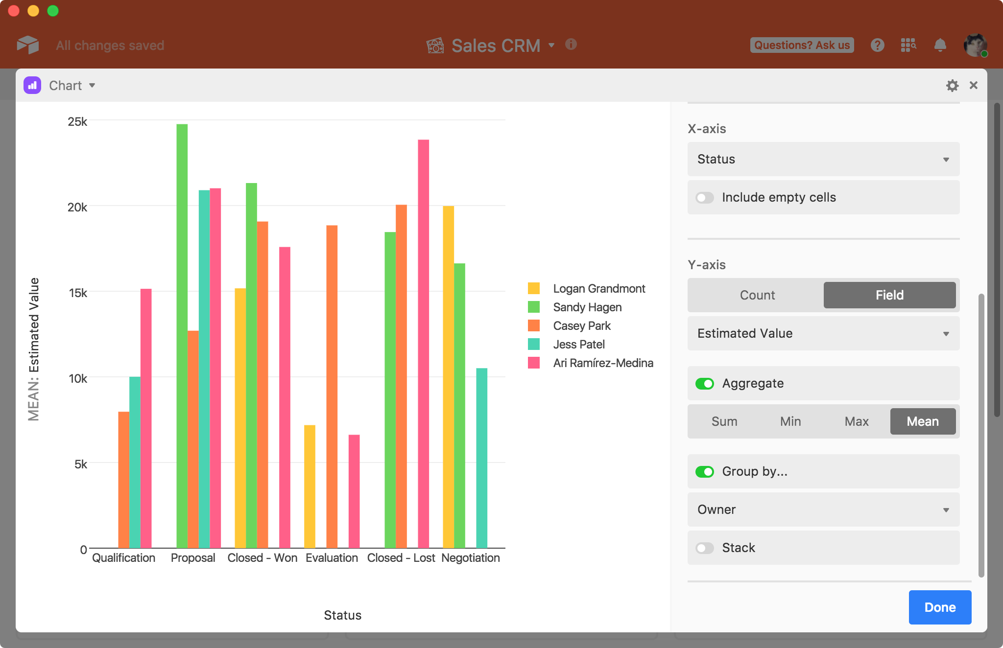
You can also choose to group by a third field, if you have any single select or single collaborator fields. Choosing to group your records will introduce individual colors for each group, giving you more options for visually distinguishing between different bars, points, and lines.
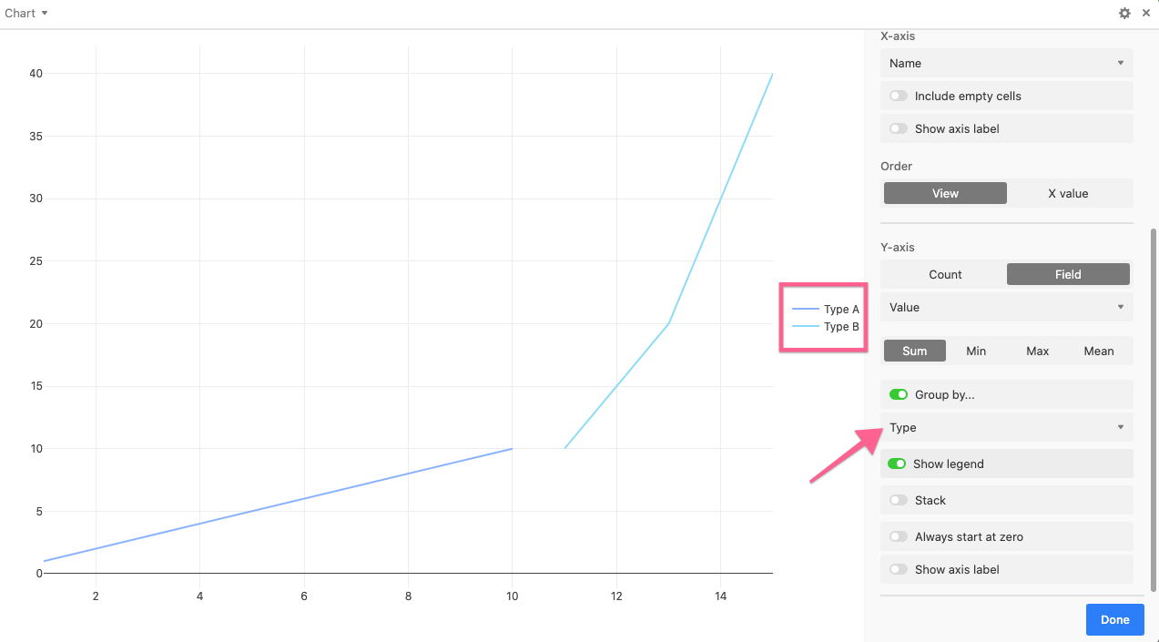
Here's another example showing multiple lines plotted by using the grouping option.
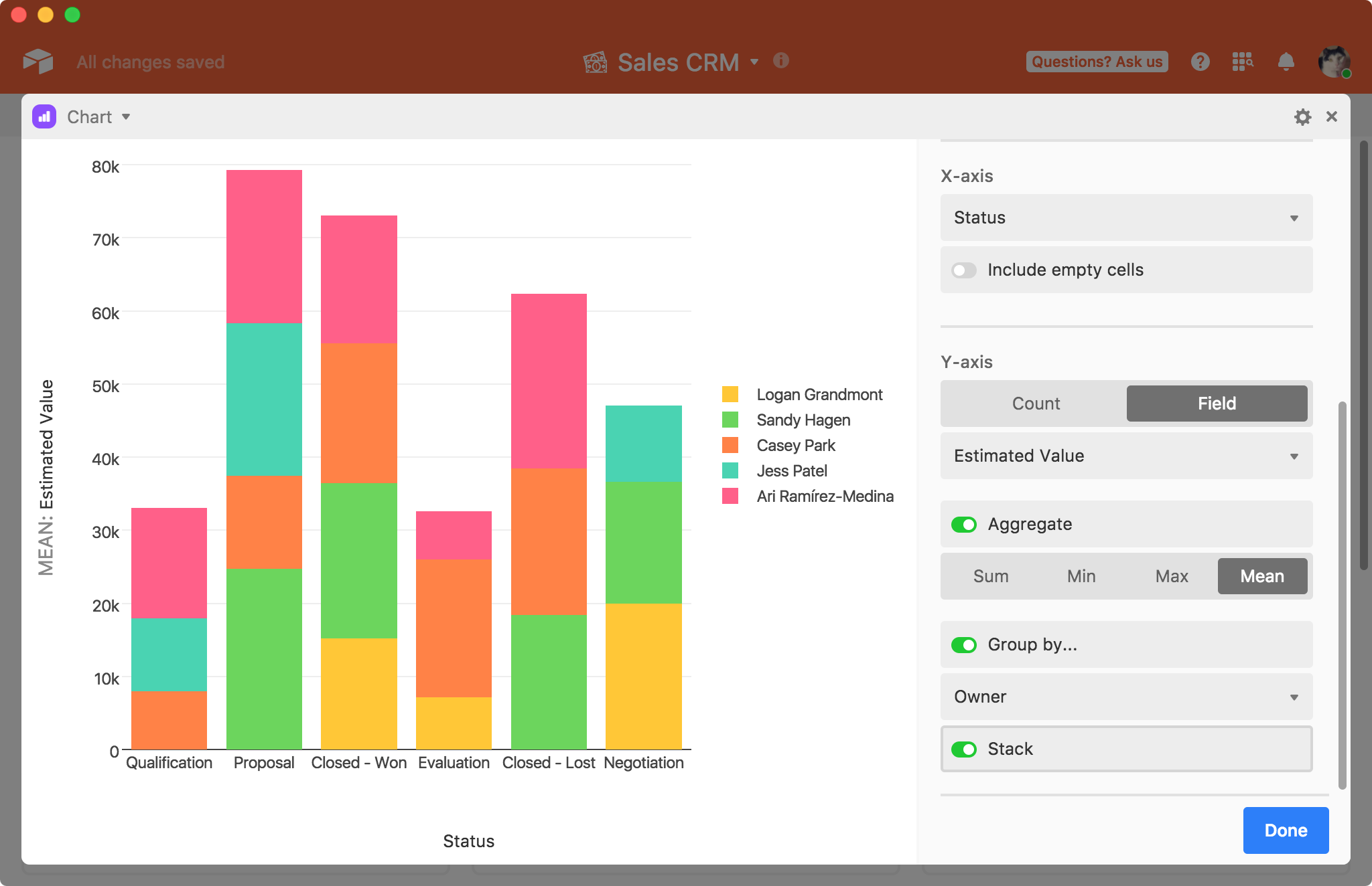
The stack option stacks the different groups on top of each other.
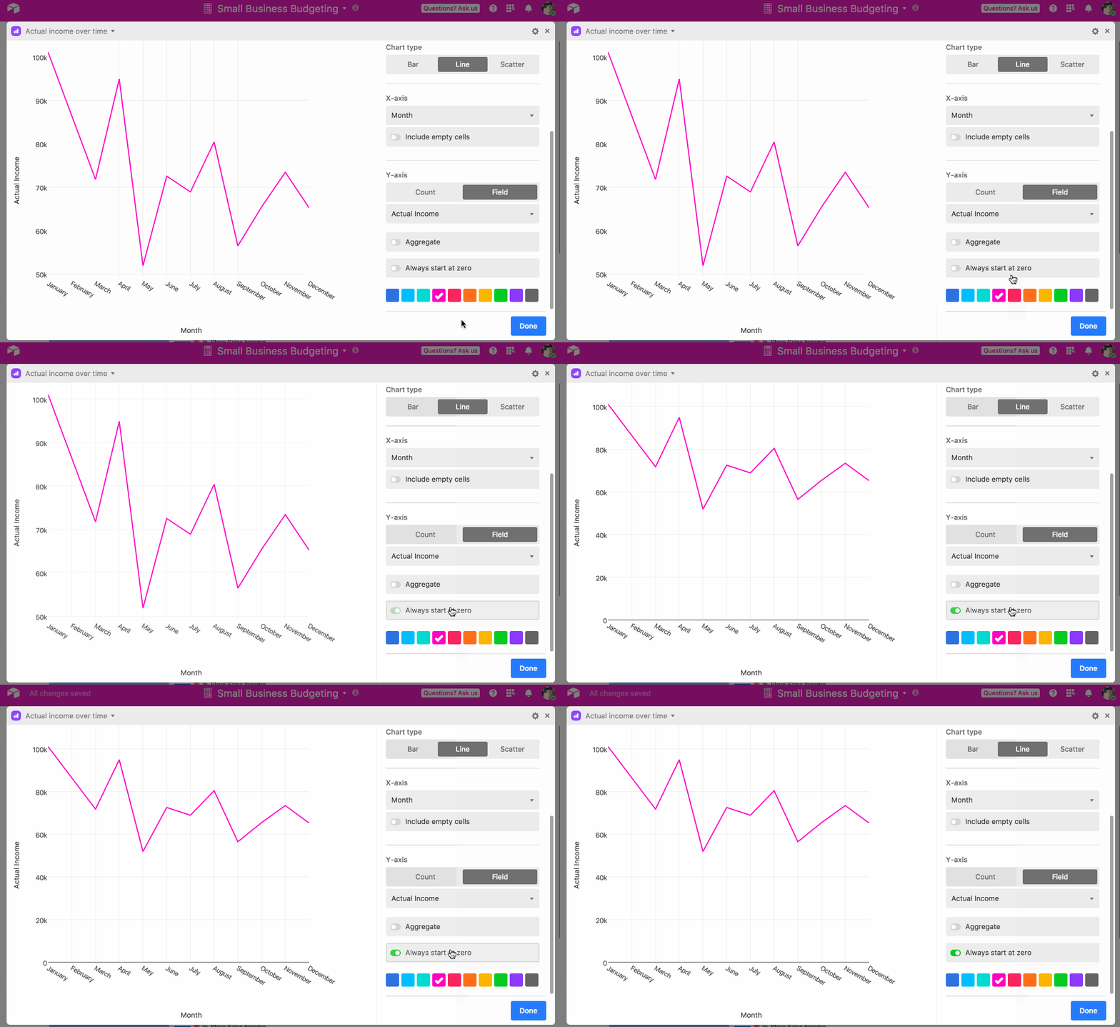
For line graphs and scatter plots, you also have the option of setting the Y-axis to always start at zero.
Interacting with a chart
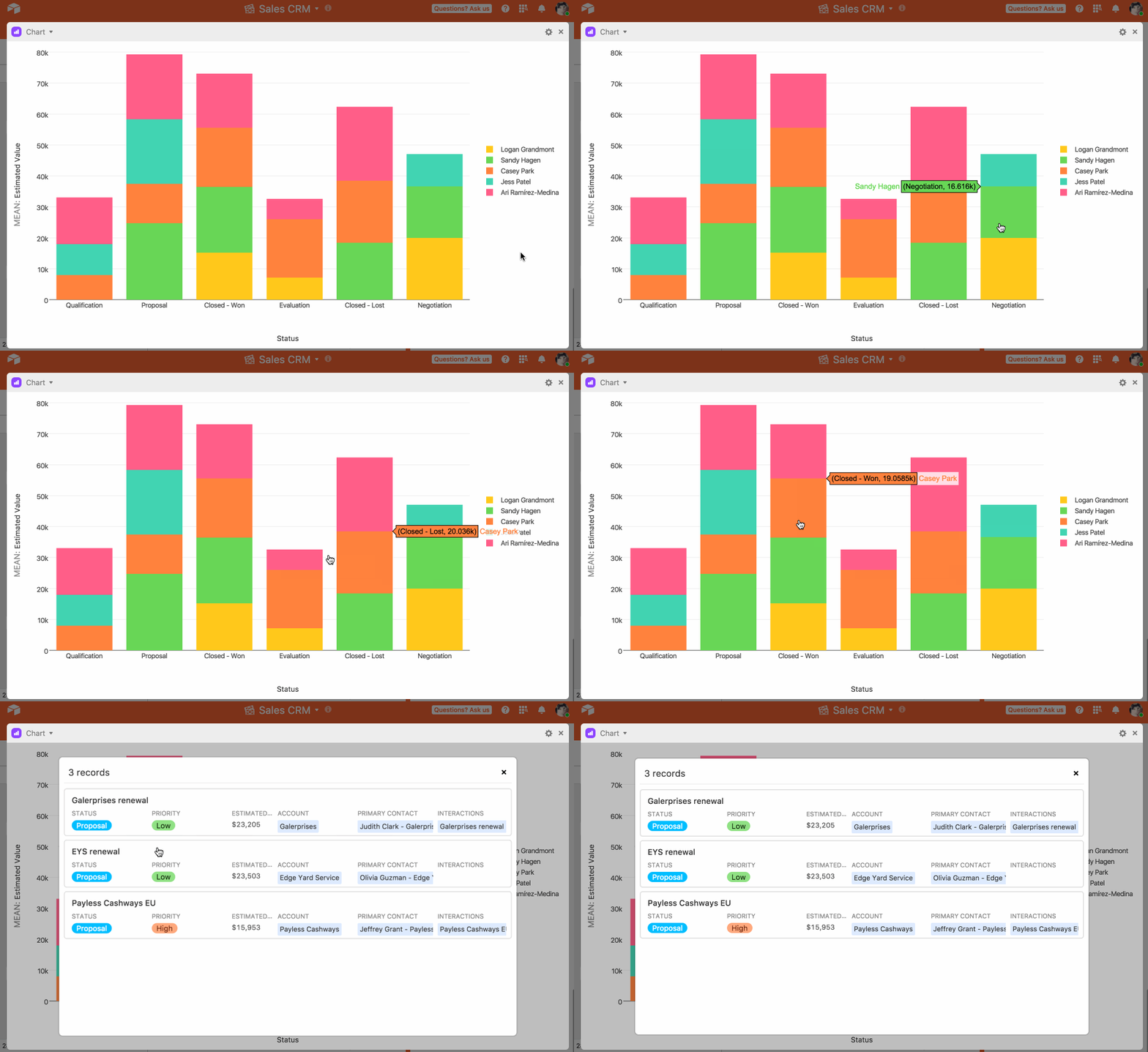
Once you're done configuring the chart, you can hover over points on the chart to get more information about the underlying data (note that we don't otherwise display the values as labels). Clicking on a point or bar will bring up the relevant record, or a relevant list of records.
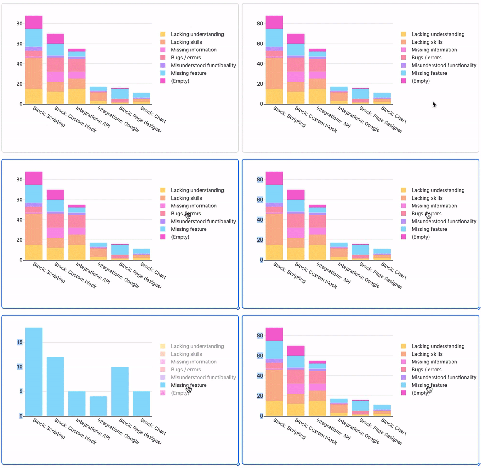
You can also double-click an item in the legend for a quick drill down.
On a line chart or scatter plot, you can zoom in by clicking and dragging your mouse to define a range.
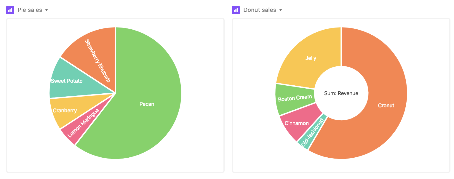
You can also make pie and donut charts with chart extension. A pie chart is used in situations when you want to illustrate proportionality: the arc lengths of the pie slices represent the relative proportions of the data set's constituent subsets. A donut chart is pretty similar to a pie chart, but—as you might guess—it has a hole in the middle.
Supported fields for chart extensions
Field type | x-axis support | y-axis support |
|---|---|---|
Autonumber | ✅ | |
Barcode | ✅ | |
Checkbox | ✅ | |
Count | ✅ | ✅ |
Created time | ✅ | |
Currency | ✅ | ✅ |
Date | ✅ | |
Duration | ✅ | |
✅ | ||
Formula | ✅ | ✅ |
Last modified | ✅ | |
Linked record | ✅ | |
Long text | ✅ | |
Lookups | ✅ | ✅ 1 |
Multiple select | ✅ | |
Number | ✅ | ✅ |
Percent | ✅ | ✅ |
Phone number | ✅ | |
Rating | ✅ | ✅ |
Rollup | ✅ | ✅ 1 |
Single line text | ✅ | |
Single select | ✅ | |
URL | ✅ | |
User | ✅ |
1 Must be looking up or rolling up a value that is formatted numerically.
Attachment, Button, Created by, and Last modified by fields are unsupported in the chart extension.
FAQs
Can you plot values?
Currently, the chart extension cannot display more than one field value per record that it's plotting.
Is there a way to separately identify overlapping scattered points in the scatter chart?
At the moment, the Chart Extension scatter option can result in overlapping points when one or more records' field values are close or identical, which can lead to one point covering up the other points on the chart. As an alternative, we recommend checking out the Vega-lite chart extension which can be used for more complex charting capabilities.
How can I sort or filter the Chart Extension's output?
It is possible to further sort or filter the records shown in a Chart Extension by modifying the underlying view that the extension references.
Can I export or print the chart I created using the Chart Extension?
Only the page designer and org chart extensions currently support exporting/printing at this time. As a workaround, we recommend using the screenshot function of your device to take a picture of your created chart.