Plan availability | All plan types/levels |
Permissions | Please consult this support article for a breakdown of Interface Designer permissions.
|
Platform(s) | Web/Browser, Mac app, and Windows app |
Related reading |
|
Interface layouts are the design framework within a given interface page. In this article, we will cover the Record review layout. You'll customize the design of an interface page that will allow end users to review many records from a single landing page.
Adding a new record review interface page
With the interface editor open click the + sign on the left side of the screen to add a new interface or page. If you add a new interface, then you need to name the interface and pick an icon before moving to the next step.
Next, you’ll be brought to the layout picker. Choose the Record review option and click Next.
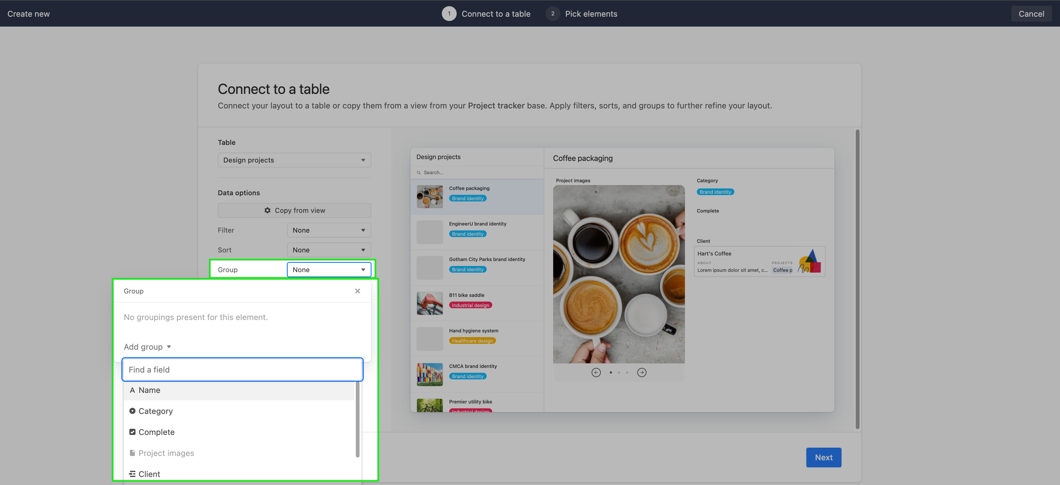
Then, you will choose the table where the record review layout will source data from in the underlying base. Once you have chosen a table, you can configure additional “Data options” in one of two ways:
By clicking the Copy settings from a view button which will allow to leverage the settings that already exist in a view from an underlying base.
Or by clicking the dropdown menus next to the Filter, Sort, and Group settings. A reminder that you can add conditions or conditional groups in filter settings.
Once you have configured the table, filter, sort, and group settings, click Next.
You’ll then be brought to a screen where you will choose the fields from the underlying table to show on the record review page you are building. Toggle the fields you’d like to see. You can add or remove fields later as needed. Also, you will see a preview of the layout as you add or remove fields. Click Next when you are satisfied.
Give the record review layout a name and then click Finish.
Configuring a record review layout
There are three broad surfaces to configure in a record review layout. The first surface to configure is the layout of records to review, the second shows a page of record-level details when a particular record is clicked, and the third are properties for an individual field in the record-level details. Learn more about each below:
Record review layout properties
In Edit mode, click on the canvas where the list of records to review is displayed to reach the properties listed below.
.png "interface_record_review_list_properties_2024(1).png")
Title - Give the record review layout page a title so other users understand what information is contained in the list of records.
Data
Source - The table from the underlying base where data is being sourced from.
Filter by - Configure any filters that will limit which records from the underlying source table will appear in this layout.
Sort by - Choose one or more fields to sort the records by. Depending upon the field type chosen, there may be alphabetical or numerical ordering options to choose from.
Group by - Choose one or more fields to group the records by. Depending upon the field type chosen, there may be alphabetical or numerical ordering options to choose from.
List item
Color by - Set the way that records will be colored in the list. Colors can be either based on a select fields or conditional logic.
Image field - If the underlying table contains one or more attachment fields, then you can leverage one of those fields to display as an image next to the record. Note that if an attachment field contains multiple image,
Title - Choose a field that will act as the title of the record. By default this will be the primary field from the underlying base/table, however, you may choose a different field if it is better for your use case.
Field 1 - Optionally choose a preview field to show next to the record in the list to give it context for end users.
Field 2 - Optionally choose an additional preview field to show next to the record in the list to give extra context for end users.
User filters
Elements - Choose none, tabs, or dropdowns. Additional options will appear which are covered in step three in this section of another support article.
User actions
Sort - Toggle on to allow end users to sort the records shown on the interface page.
Filter - When enabled this allows end users to set up their own conditions for filtering the records shown in the list of records to review. Note that any filters set up in the “Filter by” setting above will supersede the filters that end-users configure on their own.
Add records through a form - When enabled, this option will appear as a + plus button icon in the top right corner of the record review layout. This will link to a form where base or interface-only collaborators with editor permissions or higher can add new records.
Buttons - Add one or more buttons to the record detail page that end-users can click to perform a multitude of actions. For a more in-depth understanding of buttons consult this documentation.
Advanced
Allow users to export data as a CSV - Allow end users the ability to export the data set shown in the interface as a CSV file.
Allow users to print - Enabling this option allows end users to print interface pages or save them as PDFs. Learn more here.
Record review page properties
In Edit mode, click on the canvas where an individual record’s details are displayed to reach the properties listed below. Additionally, you can add groups of fields, add existing fields, or create new fields by hovering over the canvas to reveal the + Add group or + buttons.

Data
Title field - Choose a field that will act as the title of the record. By default this will be the primary field from the underlying base/table, however, you may choose a different field if it is better for your use case.
Fields - Choose which fields are visible or hidden on the page.
Appearance
Title size - Choose how large to display the text of the title field chosen above.
Show as full width - Enabling "Show as full width" expands the content container to fill the available horizontal space on larger screens, instead of being capped and centered.
User actions
Comments - When enabled, give end users the opportunity to comment on records when they have opened a record detail page. For more information on commenting in Airtable, see Commenting on records and @mentioning collaborators.
Revision history - When enabled, Show end users revision history for the particular record that they have open. Note that with revision history, users will be able to see any changes that were previously made to fields that are visible in record details, as well as any changes moving forward. These changes may include:
Interface edits
Extensions
Automations
External applications (ex: OAuth)
Allow users to print - Enabling this option allows end users to print interface pages or save them as PDFs. Learn more here.
Buttons - Add one or more buttons to the record detail page that end-users can click to perform a multitude of actions. For a more in-depth understanding of buttons consult this documentation.
Field level properties
In Edit mode, click on a field where the individual record details are displayed to reach the properties listed below. Certain fields may contain more or slightly varied configuration options, but in general you can expect the following properties to appear.

Label - By default, the label of the field will match the name of the field in the underlying base. However, you can override that name and display it as a different label on the interface you are configuring.
Data
Source - You can click the Edit field option here to change the field type, name, and more. Just keep in mind that this will make changes to the field in the underlying base and any other interfaces referencing the field as well.
Permissions - Set whether the field is View-only or Editable by end users with appropriate permissions.
Appearance
Style (Size) - Options here will vary by field type. We suggest experiementing with different styles and size to see what works best for your use case.
Helper text - When enabled, this option will cause an “Add helper text” box to appear at the top of the field on the canvas. Click into this box to add additional details that can help end users understand more about what the field is showing or how they should interact with it in the context of the interface you are designing.
Rules
Visibility - When no conditions are set, the field will always be shown. Otherwise, create conditions or conditional groups that will only reveal the field when those conditions are met.
Elements-based record review layouts
Note
This legacy layout is no longer in active development and doesn’t offer the same level of functionality that the layout option above offers.
Record review layout components
Record list element - The record list element creates a column on the left-side of the screen and displays each of the records in a table as an item in the list. People using the record review interface can quickly search or browse/scroll for a certain record in the record list. Once they click on the record in the list, more details about the record appear on the right side of the screen. Note that the record list element is only available by choosing the "Record review" layout. It's not available to add as an element to other interface layouts.
Headline/Title/Name field - This particular field element has a larger appearance to help center users around what the information below it means. This field, along with other field elements connected to the record list element can be customized in their appearance. You can choose to toggle the "label" on or off. A label matches the name of the field in the underlying base. Additionally, you can drag other elements into that header/headline space, you can delete the title, you can put static text there, etc.
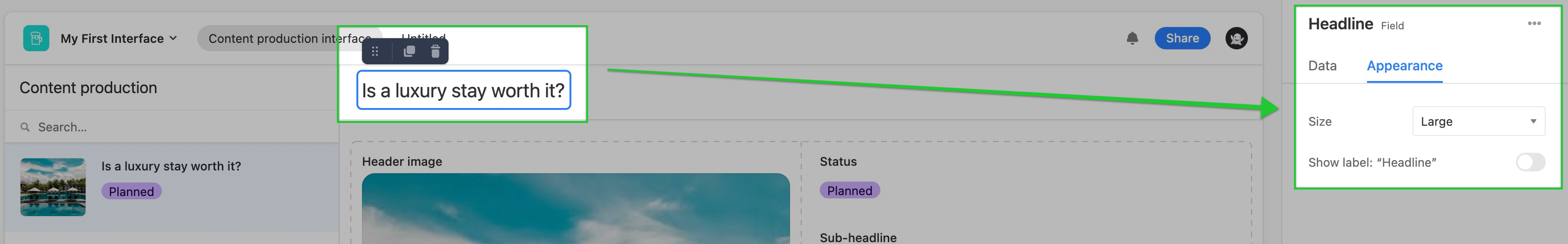
Image field - This layout includes a header image when possible. The image field is optional for this layout, and it only appears if you've elected to use an attachment element. The table connected to this interface must contain an attachments field and any individual records must contain an attachment in that field for an image to appear in the interface. Otherwise, the header image will appear blank. Clicking on an attachment will open the attachment viewer where users can download the individual file.
Other included fields - During the layout setup process, you'll be able to toggle on and off individual fields to show or hide in the interface. If you have a Pro or Enterprise workspace, you can decide which individual fields are editable or view-only.
Bonus: Linked record field - Linked record fields have the added bonus of opening the linked record in an expanded view, providing collaborators with additional details related to the record they are interacting with.
Note
Any of the components listed above can be customized during the initial layout setup or at a later time by clicking on the individual element in Edit mode.
Record review layout considerations
The only way to add the Record list element is by selecting the Record review layout when creating an interface. This element cannot be found or added in any other interface layout, including blank layouts, and provides a user-friendly way to interact and/or view records from the underlying base.
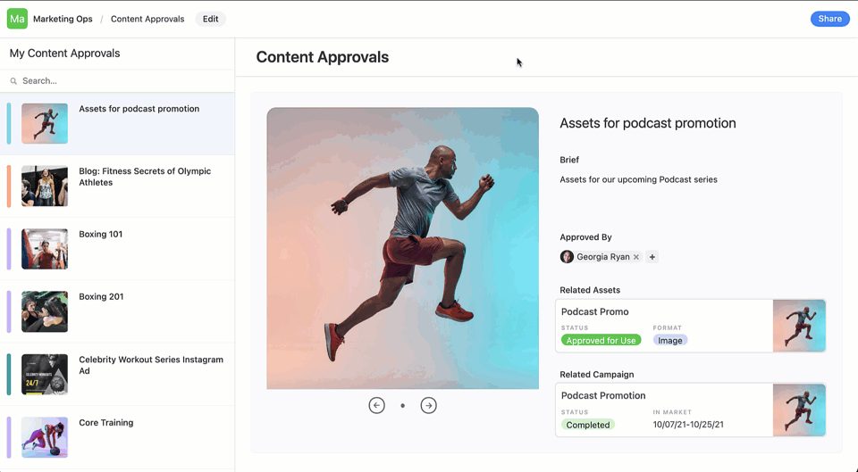
The Record review layout was designed to allow you to quickly switch between records with ease. Record review is useful for triaging or reviewing many records at once. We've built a specific guide that shows how the Record review layout can be used as a content approval workflow.
Within the Record review layout, you can also group records based on one or more fields from your base. After choosing the Record review layout option, you can click the drop-down next to the "Group" data option which will open up a menu of fields to group by.
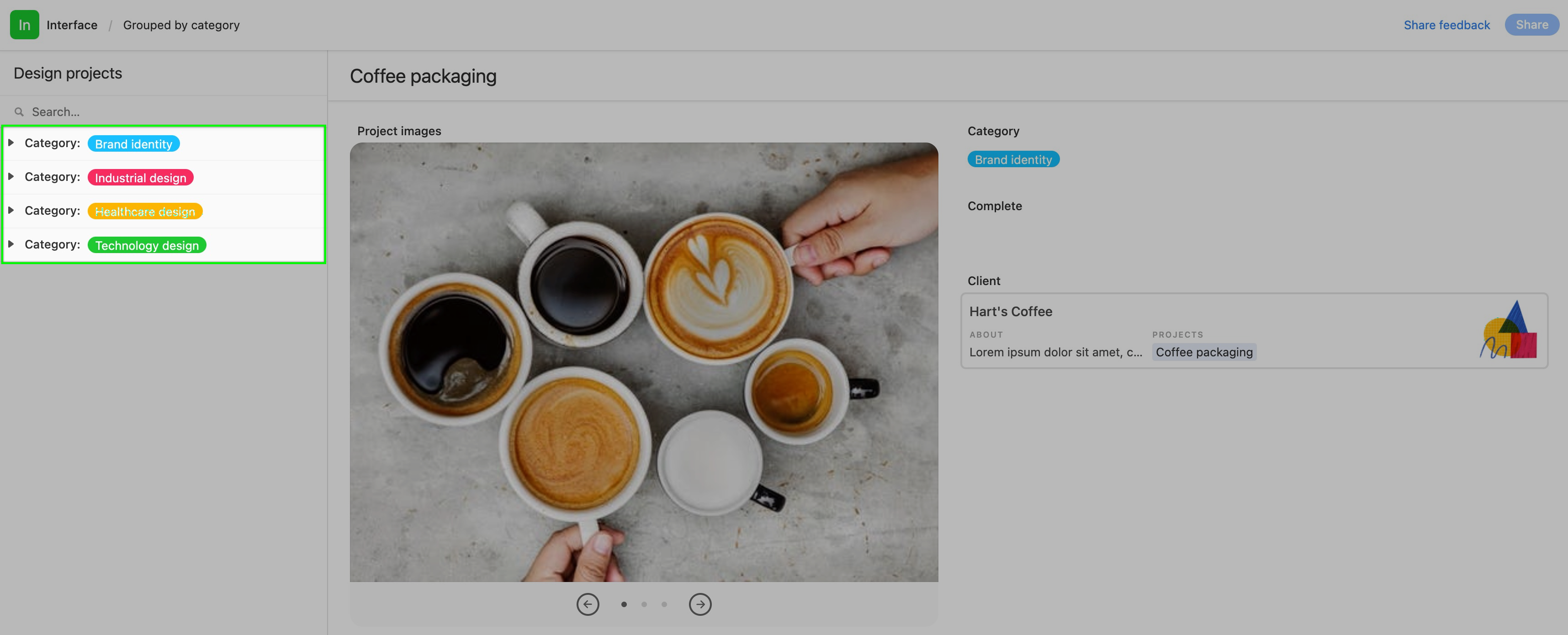
Groupings in a published base will appear as nested drop-down groups. In this case, they are neatly arranged by project category:
FAQs
What are the differences between the legacy record review and updated record review layout?
The updated layout supports modern features in the details view including: conditional fields and groups, stacked and side-by-side field labels, simplified drag-and-drop experience.
The record list also adds new functionality including:
Preset filters, filter dropdowns, and custom filters
End-user sort
More button actions