Plan availability | All plan types |
Permissions | Owner / Creator - Can configure interface page layouts Please consult this support article for a breakdown of Interface Designer permissions. |
Platform(s) | Web/Browser, Mac app, and Windows app |
Interface dashboards in Airtable overview
Airtable interface dashboards allow users to communicate summaries of important information to stakeholders across their organization. Another powerful aspect of interface dashboards is the ability to drill down into various charts or tables and get past the high-level information presented at first glance. This is particularly important for the following stakeholder groups:
Leadership: reporting on the progress or status of a workstream via a dashboard gives the leadership a bird’s-eye view of the workstream without having them be bogged down by unnecessary details.
Partner groups or teams: Giving updates to partners via dashboards helps them capture the information at the right altitude without having to know all the details.
There are two high-level use cases for dashboards:
Reporting: Tracking progress at regular intervals and providing clarity, often answering to stakeholders and executives.
Example: initiatives dashboard showing progress against quarterly goals and projects that are behind schedule
Monitoring: Understanding the current state of an initiative or part of a business, with a particular focus on anything unexpected.
Example: capacity planning dashboard that shows the utilization of team members’ time over the next two weeks
Adding a new dashboard interface page
Interface layouts are the design framework within a given interface page. The dash layout provides a way to present data as insights to different audiences across your organization. This layout type is heavily based on numbers and graphs.
With the interface editor open click the + sign on the left side of the screen to add a new interface or page. If you add a new interface, then you need to name the interface and pick an icon before moving to the next step.
Next, you’ll be brought to the layout picker. Choose the Dashboard option and click Next.
Then you will choose the table where the dashboard will source data from the underlying base. After choosing the table from the dropdown, click Finish.
Now is a good time to retitle the interface page and/or allow end users to print the page.
Configuring a dashboard layout

Once you have added a new dashboard, it’s time to customize it. The layout can be comprised of one or more dashboard groups, with each group attached to a single table from the underlying base. Once you have fully configured the interface, remember to click the blue Publish button within the interface editor to make the configured interface page visible to end users.
General dashboard configuration
First, give your dashboard a name and a description.
When hovering over the dashboard you’ll see + buttons appear in different locations on the canvas. There will be different options based on where the + button is on the canvas, but within a dashboard group you can expect these general options:
Number - Show a count or summary of records depending on filters.
Chart - Show a chart to give insights into the underlying records in a connected table.
List - Show a list of records from the underlying table. This is especially useful when grouping records (ex. status field).
Timeline - Show a timeline of events based on a start date field and optional end date field.
Summary Cards - Showcase images and highlights from individual records. They are perfect for executive overviews or status and project updates.
We’ll cover more about each option’s settings below, but you can set a title, filters, appearance, and other settings from the properties panel on the right side of the page when you’ve clicked on a particular insight shown on the dashboard.
You can also add groups to the page. These groups can source their data from different tables from the underlying base.
Configuring dashboard groups and adding new dashboard groups
In between existing dashboard groups or at the bottom of the dashboard layout, you’ll see the + Add group option appear when hovering over the line break on the canvas. Click this to create a new dashboard group. Keep in mind that individual dashboard numbers, graphs, lists, and timelines have additional settings to configure. These settings exist at the dashboard group level above those settings:
Data
Source - Here you can choose the source table for all of the dashboard elements that you add to the group.
Filter by - Configure any filters that will limit which records from the underlying source table will appear in this layout.
Appearance -
Width - Adjust the width of the entire dashboard group.
Use background color - Toggle whether there is a background color for the group. This will give the group a light grey background to help distinguish it from another group.
User filters - The elements section allows builders to give end-users different views/insights of the information in the dashboard group through tabs or dropdowns. More information about tabs and dropdowns is available in the “Step 3: Configure filters” portion of this article.
User actions - Builders can also allow end users to set their own filtering conditions by toggling the “Filter” option or configure one or more buttons that end users can click to perform some kind of action (only the “Go to interface page” or “Go to external URL” options are supported in dashboard groups).
Understanding and configuring dashboard visualization properties
Numbers
Title - Alter the label shown next to the number you are configuring. The title and description of numbers will also appear as the title of the side-sheet whenever users click to see underlying data.
Subtitle - Give the number even more context for end users.
Data
Source - This option can’t be changed for numbers. To change the table for a number you’ll need to add a new group to the dashboard to source data from a different table.
Filter by - Configure any filters that will limit which records from the underlying source table will appear in this number.
Appearance - There are two general settings to configure here:
Type - Choose whether the number is a Count or a Summary. Counts will be shown as an integer representing the number of records in the underlying table that match the filters you’ve set. A summary will look at the values in a particular field and then summarize them in a certain way depending on what the field type is and which “Summary type” is set.
Color - You can also configure the color of the number and whether or not it has a background color enabled. Additionally, you are also able to set colors based on conditions. The “Otherwise” color setting essentially becomes a fallback color. Learn more about configuring conditional colors here.
User actions - You can also allow end users to click on the number to open up a record detail page by toggling the “Click to see underlying records” option. More information is available here.
Charts
Title - Alter the label shown next to the chart you are configuring. The title and description of the chart will also appear as the title of the side-sheet whenever users click to see underlying data.
Description - Give the chart more context for end users.
Show description as tooltip - This will allow end users to hover over an ⓘ symbol and click it to reveal the description of the chart (if the description is configured).
Type - Set the type of chart that is shown: Bar, Line, Pie, Donut, or Scatter.
Data - Data configuration options will differ based on the chart type. Line, Bar, and Scatter graph types will have X-axis, Y-axis (left), and Y-axis (right) fields to configure. Pie and Donut graph types will have Categories and Values fields to configure.
If your bar chart includes a “Group by” value, then you can choose whether the “Stacking” feature is off (None), on (Standard), or shown as a percentage on the vertical y-axis (100%). Note that it is not possible to configure multiple series on the left y-axis and also use the Group By feature at the same time.
Appearance - Choose a color, size, and whether to show the record count on the chart. Charts also have a size preset that can be used to alter the height of the whole row of charts. It’s not possible to set different heights for charts that are side by side.
For more information about setting up multi-series charts and/or dual y-axes click here.
Filter by - Configure any filters that will limit which records from the underlying source table will appear in this chart.
User actions - You can also allow end users to click on the chart to open up a record detail page by toggling the “Click to see underlying records” option. More information is available here.
List
Title - Alter the label shown next to the list you are configuring. The title and description of the list will also appear as the title of the side-sheet whenever users click to see underlying data.
Hierarchy - Add levels of hierarchy to show relationships between data across different tables. Click the cogwheel icon to reveal the setup menu. We cover hierarchy in more detail in the list view support article.
Data - Filter the data shown by setting up specific conditions or groups of conditions. Configure the Sort by and Group by fields to organize the data shown in the list. You can also choose whether to show a Prefix field and which fields from the underlying table that the list will show.
Appearance - There are several options to configure in this section. Color by allows you to conditionally color records depending on conditions or a select field. Max size will change the size of the list on the interface canvas. Adjust Row height to give each record in the list more or less space. Finally, toggle Show field descriptions to show any underlying field descriptions from the base to give end users more context or Collapse all by default to hide all of the records nested below each list grouping.
User actions - You can also allow end users to click on records in the list to open up a record detail page by toggling the “Click to see underlying records” option. More information is available here.
Timeline
Title - Alter the label shown next to the timeline you are configuring. The title and description of the timeline will also appear as the title of the side-sheet whenever users click to see underlying data.
Data - Filter the data shown by setting up specific conditions or groups of conditions. There are many other settings to consider when setting up this portion of the properties for the timeline. Consult the timeline view documentation for more specifics on the setup and considerations related to these properties.
Appearance - There are several options to configure in this section. Color by allows you to conditionally color timeline events depending on conditions or a select field. Size will change the size of the timeline on the interface canvas. Adjust Record height to give each event in the timeline more or less space. You can also decide the Width of records/events to provide more space for event information. Finally, there are several toggles to Stack labels vertically, Wrap labels, Split multiple values into groups, or Collapse groups by default. We recommend experimenting with the various options to see what fits well with your use case.
User actions - You can also allow end users to click on records in the timeline to open up a record detail page by toggling the “Click to see underlying records” option. More information is available here.
Gallery
Title - Alter the label shown next to the gallery you are configuring. The title and description of the gallery will also appear as the title of the side-sheet whenever users click to see underlying data.
Data - Filter the data shown by setting up specific conditions or groups of conditions. Choose a Title field from the underlying base in order to give each image a relevant title. Configure the Sort by field to organize the data shown in the gallery. Choose which Fields will be visible below each gallery image. Choose an attachment field in the Image field setting to show the image or images in a particular record. By default the first attachment field in the underlying table will be used, but you can adjust this setting if your table contains more than one attachment field.
Appearance - There are several options to configure in this section. Color by allows you to conditionally color records depending on conditions or a select field. Rows per page allows you to set the maximum number of rows of images that will be shown in the gallery visualization. Choose between 1 and 4 rows. Toggle on or off the option to Fit image size which will resize the image to fit within the gallery card. Toggle on or off the option to Display field names.
User actions - You can also allow end users to click on records in the timeline to open up a record detail page by toggling the “Click to see underlying records” option. More information is available here.
Kanban
Title - Alter the label shown next to the Kanban board you are configuring. The title and description of the Kanban will also appear as the title of the side-sheet whenever users click to see underlying data.
Data
Source - Not configurable from this level of the properties panel. You’ll need to modify this at the group level of the dashboard.
Stacking field - Choose a single select, user, or created by field to "stack" records together.
Sort by - Set the way that cards will be sorted in this visualization. Choosing a Manual sort field from this menu will allow users to drag and drop records when "Edit records inline" is enabled.
Fields - Pick which fields are visible in the visualization.
Image field - Configure which attachment field will be used as the card's image.
Filters
Filter by - Set up filtering conditions to limit the type of record present in the Kanban visualization. Keep in mind that filters might also be present at the group level of the dashboard you are creating.
Appearance
Color by - Set up record coloring based on a Select field or Conditions.
Wrap long cell values - Toggling this option allows values to look more natural and take up less space. Experiment with this option to your liking.
Hide empty stacks - If there are no records associated with a value in the “Stacking field” configured in the Data section, then toggling this option on will hide that stack or stacks.
User actions
Edit records inline - Allow end users (with the appropriate permissions) to edit those records from the visualization page.
Add/delete records inline - Allow end users (with the appropriate permissions) to add or delete records from the visualization page.
Click into record details - Allow end users to open up more details about a record. Learn more about configuring record details here.
Calendar
Title - Alter the label shown next to the calendar you are configuring. The title and description of the calendar will also appear as the title of the side-sheet whenever users click to see underlying data.
Data
Source - Not configurable from this level of the properties panel. You’ll need to modify this at the group level of the dashboard.
Date settings - Configure a date field to be used for the start and optional end date in the visualization. Also, configure the "Initial view" settings by setting the "Position," "Timescale," and optional "Set for all visits" toggle.
Sort by - Set the way that cards will be sorted in this visualization.
Fields - Pick which fields are visible when clicking on a calendar event shown in the visualization.
Label - Configure which fields will be shown in a calendar event’s label. Due to space constraints, this option doesn't always show all fields.
Label image - Add an attachment field that will be used as the calendar event's label image.
Appearance
Color by - Set up record coloring based on a Select field or Conditions.
Size - This option will resize the amount of space that the calendar takes up on the dashboard page.
Fit image size - This option will resize images from the chosen image field to fit into the calendar event label’s available space. This option is only present if a “Label image” field has been added.
User actions
Edit records inline - Allow end users (with the appropriate permissions) to edit those records from the visualization page.
Add/delete records inline - Allow end users (with the appropriate permissions) to add or delete records from the visualization page.
Click into record details - Allow end users to open up more details about a record. Learn more about configuring record details here.
Summary cards
Note
The summary cards feature is only available for Business and Enterprise Scale plan customers.
Record Limits - Select the number of cards to display in the interface. Additional records will not appear in this interface, but users can still access the data. Check out our Managing and Sharing Interfaces article for more about data access control.
Data
Source - Not configurable from this level of the properties panel. You'll need to modify this at the dashboard's group level.
Filter by - Set up specific conditions or groups of conditions to limit the type of record shown as a card. Remember that filters might also be present at the group level of the dashboard you are creating.
Sort by - Set the order in which the records will be ordered for this visualization. Based on the order here, cards up to the Record Limit will be shown. If no sort is specified, records will be ordered by created time, from earliest to latest.
Records
Image field - Select an attachment field to display an image on the cards. If there are multiple attachments for this field on a record, the card will use the first attachment in each cell for its image.
Title field - Choose a field from the underlying base to give each card a relevant title.
Subtitle field - Choose a field from the underlying base to provide secondary information for each card. (Optional)
Fields - Select up to 3 additional fields to display on the cards.
User actions
Click into record details - Allow end users to review more context about records. Check out our Record detail article to learn more about configuring record details.
Multi-series charts and dual y-axes in charts
The multi-series chart and dual y-axes features are only available for line, bar, and scatter charts. Overall, these features are useful for comparing data from multiple fields, empowering users to configure their dashboards in novel ways. A "series" refers to a field/aggregation configuration pairing. Builders select one field that will “fetch” data and another field that will act as an “aggregator” in order to plot that data. The resulting data is then displayed as a bar, line, or scatter series on the chart.
Builders can configure up to 5 series on the primary y-axis (left by default). The secondary y-axis (right by default) can be configured with 1 series.
The multiple series on the primary y-axis are always the same visualization type. For example, if the primary y-axis is a bar chart, all series on the primary y-axis will render as bars.
The secondary y-axis can be a different visualization type than the primary y-axis. For example, an interface builder could set a bar chart on the primary y-axis and a line chart on the secondary y-axis.
Pivot tables in dashboard layouts
Historically, the only way to use pivot tables in Airtable was via the Pivot table extension. Interface builders can now add pivot tables directly to their interface dashboard pages. A pivot table is a powerful tool to calculate, summarize, and analyze data that lets you see comparisons, patterns, and trends in your data. It is a table of values which are aggregations of groups of individual values from records from a more extensive table, categorized by one or more fields in the extensive table.
Note
This feature is only available for paid plan workspaces in the desktop interface experience.
Adding a pivot table to a dashboard layout
Create a new dashboard page layout or access an existing dashboard layout in Edit mode.
Then, do one of the following:
Add a new group to the dashboard by hovering over the canvas, moving the mouse around on the page, and clicking the + Add group button that appears. Then click the + Add pivot table option.
Find an existing group, hover over the group, and move your mouse around until you can click on the + button that appears. Then, click the Pivot table option from the menu that appears.
Now you are ready to begin configuring the pivot table from the properties panel on the right side of the screen.
Configuring pivot tables
From the properties panel on the right side of the interface editor, configure the following settings to match your needs/use-case:
Title - Alter the label shown for the pivot table you are configuring.
Description - Give the pivot table more context to help end users understand the data being shown.
Data
Source - Note that the source is only configurable from the main dashboard page.
Filter by - Set up one or more conditions or conditional groups to hone the records that the pivot table is showing.
Rows
Field - Choose the field that will be grouped/sorted in pivot table rows.
Sort by - Sorting by “group” will result in the rows in the pivot table being sorted based on the order of the groupings from the field, e.g. alphabetical order for text groupings or numerical order for numerical groupings. Sorting by “value” will result in the rows in the pivot table being sorted based on the summary values (the values in the rightmost column in the pivot table).
Note that you must choose a field for the row groupings to build the pivot table. A default field will be selected for you when the pivot table is first added to the dashboard layout.
Sort order - Choose an ascending ↑ or descending ↓ order in the pivot table.
Show label - Choose whether to show the label for the axis, i.e. the associated field name, in the pivot table.
Show totals - Choose whether to show the total values for the axis in the pivot table.
Columns
Field - Choose the field that will be grouped/sorted in pivot table columns.
Sort by - Sorting by “group” will result in the columns in the pivot table being sorted based on the order of the groupings from the field, e.g. alphabetical order for text groupings or numerical order for numerical groupings. Sorting by “value” will result in the columns in the pivot table being sorted based on the summary values (the values in the bottom row in the pivot table).
Note that column grouping is optional. If a field is not selected, the pivot table will simply expose one column with the aggregated values for each row grouping.
Sort order - Choose an ascending ↑ or descending ↓ order in the pivot table.
Show label - Choose whether to show the label for the axis, i.e. the associated field name, in the pivot table.
Show totals - Choose whether to show the total values for the axis in the pivot table.
Values
Summarize by - You can choose to summarize (aggregate) the data by Count or by a Field.
Count displays the number of records that are included in the row (and field) grouping(s).
Alternatively, the Field option displays the results of a summary function performed on a specific field. You'll need to select the specific field you want to summarize and a type of summary function (e.g. sum, average, min, max, etc). The available summary functions will depend on the field type that you choose.
Appearance
Size - This setting alters the size that the pivot table will take up on the interface page. Experiment with the options to see what works best for your needs.
User actions
Click to see underlying records - You can also allow end users to click on records in the timeline to open up a record detail page by toggling the “Click to see underlying records” option. More information is available here.
Click into record details - Learn more about record detail layouts here.
Allow users to print - More information about printing is available here.
Other considerations when configuring pivot tables
Splitting multiple values
When you select a field for either the row groupings or the column groupings that contains cells that may contain multiple values, e.g. multi-select fields or a linked record field that allows multiple linked records, you will be presented with the option to toggle the “Split multiple values.”
Splitting multiple values means that a record containing multiple values in the specified field will be counted/summarized separately for each grouping. For example, a record containing options “A” and “B” will be counted under both “A” and “B.” In contrast, not splitting multiple values means that the pivot table will treat separate compositions of multiple values as different values in themselves; a record containing options “A” and “B” will not be counted under “A” or “B,” but rather, under “A, B”.
Viewing underlying records in the pivot table
In the top right corner of the pivot table there is an up arrow ↗ button to expand the pivot table into a full-screen view.
The full-screen view contains the same pivot table as in the dashboard. However, when the option to “Click to see underlying records” is enabled, it allows end-users to see the list of records that underlie each cell as well as the ability to open a record detail page for each record in the list when “Click into record details” is enabled.
Note that you can also enter the full screen view by expanding an individual cell by clicking the expand icon that appears on hover of a cell.
Conditional coloring in dashboard number elements
Note
Conditional coloring is only available for Numbers in Dashboard and Record detail layouts.
Numbers in interface dashboard layouts have the ability to apply colors based on configured conditions. To set up conditional coloring:
To set up conditional coloring:
Select the number element
Next, click the drop-down next to the “Color” option.
Select the “Conditions” menu item.
You can add multiple conditions and multiple colors. In the example below, you can see that the number can be colored based on the percentage summary for a particular column.
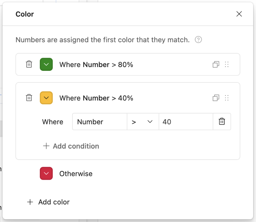
To delete color conditions, click the trash can icon next to the color you would like to remove.
Underlying record details
In the User actions section of a dashboard visualization there is the option to allow end users to "Click to see underlying data" from the interface page. This option is per-visualization, meaning you as a builder have the granularity to toggle this on for individual dashboard insights. The option to turn this feature on can also be enabled by double-clicking on a visualization on the canvas.
The drill-down will only show the underlying records associated with the visualization and builders can configure:
Visible fields
Default sort
Record details for the records shown
Record details for foreign fields (This is available by clicking on the specific field header)
The option to allow end users to print
Element-based dashboard layouts
While we recommend that you use the dashboard layout as highlighted above in the vast majority of use cases, you can also create an interface by utilizing a blank layout and adding elements to it.
Blank layout dashboard elements
Note
With any interface layout, we try our best to create a layout that will work well with the table you are connecting. Depending upon the design of the table you are connecting to an interface layout, different interface elements may or may not be available.
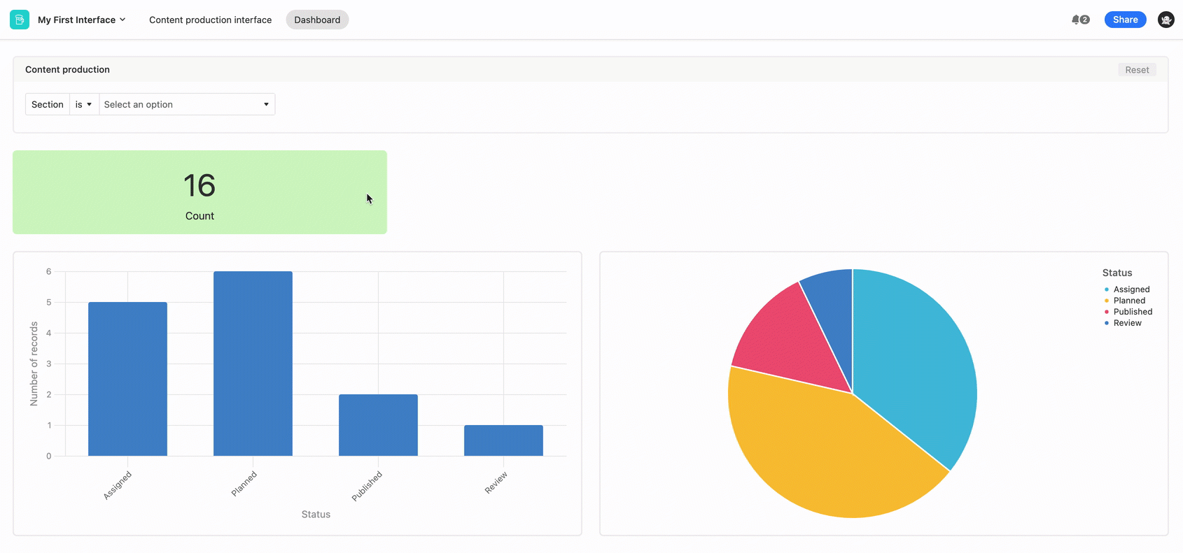
Filter element - The filter element is the star of the dashboard layout. Filter elements provide your interface users with dynamic filters that they can use to filter other dashboard elements. You can connect some or all of your dashboard elements to filter elements. Because filter elements are dynamic filters and not static filters, the choices each person makes in a filter element will not affect other people using the interface at the same time or in the future. This is why they're so useful when you're building a dynamic dashboard for people to use to analyze your data. We cover the Filter element in depth in this article.
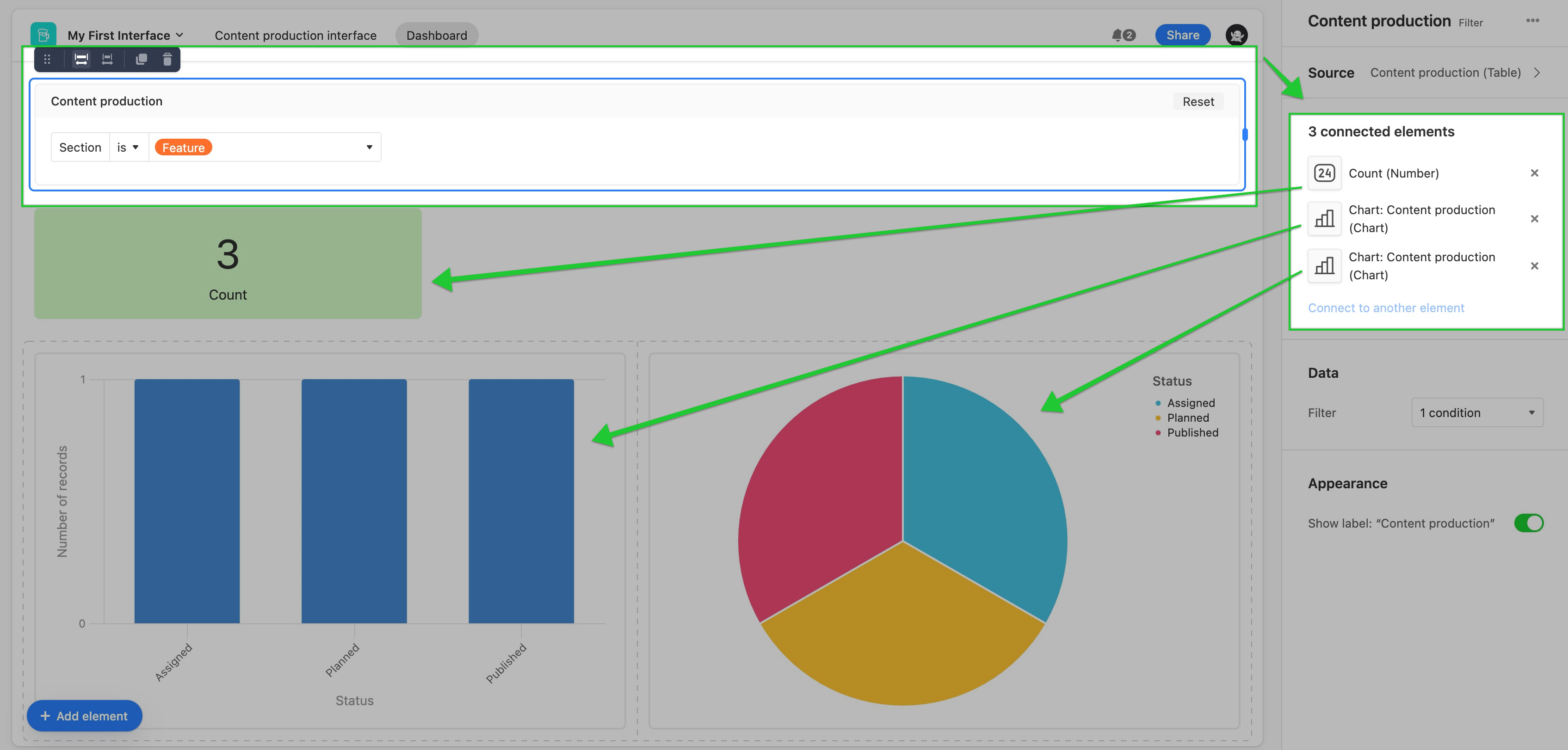
Number element - Number elements are covered more extensively here, but in general, they can display a count of records or a summary of a connected field's records such as the number of records where this field is empty, the percent filled, or the percent empty.
Chart elements - The dashboard shown above includes both bar and pie charts. There are even more chart types to choose from as described here. The nice thing about charts connected to a filter element is that they will dynamically adjust to display information according to the filter(s) a user has chosen. Learn more about the chart element here.
Element-based dashboard layout considerations
With this layout, you can let your collaborators filter data themselves, surface important numbers, and highlight metrics with charts and graphs. Click here to read how to create a product roadmap using the Dashboard Layout.
They also can be used to calculate sum totals, averages, minimums, and maximums for number and currency fields.
FAQs
When should I use a blank layout versus a dashboard layout?
Blank layouts are useful when you are designing a highly specific layout that the dashboard layout can’t fully support. But in most cases, the dashboard layout is the best option as it is the most feature-rich.
Can a dashboard group be sourced from more than one table?
No, dashboard groups can only be sourced from one table. To show insights from another table in the underlying base, add a new dashboard as outlined here.
Can I move dashboard visualizations or groups around?
Yes. In edit mode, builders can click and drag different dashboard groups around to rearrange them on the canvas. You can also click and drag visualizations around within interface groups. However, dragging a visualization from one dashboard group to another is not possible.