Plan availability | The form builder is available on all plans, but certain features are only available on paid plans. |
Permissions |
|
Platform(s) | Web/Browser, Mac app, and Windows app |
Related reading |
|
Choosing which form creation process to utilize
Airtable offers several form experiences that might be a better fit depending on your use case. Using the form builder is our recommended way to build and share forms, but consider all of the following options:
Sharing standalone forms
Form builder - A more creative and options-rich way to build standalone forms that can be shared with a variety of audiences. Over time, Airtable will continue adding sophistication. Form builder already offers enhanced functionality such as default values and warning messages that the form view does not offer.
Use cases: External-facing feedback, internal-facing feedback, complex data entry, condition-dependent forms
Form view - Airtable’s original form creation experience. Still powerful, but won’t receive the newest features that Airtable builds out in the form builder.
Use cases: External-facing feedback, internal-facing feedback, complex data entry, condition-dependent forms
Forms within an interface - Interface Editor permissions or higher needed
Interface Designer form layout page - A form that appears as an interface page only to logged-in users with edit access to that particular interface. If you want to duplicate an existing form layout page in the form builder, then learn more here.
Use cases: Internal-facing feedback, record creation from an interface
Record creation form buttons - Templated record creation forms that allow interface users with editor permissions to create new records without having to navigate the full complexity of the base on the backend. If you want to duplicate an existing record creation form button in the form builder, then learn more here.
Use case: Quick, simple record creation within an interface workflow
Creating forms using the form builder
To create forms using the form builder:
Open your Airtable home screen.
Open the base where you want to create a form.
Click Forms.
A page opens, allowing you to chose between creating a new form or using a form template.
Click + New form or View templates.
If an interface or form has previously been configured, click the + button at the top of the forms sidebar.
A configuration window opens, asking you to select an existing table — or create a new table — to store your form submissions.
Click Create form.
Click Publish after configuring your form.
After publishing, the live version of the form opens, where you can configure share settings, embed options, and copy the link if needed.
Configuring form settings
After creating a new form, you will begin the process of customizing the form to fit your needs by adjusting options on the canvas or from the properties panel on the right side of the screen.
Canvas settings
Form cover image (Paid plans only)
Adding a cover image to forms requires a Team, Business, or Enterprise Scale plan. If you're currently on a Free plan, upgrading to a paid plan will give you access to this feature.
To add a cover image, click Add a cover image on the form’s canvas. Then, drop a file or click browse files. Next, click Upload 1 file. Your cover image will appear after uploading has been completed.
To remove an existing cover image, click the X button in the top left corner of the canvas.
Only 1 file can be uploaded.
As a general guideline, 1800px (Width) by 512px (Height) is suggested size for the image you are uploading.
This differs from the area the form cover image will render as is 256px tall and the width is the width of the browser window that the end user is accessing the form from.
Form logo (Paid plans only)
Adding a logo to forms requires a Team, Business, or Enterprise Scale plan. If you're currently on a Free plan, upgrading to a paid plan will give you access to this feature.
To add a logo, click Add a logo on the form’s canvas. Then, drop a file or click browse files. Next, click Upload 1 file. Your logo will appear after uploading has been completed.
To remove an existing logo, click the X button in the top left corner of the canvas.
Only 1 file can be uploaded.
Logos will be limited to max dimensions of 200px by 64px. Image files that exceed these dimensions will be resized to fit but not cropped.
Form title
A form’s title will always appear as an H1 heading near the top of the form, just below the cover image and logo (if applicable).
Note that a form’s title can be different from a form’s name. Form titles are viewer facing (visible for all form viewers), while form names are internal facing for organization purposes.
To change the form’s title, double-click on the title and modify it to fit your needs.
Form descriptions
Just below the form’s title, you’ll see a text box where you can add or modify an existing form description.
Form descriptions support the following formatting options:
Text formatting (Paragraph, Quote, Code block, Large heading, Medium heading, Small heading, Numbered list, Bulleted list, and Checklist)
Bold ( ⌘ B)
Italics ( ⌘ I)
Strikethrough
Code
URL/Hyperlink ( ⌘ K)
Add, configure, reorder, resize, or remove fields in the form
On the canvas, you are able to:
Add fields to the form
After clicking on the canvas, hover in between fields. Click on the blue + icon where you want to add the field.
This will open up the option to add an existing field (also searchable by name) or add a new field to the backend base and form by clicking the + Create field option. Choose an existing field or configure a new field and continue building your form.
Computed field types are not supported in Airtable forms.
Reorder fields
Click and hold the field that you would like to move around on the canvas. Then drop that field where you see fit.
Dragging a field above or below will place that field above or below the closest field(s).
Dragging a field on top of another field will place the fields next to one another. Up to 4 fields can be placed side by side but this maximum can vary depending on field type and space constraints.
Dragging a field over a line break will cause the + Add group button to appear. Drop the field to create a new group as discussed in the next accordion section.
Resize fields
Click on the right edge of a field to resize its width on the canvas.
Any preceding or subsequent fields in the same group can be resized to match the width of the first field in a row.
At times auto-formatting is applied when reordering fields when multiple fields exist side-by-side.
Remove fields from the form
Click on the specific field that you would like to remove from the form.
Click the … icon on the far right side of the field.
Click the Remove option.
*Note that removing fields will not delete them in the underlying base
Configuring form fields - By clicking on a field within the form builder’s canvas you will see the properties panel on the right adjust to that field’s settings. We cover configuration options available in the properties panel in the next section.
Form groups
Form groups allow you to group one or more fields together. These groups provide a clear delineation of questions/data entry for end users.
To create a new form group:
Hover just below a form’s description or below the last field on the form-building canvas.
Then, click + Add group.
A New Group will appear. Click on the New group text box. Feel free to rename the group at this time.
This will open up configuration options in the properties panel on the right. This is discussed in more depth in the next section below.
To delete a form group from the canvas:
Click on the group’s name.
Hit delete twice to remove the form group.
Properties panel settings
General form properties
After creating a new form, clicking on the edge of a form’s canvas, or clicking on the Form button at the top of the properties panel on the right side of the screen you’ll find these general properties to configure:
Title - Rename the title of the form
Data
Source - Find the source table from the underlying base
Fields - See how many fields are visible in the form. Click the cogwheel icon to bring up a menu where you can Find a field, see form groups, and Edit, Delete, or Hide fields in the “Group” and “Hidden” sections.
Appearance (Paid plans only)
Show or hide Airtable branding
Settings
Toggle on the option to “See who submitted a response” to require that the form submitter logs into Airtable to track submissions in a created by field.
If a created by field doesn’t already exist in the source table, then a new user field will be created in the source table when this option is toggled on.
Toggle off the “Accepting submissions” option to close the form and prevent people from submitting a response.
Submission options
Button label - Choose the text that will appear on the submission button. The default label is “Submit.”
Redirect to URL - Toggle this option on to redirect the form submitter to another URL.
This URL can be a static http or https link. Other abbreviated URLs are not supported.
Post-submission URL redirects aren't available when a form is embedded.
You could even have the form dynamically redirect the user to the record created from the form submission inside the Airtable base. To accomplish this, copy the unique base URL (
https://airtable.com/appxxxxxxxxxx/) from your browser’s search bar and insert{record_id}at the end of the base’s URL like so:https://airtable.com/appxxxxxxxxxx/{record_id}/. Note that the form submitter would need at least read-only base access to be able to access this page.
Message - Type a custom message that will appear after a form response is submitted.
Show a ‘Submit another response’ button - After a form response is submitted, the page will load and show the option to “Submit another response.”
Email responses - This option allows builders to choose base collaborators who will receive an email notification each time a form has been submitted. Builders can choose whether to Select all base collaborators, choose individual base collaborators by clicking the toggle next to their name, or click Clear all to remove all base collaborators from notifications. Take note that any changes to the email responses setting will only occur once the interface has been published or re-published.
User actions
Toggle on the “Allow printing” option to allow end users to print or save a PDF of the form (filled or unfilled).
End users will need to click the … icon in the upper left portion of the screen and then click Print this page to print or save the form as a PDF.
Field properties
Clicking on a field on the form builder’s canvas will open different properties in a panel on the right side of the screen. Certain options listed below will only be available depending on the type of field you click on.
Title - Change the title of the field in the form. It’s important to note that changing the field’s title in the form will not change the name of the field in the source table.
Data
Source - Click Edit field to bring up a menu of field editing options. Note that changing a field type here will change the field’s type in the source table as well.
Appearance
Layout
Dropdown or List - Specific to single and multiple select fields.
Card or pills - Specific to linked record fields
Size - This option modifies font size in the resulting form.
Helper text - Type additional context that relates to the specific form field you are configuring.
Rules
Visibility - Add conditions or conditional groups that will hide the form field from an end user’s view unless the submitter’s entry causes those conditions to be met. Take a deeper dive into these settings below.
Selection - This option is only available on linked record fields. This allows you to control the Specific records that form submitters will be able to choose from.
Options - This option is only available on single select or multiple select fields. Choose the specific option(s) you will allow form submitters to be able to choose from.
Collaborators - This option is only available on user fields. Toggle the specific users you want the form submitters to be able to choose from. Additionally, you can Clear all or Select all users.
Default value - In most fields, you can insert a default value that the form submitter will have to manually adjust, otherwise the default value that is set here will return that value with each form submission. This can be especially useful when hiding the field from submitters such as a hidden status field. The formatting of the default value that you enter will depend on the field type. You can also prefill forms much in the same way that form views can be prefilled.
“Allow users to edit this field” - When a default value is configured, builders can also choose whether to disable or enable edits by toggling this option.
Required field - Toggle whether the field must be filled or selected before the form submission can be entered.
Certain fields also allow for data validation to be configured. This is covered in another section of the article below.
Form group properties
Clicking on a form group’s title will open the following properties in a panel on the right side of the screen:
Title - Adjust the title of the group. This can also be accomplished by clicking on the name in the canvas.
Data
Fields - See how many fields are visible in form group. Click on the cogwheel icon to Find a field. By hovering over a field and clicking the … icon, you can also Edit a field or Delete a field from the form. The eye icon allows you to toggle off the visibility of fields in any form groups or toggle on any fields that are hidden.
Appearance
Show group title - Optionally toggle off the group’s title. Only field names will be displayed.
Show description - Insert helpful text to guide form submitters.
Show background color - Give the form a slight gray background color to help visually separate the group from other groups or fields.
Field labels - Choose whether field labels (titles) will appear on the Side or on Top of the fields in the group. The “Side” option is not available when two or more fields are next to each other.
Organizing forms with sections
You can create sections in the Forms tab to group and organize related forms. To create a section:
Click Forms.
Click Add section.
Name your section (e.g., "Customer Feedback" or "Internal Requests")
Now you can organize forms into sections and manage multiple sections:
Drag and drop forms to add them or remove them from a section, or place them into a different section.
Reorder sections by dragging them up or down.
Collapse/expand sections to focus on specific groups of forms.
Rename sections by clicking on the section name, typing the new name, and clicking Enter / Return.
Adjusting previously configured forms
To adjust previously configured forms:
Open your Airtable home screen.
Open the base with the form you want to update.
Click Forms.
Use the “Find a form” search bar to search for a form by name or browse and click on the form that you want to edit.
Follow the instructions throughout the rest of this support article to make updates and don’t forget to click Publish form once you are done so that your changes are reflected for form submitters to see.
Configuring a form’s share settings
After publishing a form for the first time or after clicking on the Share form button from within the form builder you’ll have several share options to choose from:
Anyone on the web - Anyone on the web will be able to fill out the form, even people who have not had the link shared with them directly, so use this setting with caution.
If the option to “See who submitted a response” has been toggled on, then end users who access the form must log into Airtable in order to create a form submission.
Anyone at {Your organization} - Available on Business and Enterprise Scale plans only.
Once this has been toggled on, you’ll see the “Approved email domains” that have been enabled from within your organization’s admin panel.
Anyone at a domain - Available on paid plans only. Specify a single domain that is allowed to access the form and submit responses. After clicking this option, type in a domain such as “airtable.com” and click the Set email domain button.
This will require end users to sign into Airtable before accessing the form
If the email domain of the signed-in user does not match, then the following message will appear: “The private share link you tried to reach is not available. The owner of this base may have unshared or deleted it. Please contact them if you need access.”
Only users with base access - When this option is chosen, the form will only be accessible to other base or workspace collaborators.
Interface-only collaborators will not be able to access the form. If you are looking for interface-only collaborators to access a form, then we recommend using the Interface Designer form layout.
Require a password - This option only shows up for publicly available forms. For an extra layer of security, toggle this option on (or click Change password), enter a password, and click Save.
Upgrading existing form views
Note
If you choose to use the Upgrade form option to convert a form view to a standalone form, you will need to update any automations that use that original form in an automation trigger. Airtable treats the "upgraded" form as a new form, and automations with When a Form Is Submitted triggers will not be automatically updated to use the new form to trigger the automation. The form submission trigger can be changed by selecting the new standalone form in the “Select a Form” dropdown and updating the automation configuration by clicking the Update button. Note that the form must first be published in order to be able to select the form from the dropdown menu.
Only base owners/creators can upgrade a form view.
In addition to the note above, any prefilled form formulas will also need to be updated to the URL of the new form you are converting to.
To upgrade an existing form view to the form builder experience:
Navigate to the base and specific form view that you want to upgrade.
Near the top right portion of the screen, click the Upgrade to new forms button.
Note that if your form view is currently locked, you will need to unlock it in order to see the button appear. To unlock the form view, click the lock icon/dropdown button next to the “Share form” button. Hover over the “Locked view” section and click the Collaborative view option. Finally, click Unlock.
You can now begin modifying the form as described in the article above.
Duplicating to form builder
Duplicating an interface form layout page in the form builder:
Open the interface editor where you want to duplicate the form.
From the Pages tab on the left side of the screen, find the form layout page you want to duplicate and hover your mouse over it.
Click the … icon to reveal a menu of options.
Finally, click Duplicate to form builder. This will create a new, duplicate form in the “Forms” section on the left. You can now modify and publish the form as outlined in the article above.
Duplicating an interface record creation form button in the form builder:
Open the interface editor where you want to duplicate the form.
From the Pages tab on the left side of the screen, find the layout page containing a record creation form/button that you want to duplicate.
Click the Add record button. Not that this button can have a custom label, so your button may appear differently. However, the button will be in the upper right corner of the canvas.
From the properties panel on the right, find the “Data” section and the “Form” option.
Next, click the dropdown to open the menu.
Finally, click Duplicate to form builder. This will create a new, duplicate form in the “Forms” section on the left. You can now modify and publish the form as outlined in the article above.
Setting conditional form field visibility
In a form field’s visibility rules, you can click the cogwheel icon to add condition(s) and/or conditional group(s). Changing these rules will vary by use case, but one example would be setting rules to only show the first form field, then the second, the third, and so on. A few important callouts:
Conditional fields in forms are available on all plan types
Conditional groups in forms are only available on Business and Enterprise Scale plans
This functionality is not supported on iOS or Android interface experiences
We don’t recommend using this for sensitive fields. Although visually hidden, underlying record/field values may still be exposed. Visibility should not be equated with security in this case.
You can also set conditions to conditionally show form groups if there are several fields that you want to bundle together.
Example: Setting successive field visibility in a form:
Click the first/top field on the form building canvas.
Under Rules and next to “Visibility” ensure that “Always show field” is showing.
Click on the next field on the form. This time click the cogwheel icon next to “Visibility.”
This will open up a conditional menu. Click + Add a condition.
Next to “Where” click the name of the previous field if it isn’t already selected. Then choose the is not empty option from the dropdown to the right. You’ll see a strikethrough eye icon appear on the canvas on the field you are editing indicating that the field is hidden from form submitters.
Click on the next field on the form. Again, click the cogwheel icon next to “Visibility.” Follow the same process outlined in step 5, but this time select the field that you just hid from form submitters. This will result in cascading visibility. Continue to repeat step 6 as much as necessary to capture every form field.
At any point in your form-building process, you can toggle on a Preview from the upper left side of the screen. Once you are happy with the result, don’t forget to click Publish form to update the live form.
Configuring data validation
Form builders can configure various settings under the “Rules” section of a field’s settings in the form. The data validation settings covered below will ensure valid entry by form submitters. Certain settings allow for more specific customization. It’s important to note:
These data type validation rules will only apply to non-empty fields. If form builders want to require that a field is filled, then they should also mark the field as a required field.
If any fields error out for form submitters, then they will be unable to submit the entry until the error is resolved. Our error messaging provides general information about the error, but form builders might consider using the “Helper text” option to give submitters more specific instructions.
Data validation settings are only available on paid Airtable plans.
Email validation
To enable email validation, click the toggle next to Validate email under the “Rules” section of a valid field type.
If a form submitter hasn’t entered an email address in a valid format (e.g. [email protected], [email protected], [email protected]) they will see the following error:
Please enter a valid email addressConsider enabling the See who submitted a response option for the form to ensure proper format and provide an understanding of which user submitted the form response. (An Airtable account login is required to submit the form)
Character count limits
To enable character count limits, click the toggle next to Character limit under the “Rules” section of a single line or long text field type. Then, enter a value next to one or both of the Minimum and/or Maximum fields that appear.
If the minimum character count is unmet, then the following error will appear:
Your input must be at least ## characters longIf the maximum character count is exceeded, then the following error will appear:
Your input must not exceed ## characters
Number range limits
To enable email validation, click the toggle next to Range limit under the “Rules” section of a valid field type. Then, enter a value next to one or both of the Minimum and/or Maximum fields that appear.
Valid field types include: Number, Currency, Percent, and Duration field types
Attachment file type restriction/validation
To enable file type restriction/validation, click the cogwheel next to Allowed types under the “Rules” section of an attachment field type. A few notes:
By default all supported attachment field file types will be allowed
For a list of supported file types, please consult this documentation
You’ll need to specify allowed MIME types. You can find MIME types for most file formats here.
URL validation
To enable URL format validation, click the toggle next to Validate URL under the “Rules” section of a URL field type.
Embedding forms
Note
Post-submission URL redirects aren't available when a form is embedded.
You can embed a standalone form in an external location to collect responses from your required audience.
The viewer of the form will only see field information displayed within the form and is not permitted to make any configuration, beyond filling in information as required.
All settings applied to the form’s properties will apply.
If you change cell values, add records or fields, or update which fields and records are visible in the form, the embed will automatically update in real-time to show the most updated version.
To embed a form layout:
Open your preferred interface form and click Share form at the top right and select Embed.

This will take you to the embed settings page which is covered in this article.
FAQs
Are there any general limits to be aware of when building standalone forms?
Yes. A maximum of 50 forms can be created per base/app.
Who can create a form?
Only users with creator permissions can create and publish forms in the form builder.
I thought there were already form options in Interface Designer, what is special about this option?
Though forms are built inside the Interface Designer UI, forms built and published this way are full-page forms that can be shared with any audience, outside of your interface. Use interface form page layouts or record creation templates to collect data specifically from interface collaborators.
Can form submitters clear the form to restart a form entry?
Yes, form submitters will find a Clear form option next to the “Submit” button at the bottom of a form. When they click this option, they will be asked to Confirm that they want to clear the form before any data is cleared.
Is there a way to send custom email form confirmations?
Yes. You’ll use the Airtable Automations feature to accomplish this type of workflow.
In this example, we'll use this event planning template as a real-life example to demonstrate this functionality.
Add a form - To start, you'll need to create an Airtable form as outlined in the building and sharing forms article above.
Add an automation - If you’ve never created an automation before, consult this article.
Configure a trigger - The next step is to set up an automation trigger to look for new records added to the Attendees table.
Using the " When form submitted trigger" automation will trigger (run) every time the form we select is submitted.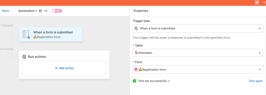
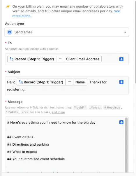
In our example, this automation will trigger after someone fills out the event registration form.Set up an automation action - To send the confirmation email we'll use the Send an email action which is covered in more detail in this article. To set up the "Send an email" action click the blue "+ Add Action" button. Then, click on the "Send an email" option. This will bring up a box with configuration options to add recipients, a subject line, and the message body. For the To field, we'll select the email field used to collect registrant email addresses.
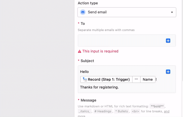
You can then configure the other available fields. By clicking on the "Show more options" drop-down arrow, you will have the ability to customize four additional parts of the automatic email you send out, which includes "CC", "BCC", "From name", and "Reply to". It's a good idea to BCC your own email address. You can remove your email address after the automation is confirmed to be sending the email correctly.
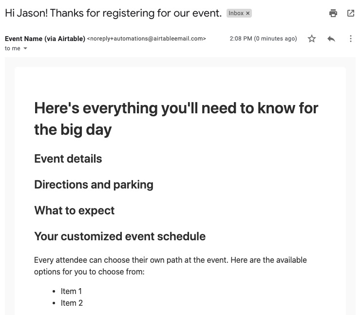
Our native Send email action may not be the best choice in every situation. Consider also testing out functionality with our Gmail: Send Email and Outlook: Send Email actions.Test and review the confirmation email - After your message looks the way you want it to you must test to ensure the automation is working properly. If the test runs successfully, then at this point it's a good idea to check that the test email was also sent successfully and looks the way you want it to. If so, you can now turn on the automation. Every time someone registers for an event they'll receive the confirmation email you created!
Is it possible to receive native form submission notifications?
Yes. The submissions section has an “Email responses” option that allows builders to choose base collaborators who will receive an email notification each time a form has been submitted. Builders can choose whether to Select all base collaborators, choose individual base collaborators by clicking the toggle next to their name, or click Clear all to remove all base collaborators from notifications. Take note that any changes to the email responses setting will only occur once the interface has been published or re-published.
I’m receiving an error stating "Refresh page to submit form - This form has been updated..." – what should I do to resolve this?
There are a couple of reasons why you could be experiencing this error when attempting to submit a form.
If the form is configured to only allow access to “Users with base access,” then any collaborator with read-only or commenter permissions won't be able to submit the form response. In this case, we'd recommend using another form share setting when collecting responses.
Another reason this error may occur is when fields used on the form are conditionally visible, but the conditional form field contains an invalid condition due to an underlying field change or deletion.
To confirm if this is happening, please navigate to the form in your interface editor, open the conditions for all of your conditional fields, and look for an “invalid condition” error. Here's a GIF showing an example of what this may look like:

If you find one of these, you will need to fix or delete the condition and then (re)publish the form. Please note that this may be happening on multiple fields, so you'll want to check all conditional fields.
Interface-only users are encountering a “Lost connection to the server” error, how can I resolve this issue?
The “Lost connection to the server” error happens when interface-only users attempt to access the standalone form, but the URL they are using is missing '/form' at the end:

The URL should be formatted in the following manner: https://airtable.com/appXXXXX/pagXXXXX/form
Once you add /form to the end of the URL, your interface-only users should no longer experience this error. When sharing a link to the form or building prefilled form links in the future, the full share URL can be copied by going to Share form > Copy Link:

Where do I view data (form responses) that has been submitted via a standalone form?
The table that was selected when creating the form will hold the data submitted via form responses. Keep in mind that:
The underlying table in the base may contain views that filter certain data out based on conditions.
An interface may or may not be set up to include pages that display data submitted through forms.
You might not have the appropriate permissions to view data in a base or on specific interfaces.
My form shows that a field has been deleted, how do I rectify the issue so that new submissions can be made?
When a form containing a field that has been deleted in the underlying base, a warning message will appear:
“The form cannot be submitted because some of the fields have been deleted".”
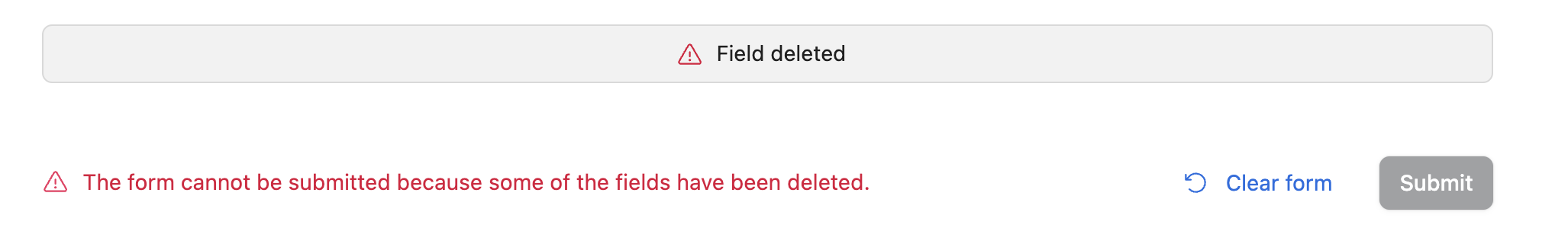
To rectify this situation, you can do one of two things:
Remove the field from the form and republish the form.
Restore the field that was deleted from the base trash. Once restored, as long as no other changes to the form are needed, there’s no need to republish the form.
Why aren't collaborators who are added to a form's user field notified when the "Notify user when added" setting is enabled?
Collaborators added to user fields are not automatically notified when a record is created through a form submission. Notifications are triggered by direct actions within the base, interface, or through specific automation setups.
Although there isn't a form setting to enable collaborator notifications, you can set up an automation to send notifications when a record is created via a form.
Can I change my duplicated base’s data source?
No. Updating a duplicated form’s data sync table is not an option. As a workaround, create a new form and select the table you want as the source during setup. You can then manually adjust the fields and settings to match your previous form. If you duplicated the form for layout reasons, this process should be pretty quick since you can reference your old form as you rebuild.
Can one form submission create a parent record and several line items at once?
No, not with a standard Airtable form view. Each time someone submits the form, Airtable adds one new record in the table that form is connected to. The form alone cannot, in a single submission, create several rows in another table (for example, one quote plus five line items).
Workflows like orders with many items, quotes with line items, or invoices with product lines usually need more than one table row per “submission.” You’ll need to design a follow-up step after the main row exists.
Common solution:
Form for the “header” row – Use the form to collect the main record (customer, dates, totals you type once, and so on).
Add line items afterward, for example by:
Entering rows in the linked line-items table (manually or with collaborators).
Using an interface with a form layout so signed-in people with access can add related records in context.
Running an automation (for example, When a form is submitted) that creates one or more linked records from the submitted data.
Using AI to extract details and context to add line items as a checklist in a long text field.
Sharing a second form (or another flow) that creates line items and links them to the parent record (often using a returned record URL or a dedicated link field).
More considerations:
For internal teams who want to create a parent record and then add several related records in one place, Interface Designer (including form layout pages) is often a better fit than a public form view alone. See Interface layout: Form for how that works.
Line-item tables are usually linked to a parent table; each line item is still its own record. To learn how linked records work in Airtable, see Understanding linked record relationships in Airtable.
Consider using record templates for repeatable workflows.
What permissions types can add to, update, or change forms?
Only Editors or Creators can update or amend forms and existing records.