Plan availability | All plan types |
Permissions | Owner / Creator - Can configure interface page layouts Please consult this support article for a breakdown of Interface Designer permissions. |
Platform(s) | Web/Browser, Mac app, and Windows app |
Overview of legacy Interface Designer functionality
Elements are the essential building blocks of the original version of Airtable Interface Designer. Elements are customizable, drag-and-droppable pieces that enable you and other collaborators to see and interact with your table’s data in real time. In this article, we’ll be covering how to add, remove, and format elements on an interface. This functionality is only available on Blank, legacy Record review, or legacy Record summary layouts interface layout types.
There are four primary purposes that elements can serve:
Visual representations of information. Elements can show a table’s data directly or aggregate a table’s data to present information in a more visual way.
Design the look and feel of an interface. You can add text and divider elements to add context and change the formatting and spacing of your interface.
Decide on which elements can be editable, allowing collaborators to update records directly through an interface. Elements can directly link to fields, allowing end users to update the underlying records from which the element is drawing its information.
Elements can be filtered to only show the most relevant information, including the ability to dynamically show information based on who is viewing the interface.
Element-based layout configuration steps
Once you’ve selected the layout that is the best fit for what you are building, you will need to connect your layout to one of your base’s tables.
Note that if you selected the Blank layout, you will skip this step because you’ll be adding your own elements.
Using the dropdown menu, you can select a table from your base to link to the layout you’ve chosen:
Interface Designer also allows you to copy over filtering conditions or sort rules straight from one of your views into your layout. Clicking the Copy from view button and choosing a view from your base will allow you to carry view configurations straight into your interface.
Once you are satisfied with your table configuration, click Next to choose the initial elements that will be included in your interface.
Note
You can also allow users to filter data themselves by later adding a Filter element to your interface.
Element based layout dependencies
If you chose the legacy Record review or Record summary layouts, the next stage of setting up your layout will allow you to select which elements, correlating to your table’s fields, to initially add to your interface.
Each of these Field elements will be automatically connected to either the Record picker or Record list elements, depending on which layout you went with.
Once you’ve chosen a layout and connected it to a table, you can add a name and description to your new individual interface for clarity and to let your collaborators know how to interact with it.
If you choose the Blank layout, you’ll skip the step of naming your new interface, but you can choose to add a name and description for your interface at any time.
Adding elements
Open the interface in Edit mode if you haven't already done so.
Click + Add element in the lower left portion of the interface editor. You can select from the available element options or search for a specific element’s name using the Search box located near the top right side of the menu.
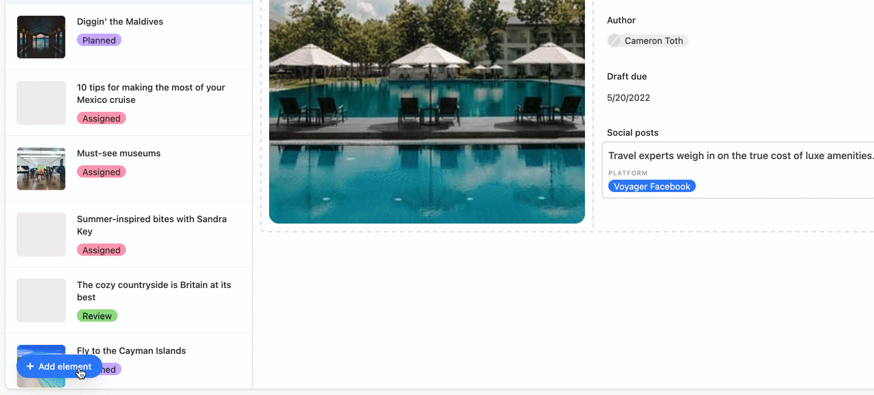
You'll then place the element somewhere in the layout of your interface page. Don't worry if it isn't in perfect positioning yet, as you can always move the element later. Notice that as you drag and drop elements, a grid comprised of dashed lines appears to help you visualize where your element will be placed and how other elements on the interface will move in response to that placement. If you are in the process of dragging and dropping a new element, you can press the Esc key to remove the new element. You can also use Ctrl+Z at any time to undo an action you took in your interface.
.gif)
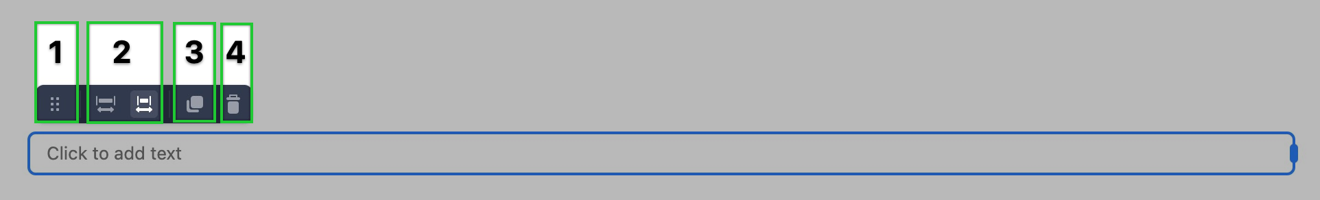
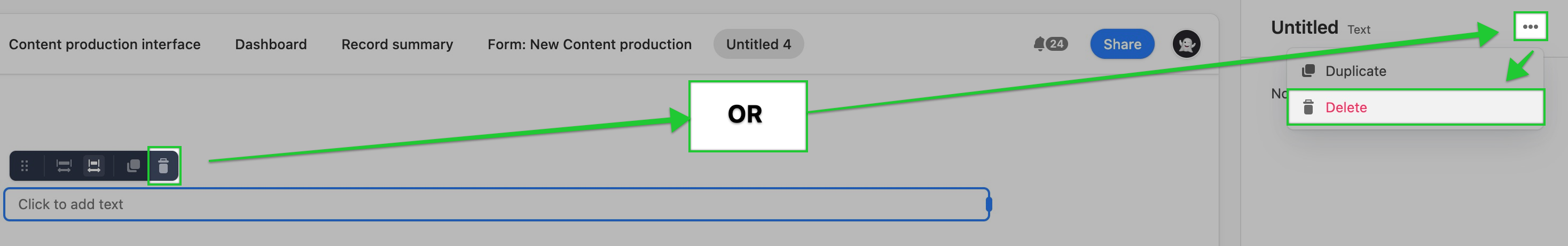
Once an element has been placed, you'll see a menu of options at the top. Hovering over the dotted rectangle on the left 1 will show the hand icon allowing you to move the element around the interface layout. You can expand or contract the element using the two icons 2 in the middle. You can also duplicate any elements 3. And finally, you can delete elements by clicking the trash icon 4.
Elements deep dive
Summary of elements to choose from
You can learn more about each element below. For more complex elements, we offer more in-depth articles about each element in their own individual support article.
Button element - Button elements allow you to configure a button that will perform a certain action when clicked. For instance, you can have the button run an automation, navigate to an external URL, update a record with specific information, and more.
Calendar element - This element is similar to a calendar view in a base.
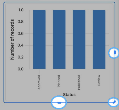
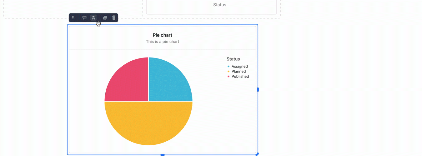
Chart element - Chart elements are similar to the Chart extension. You can configure bar, line, pie graphs, and more using this element.
Divider element - Divider elements are horizontal lines meant to help break up different sections of the interface you are designing.
Field element- Certain elements like the Record list or Record picker elements allow you to choose specific fields to display that correspond to the record that has been chosen from the list or picker.
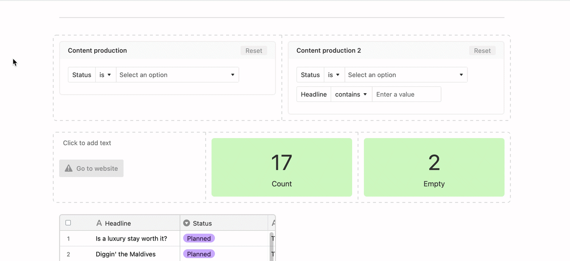
Filter element - The filter element is meant to allow users to manipulate conditions to change the output/display of connected elements on an interface page. Filter elements can have other elements connected to them. This is a very powerful feature that allows charts, grid, calendar, number elements, and more to dynamically change depending upon the filter(s) chosen.
Gallery element - This element is similar to a gallery view in a base.
Grid element - This element is similar to a grid view in a base.
Kanban element - This element is similar to a Kanban view in a base.
Number element - Number elements can display record counts or summaries derived from an underlying base's data.
Record list element - The only way to add the Record List element is by selecting the “Record review” layout when initially creating an interface.
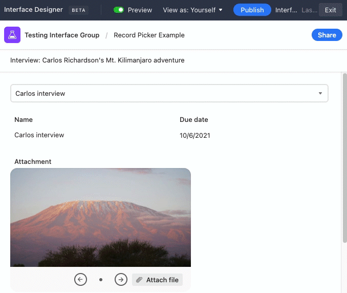
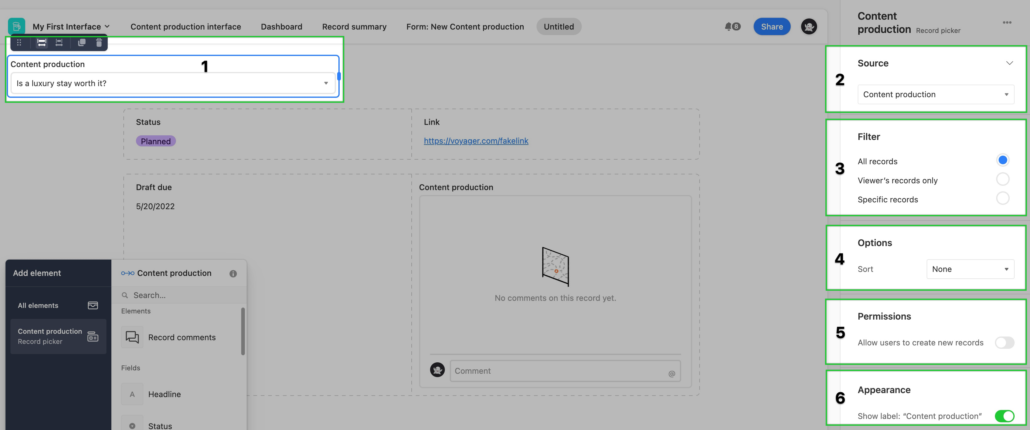
Record picker element - The record picker element allows interface collaborators to choose individual records. Depending upon the configuration, you can provide users with various levels of filters to ensure that they are only seeing the records most relevant to their work.
Text element - Text elements allow you to add helpful formatted text, links, lists, descriptions, and more to your interfaces.
Timeline element - This element is similar to a timeline view in a base.
Changing an element's source
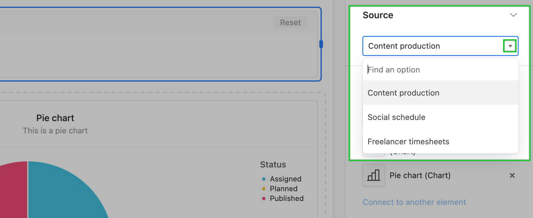
The majority of elements on an interface serve as visual representations of your base’s information. To display data, an element needs to know where to find that data. Setting the “Source” property on an element essentially lets it know where to get its information. Elements can source their information directly from a table in your base or from certain special elements. To better understand the source of an element, open the interface in Edit mode, click the element of your choosing, and open the Source dropdown in the sidebar on the right of the interface editor.
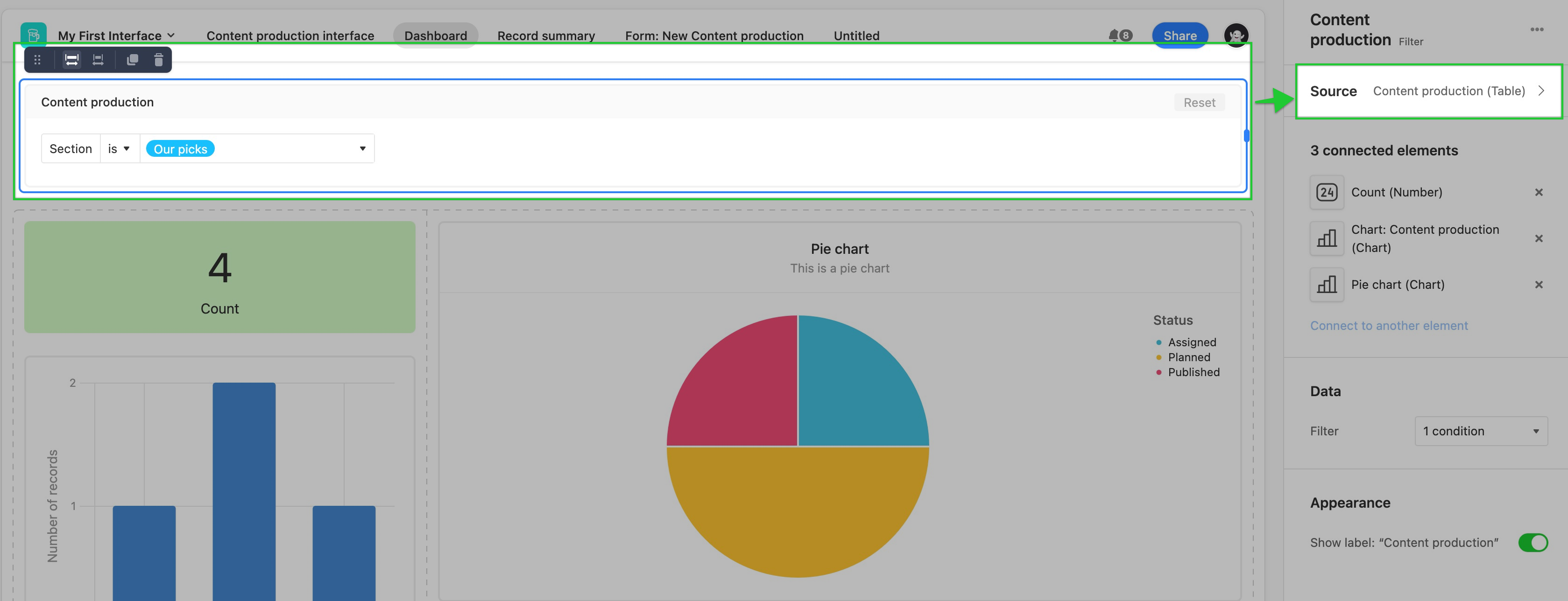
To reconfigure the current source for an element, click on the arrow to reveal a dropdown of the available sources.
Adding elements connected to other elements
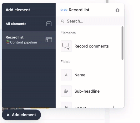
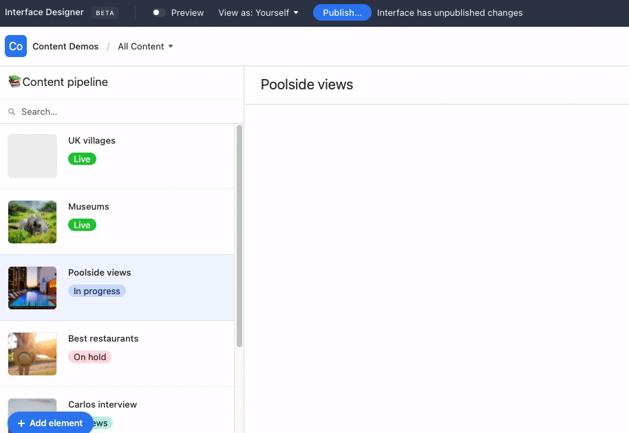
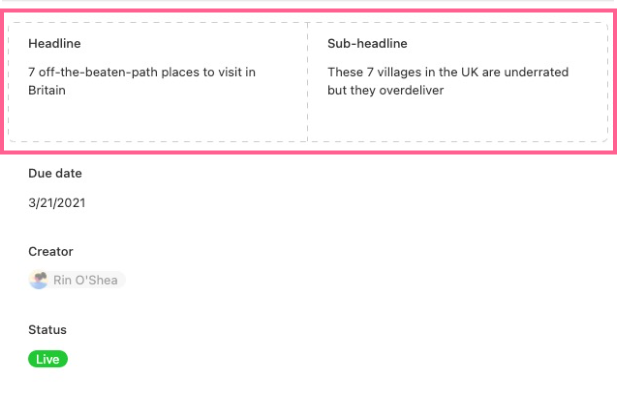
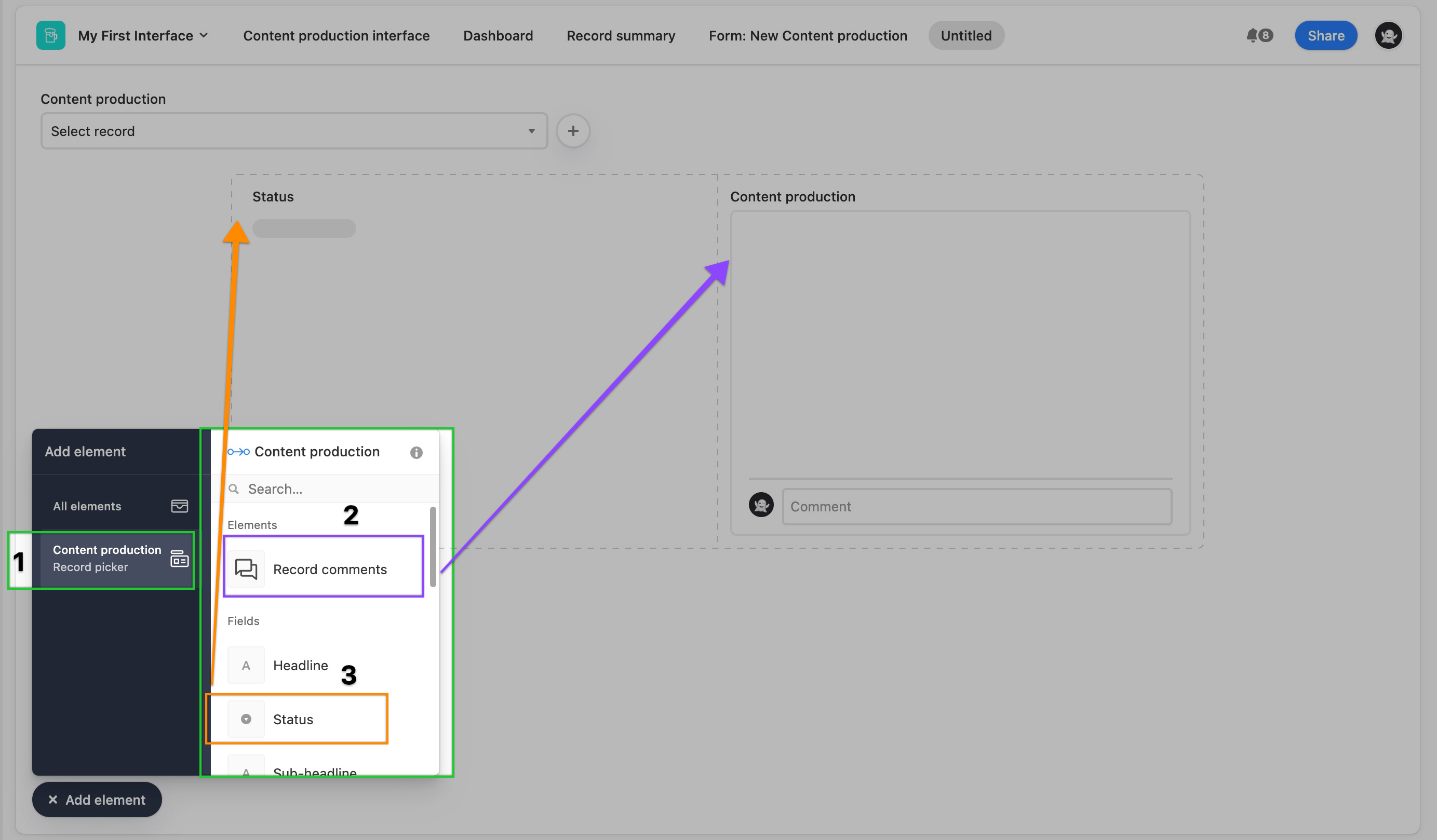
If you have either the Record picker or Record list elements on your interface, they will populate in the side menu of the “Add element” menu below “All Elements." The Record picker and Record list elements will allow you to add elements that will display specific fields directly from the linked source of that element. The Record list element will tell you its current data source, so you know where the listed fields are coming from. In the image below, the Record list element gets information from the “📚 Content pipeline” table, so all the fields are from that table.
Creating a new element with either the Record Picker or Record List element selected in the “Add Element” sidebar will create a new element directly connected to the chosen Record List or Record picker:
You can also add a Comment element to create a space for collaborators to add to comments and view all comments made on a selected record.
Duplicating an element
To duplicate an element:
In Edit mode, click the element you would like to duplicate
Then press the double square icon next to the trash icon.
Removing an element
You can remove any element in editing mode by clicking on that element, then selecting the “trash can” icon. You can also remove an element by clicking on the “Delete” button at the bottom of the Properties menu.
A few notes on deleting elements:
If you used a layout when setting up your interface, some elements might not be able to be deleted.
If you remove an element being used as the source of information for another element on an interface— the connected elements will show an error until another data source is connected.
Viewing an element’s current configuration
While in editing mode, you can click on any element on your interface to see that element’s complete configuration by checking out the list of that element’s current properties:
Each element’s type has its own properties, so make sure to check what’s available on your interface’s elements to see how you can customize them.
Moving elements
An interface’s formatting is fluid by design. Interfaces are built on flexible grids that will keep elements neat by stacking them together. The flexible grid also ensures elements on your interface are always snapped in place and aligned, with no awkward shifting needed. Stacking elements by dragging and dropping them on an interface is a core feature of Interface Designer.
You can easily drag and drop new elements anywhere on your interface, and your interface’s grid will adapt:
If you want to move an element already on your interface, clicking on that element will reveal a small dark grey box with a pull handle that you can click to drag and drop that particular element.
Resizing elements
You can adjust the width of an element on an interface in two ways:
The first way is to manually adjust the size of an element by clicking on that element to reveal its pull handles:
You can click and drag on these pull handle to adjust and resize the element until it looks good to you: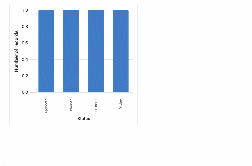
Note
You cannot adjust the height of any “Field” type elements. You can adjust the width, but all Field elements will only be as tall as needed to show the underlying record’s value for that field.
The second way to adjust the size of an element is by using one of the two buttons that pop up the top left corner of a single element, or a group of elements, when clicked. You can click on the “wide” or “narrow” buttons to quickly grow and shrink the selected element within the current grid box it is located in:
If your element is currently in a group of elements, indicated by the square made of gray dashed lines, clicking “wide” or “narrow” will widen the whole group:
If your current layout is looking right to you, you can always drag and drop your elements into a whole new arrangement!
Adding background colors to elements
Using a background color is an excellent way to add emphasis or create a visual connection for a group of elements. As we mentioned above, groups of elements are indicated by squares of grey dashed lines.
Hovering over the group of elements will reveal a dark grey menu that includes available background colors for the group of elements. Hovering over the different options in this menu, you’ll see two background colors available. The first color will always be “Grey Background,” but the second background will match the icon’s color for this interface.
Note
Notice the single grid element in the GIF above. Elements that appear alone on an interface page will not be "grouped" with other elements. Therefore, no background coloring options will appear.
To change the secondary background color of an eIement group, you'll need to adjust the color of your icon. This will cause any element groups using the colored background to update:
You can remove an existing background color at any time by hovering over a group of elements and selecting No Background.
Additional element formatting
Below, we cover a brief overview of additional formatting options for elements. Since options may vary across element types, each individual element article has more about the formatting options for that particular element.
Filtering - In Interface Designer, you can set conditions to filter out records in individual elements on your interface.
Sorting - Sorting records within an element works much the same way as it does when sorting records in a view. You can order your records in a particular order according to the values in specific fields.
Grouping - Certain elements will allow you to group your records based on one or more fields of your choosing.
Color records - In certain elements, you can also color your records by a select field or by setting conditions.
Note
Have a view configured just right and want to copy that configuration into an element? In many elements, you can do so by using the Copy from view button located under the “Data” portion of an Element’s properties.
Making elements editable for collaborators
Note
The ability to edit elements or fields in interfaces is largely dependent upon plan and permission type. Check out our permissions article for more information.
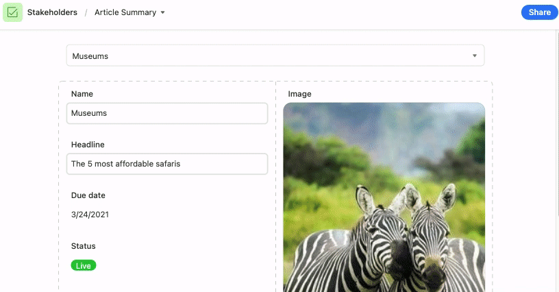
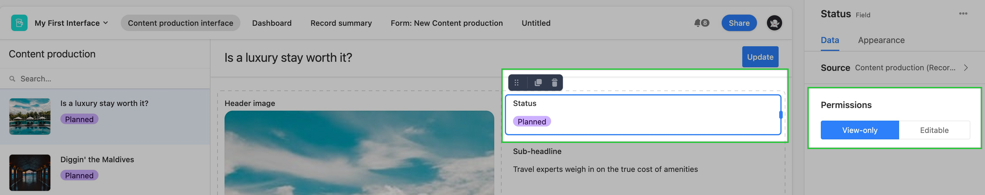
Interfaces are not just for making your data look good— collaborators can directly update a table’s records from an interface. Elements representing fields can be made editable for collaborators by clicking the Editable option under Permissions. When a field is Editable, it will allow collaborators to edit that field and the underlying record’s values directly. In the image below, making the "Status" field Editable means that certain collaborators will now be able to change that record's status right from the interface.
If you create an element representing an Attachment field (i.e., the Field element, Hero Element, and Carousel element) and make it “Editable,” collaborators will be able to comment directly on that attachment.
Adding the Comment element will show any current record comments and allow collaborators to add, edit and remove comments directly in an interface that will push to the underlying record.
Button element
Adding button elements
Find the Button element by clicking + Add element in the lower left portion of the interface editor.
You'll then place the element somewhere in the layout of your interface page. Don't worry if it isn't in perfect positioning yet, as you can always move the element later.
Next up, you'll need to configure the button's properties so that it performs and looks the way you want it to. This includes properties related to “Button actions" and "Appearance."
In order to be able to configure many of the action types for a button to perform in a blank layout, you'll need to already have a record picker element configured on the page. If you don’t, then you will see an “Unconfigured source” error and won’t be able to connect it to a source. When you have multiple record pickers on the same page, then you will be able to choose which record picker element to use as the source.
Each action type will have different settings to configure.
Calendar element
Adding calendar elements
Find the Calendar element by clicking + Add element in the lower left portion of the interface editor.
You'll then place the element somewhere in the layout of your interface page. Don't worry if it isn't in perfect positioning yet, as you can always move the element later.
Next up, you'll need to configure the calendar's properties so that it performs and looks the way you want it to.
Configuring calendar element properties:
The “Editable” setting allows users interacting with the interface to add, edit, or delete records in the view element.
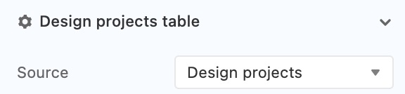
Now that you've placed the calendar element, you'll need to configure the calendar. The "Properties" box allows you to customize the Source, Data, and Appearance of the calendar. If you want to change the name of the calendar, then click the pencil icon near the top to edit that.
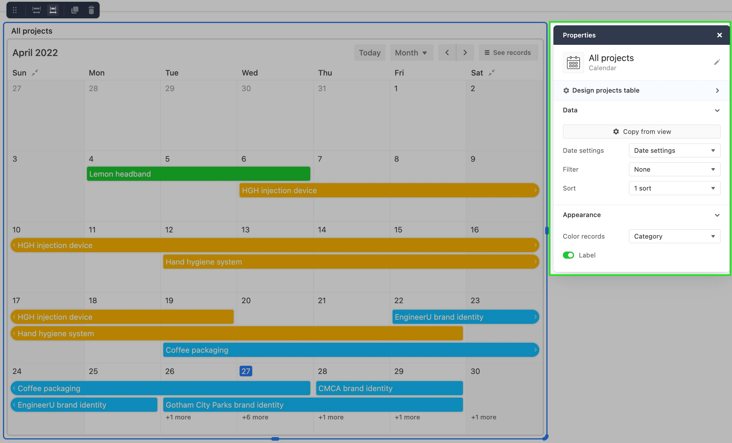
Next, you'll want to choose a source for your calendar. In this case, we will choose the "Design projects" table as the source.
Next, make data adjustments. Decide which data to show in the calendar. The "Copy from view" option will allow you to copy over settings you've already created in a view from your base.
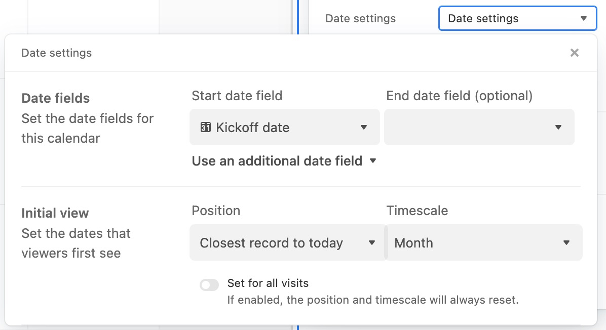
The "Date settings" section drop-down will show a menu of additional options to customize. Every calendar needs at least one date field to use in the "Start date field." However, the "End date field" is optional. You can also click the "Use an additional date field" option to add more event dates to the same calendar element.
The "Initial view" section allows you to set up the way that the calendar will initially appear to collaborators opening the interface. These options can be changed by the interface user, but it may be helpful to think of the way your team will be interacting with this calendar element. The "Position" field can be set in three ways:
Closest record to today
Today
Exact date
You can also set the "Timescale" of the calendar. Here, there are 5 settings:
Month
2 week
Week
3 day
Day
Lastly in this section, you can choose to enable the "Set for all visits" toggle which will reset the Position and Timescale to the settings you've configured each time the interface is visited or reloaded.
If there are any other filters or sorts you would like to add to the calendar, then you can add those now. You can even create a Filter element to allow collaborators interacting with this interface to set their own filters for the calendar.
Finally, you can also customize the appearance of the calendar. This includes setting an image field up to be a thumbnail for calendar events, changing the fit of those images, choosing which fields should be visible in the event's record, coloring the records by a single select field or conditions, and finally choosing whether or not to show the element's name/label.
The first option is to select an image field. The table you are sourcing information in the element from must contain an attachment field in order to use this option. The "Fit image size" toggle will allow for slight adjustments in the way the thumbnail will appear in the element. It's worth noting, that only the first image attachment that shows in the corresponding attachment field will appear in the calendar element.
Next, you can choose which fields will appear in the event's record. It's worth noting that there isn't a lot of room to show multiple fields in cases where an end date is not present or where the start and end date for an event are close to one another.
You can also color the records in the calendar. There are two options:
Color by a single select field in the source table
Conditional coloring
The last option is the "Label" toggle. This allows you to show or hide the name of the element. By default, this option is toggled off.
Calendar element options
When you or other users are interacting with a published calendar element there are five options that allow users to tweak the element:
Today - Sets the calendar to start from today's date looking into the future
Timescale - Set the scale of the calendar (Month, 2 week, Week, 3 day, Day)
Move (Forward/Backward) - Clicking these buttons allow you to move the calendar to the past or future by the value set in the timescale drop-down.
Collapse weekends - Some teams may not work through the weekends. In these cases, you can collapse Saturday/Sunday weekends.
See records- Clicking this allows you to see a list of records (With dates, Without dates, or All records) and also will show a search bar to "Find a record."
You can also click on a record (event) in the calendar to show more details and even expand the record. Collaborators may also be able to edit or delete the record from this window.
If users are able to make edits in the element and have the corresponding base permissions, they can:
Move events (Maintains current date range)
Edit start and end dates
Add new events (records)
Here's what that might look like:
Chart element
Adding chart elements
Find the Chart element by clicking + Add element in the lower left portion of the interface editor.
Once the element has been placed 1, additional formatting 2 and configuration options 3 will appear.
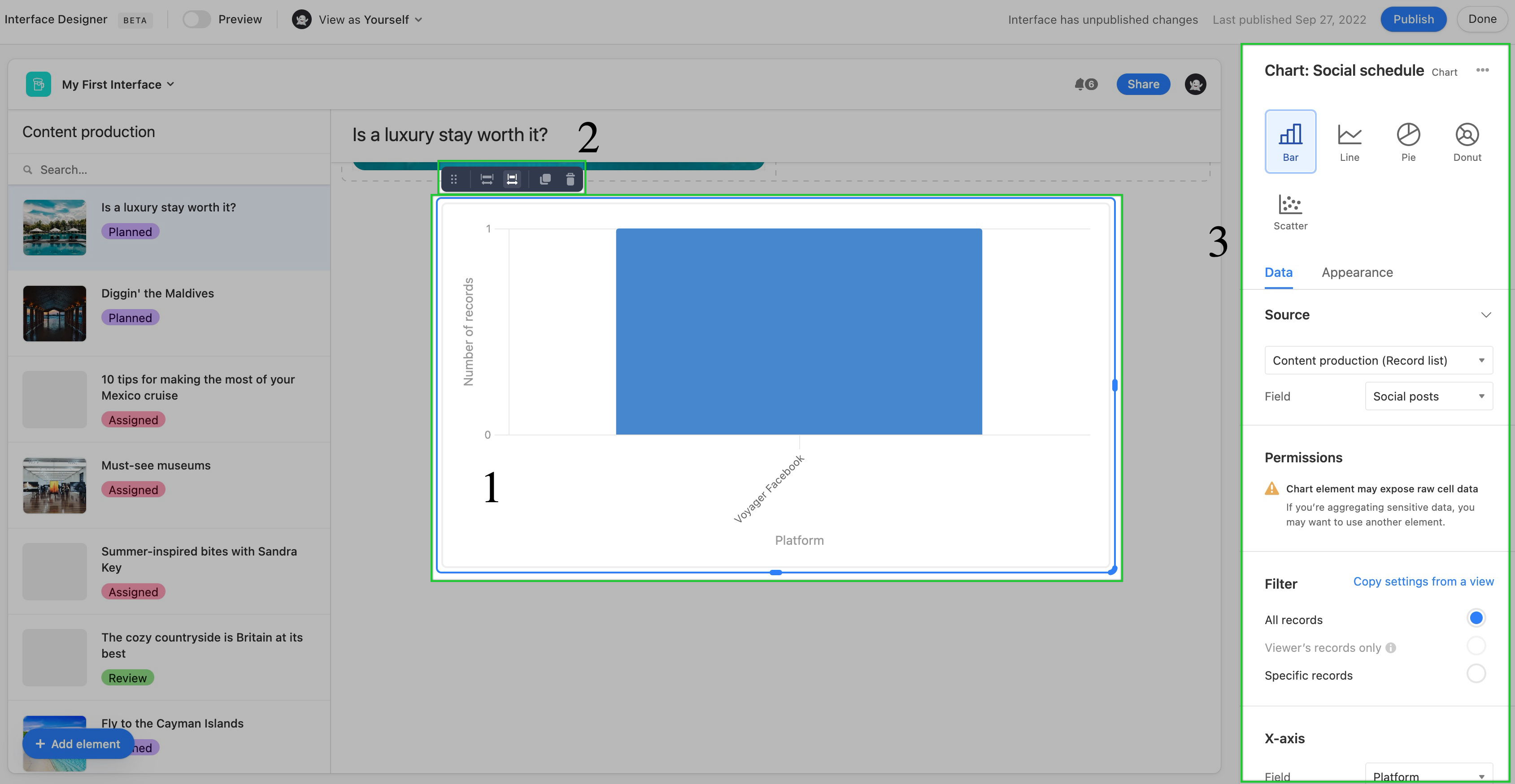
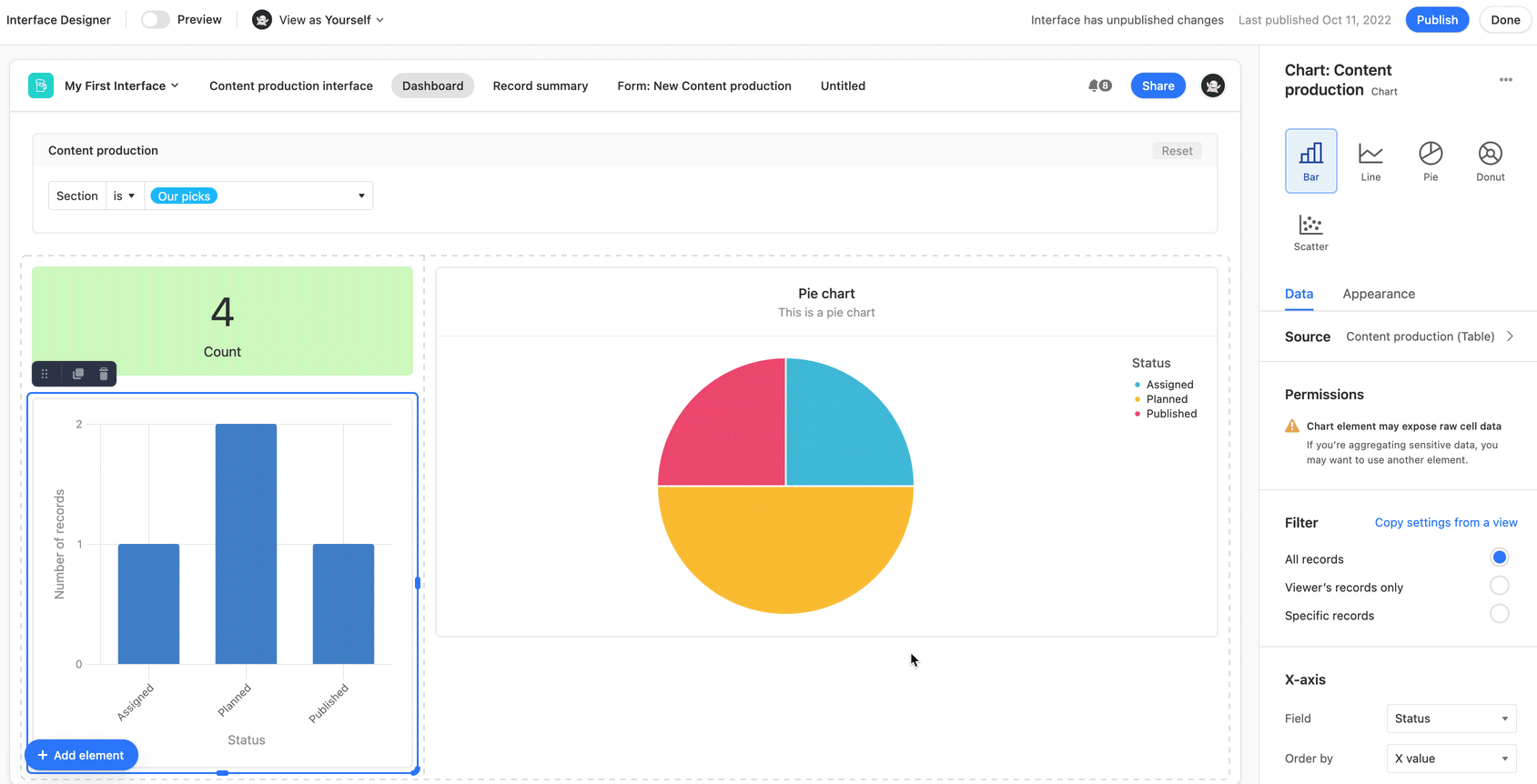
Next, you'll want to decide which type of chart. Choose between Bar, Line, Pie, Donut, and Scatter.
You'll then move on to configure the Data and Appearance sections discussed below.
Notes:
If the chart you are creating is connected to a filter element, then it's important to consider how the filters set at the chart element level may or may not interact with the filtering options available in the filter element.
You can switch the chart type to another chart type after building it out. However, keep in mind that certain charts offer more configuration options than others. So, be sure to look back through both the Data and Appearance sections of the configuration sidebar.
Chart data configuration
First up, configure the source of the chart. Typically, this will be a particular table from the underlying base.
As a reminder, chart elements can expose raw data that may be sensitive, and therefore should not be used if you have concerns with viewers being able to see that information.
Next, set up filters. Choose to copy filter settings from a view in the underlying base or from the three general filters. By default, the All records option will keep the chart unfiltered. The Viewer's records only option will only show chart data related to the interface viewer if their name (or a group they belong to) has been added to a user field in the underlying base. You can specifically set one, and only one, user field for this option. Finally, you can set Specific records by condition(s) or condition group(s) to filter the underlying data.
Depending upon the chart type you have chosen you will see Categories field and Values or x-axis and y-axis configuration options for the chart. Feel free to adjust the variations options until the chart is displaying data in the meaningful way you would like it to appear.
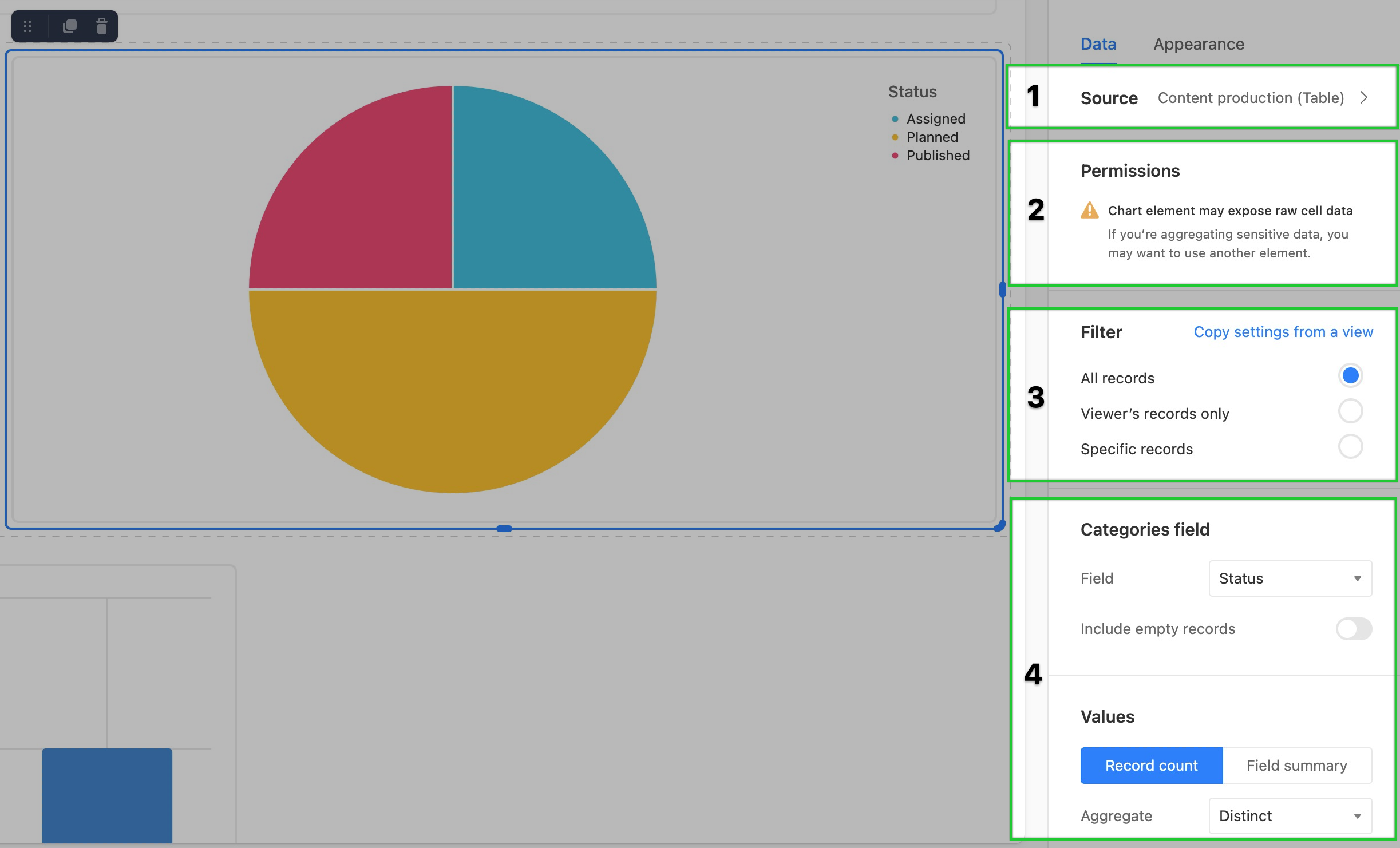
Chart appearance configuration
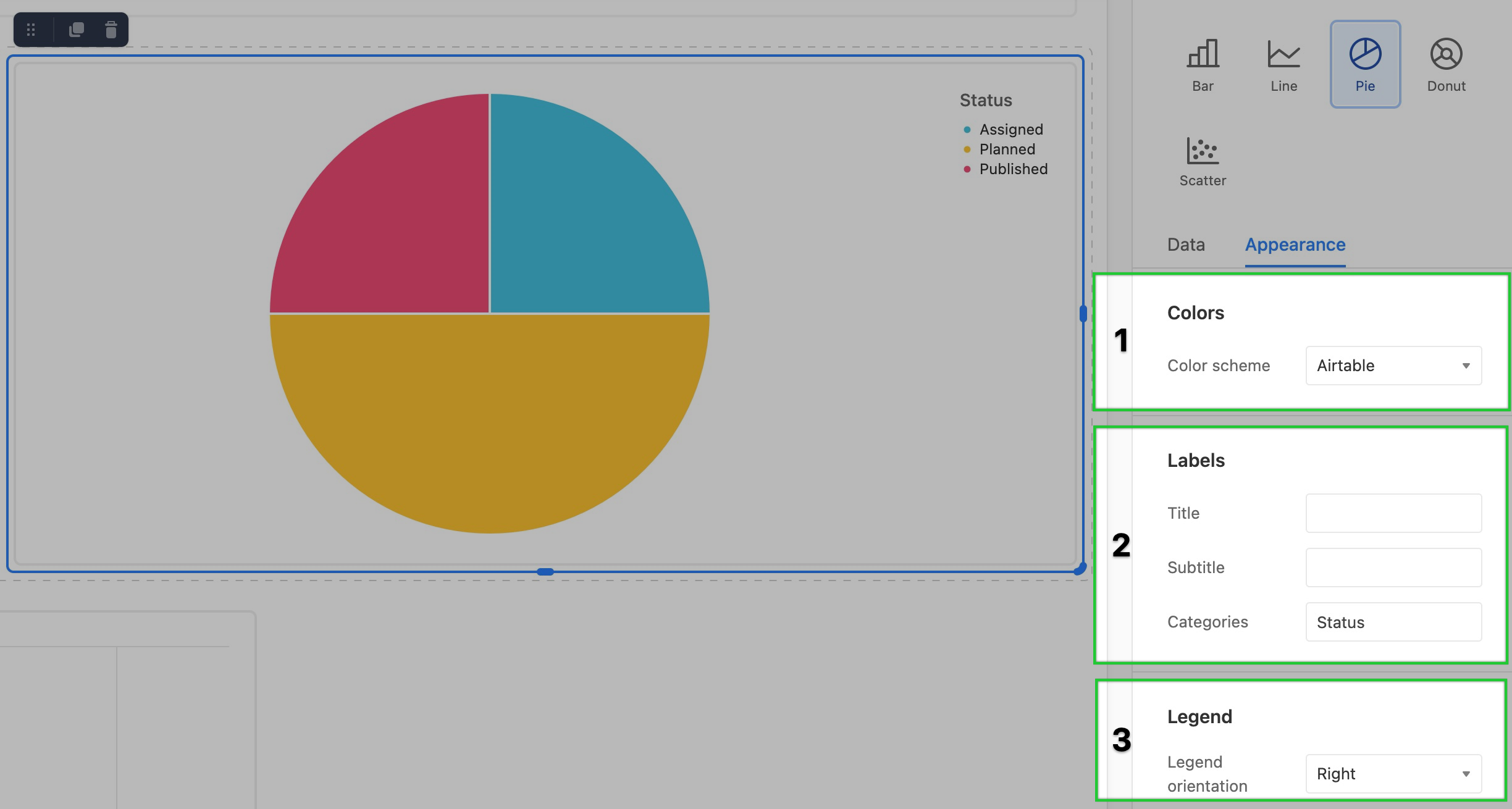
The final steps in setting up a chart element are to modify its appearance.
Colors - Here you can adjust the color scheme. There are several preconfigured color palettes to choose from or you can Use colors from the base. The latter option allows you to have the chart reflect the color schema already set in a select field from the underlying base.
Labels - Next you can add helpful text labels (Title, Subtitle, and the field/legend label) to the chart element.
Legend - Lastly, you can Hide or show a legend for the chart in the Left, Right, Top, or Bottom of the element.
Supported fields for legacy chart elements
Attachment, Button, Created by, and Last modified by fields are unsupported in the chart element.
Field type | x-axis support | y-axis support |
|---|---|---|
Autonumber | ✅ | |
Barcode | ✅ | |
Checkbox | ✅ | |
Count | ✅ | ✅ |
Created time | ✅ | |
Currency | ✅ | ✅ |
Date | ✅ | |
Duration | ✅ | |
✅ | ||
Formula | ✅ | ✅ |
Last modified | ✅ | |
Linked record | ✅ | |
Long text | ✅ | |
Lookups | ✅ | ✅ 1 |
Multiple select | ✅ | |
Number | ✅ | ✅ |
Percent | ✅ | ✅ |
Phone number | ✅ | |
Rating | ✅ | ✅ |
Rollup | ✅ | ✅ 1 |
Single line text | ✅ | |
Single select | ✅ | |
URL | ✅ | |
User | ✅ |
1 Must be looking up or rolling up a value that is formatted numerically.
Filter element
Adding filter elements
Find the Filter element by clicking + Add element in the lower left portion of the interface editor.
You'll then place the element somewhere in the layout of your interface page. Don't worry if it isn't in perfect positioning yet, as you can always move the element later.
After placing the element 1, you'll see the configuration window on the right appear. First, you'll want to choose the source where you'd like to filter information from 2. Next, you'll connect other elements on the page to this filter 3. Then, you'll want to set the filter conditions 4. Finally, you can toggle whether or not to show the filter element's label 5.
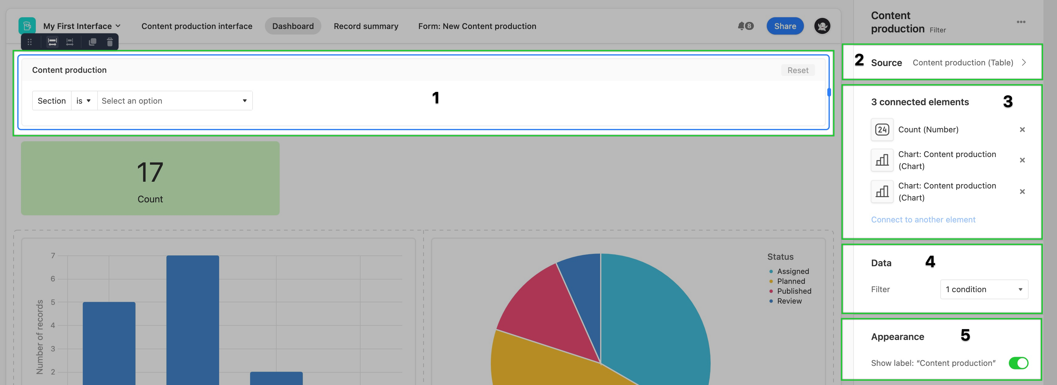
Filter element dependencies
When setting up the filter conditions, any values entered will be the default conditions set when the interface page is first opened. However, users interacting with the interface page can modify operators and options to manipulate the results further.
Keep in mind, that elements that do not match the same source as the filter source will not be filterable. In the image below, a new number element was added, but it sources the information from a different table than the filter element we set up. Therefore, it is not filterable by that filter element.

You could add a new filter element and connect it to other elements that match the same source. Remember that for interface viewers it may be hard to understand what filters are connected to which elements. Adding a text element to help explain any underlying connections is usually helpful for preventing confusion.
Gallery element
Adding gallery elements
To add and configure gallery elements:
Open your Airtable homepage.
Open the base where you want to add/configure a gallery.
Click Gallery + in the bottom left corner.
Name your gallery view and select who can edit.
Click Create new view.
After placing the gallery element on the page:
Pick a source for the gallery.
Configure the permissions.
The "Editable" setting allows users interacting with the interface to add, edit, or delete records in the view element.
Configure which fields to display in each card along with the sorting order of the gallery records .
Customize your column count: You can select between 1 and 3 columns per row to customize the gallery layout. This setting defaults to
“Auto” to automatically arrange cards to fit to the available size.Select your aspect ratio: Chose between wide, square, or tall. Defaults to “None” which uses a fixed height.
Preview your image(s): Images are now clickable to open an image viewer.
Gallery element notes
For the filter configuration, choose from the 3 general filters. By default, the All records option will keep the gallery unfiltered. The viewer's records only option onlyshow srecords related to the interface viewer if their name (or a group they belong to) has been added to a user field in the underlying base. You can specifically set 1 user field for this option. Finally, you can set specific records by condition(s) or condition group(s) to filter the underlying records.
You can also adjust your element's appearance. If the connected source has two or more attachment fields, you may need to select a different image field than the one chosen by default.
Choose whether to toggle the "Fit image size" option.
You'll also select a "Title field" (The text that appears just below each image).
The "Color Records" option allows you to color each record according to the colors from a single select field or by customized conditions.
Choose how many rows to display. You can expand the element across the page to show more gallery cards per row.
Finally, choose whether or not to display field names and/or show a label for the gallery element.
Grid element
Adding grid elements
If this is the first time you've added elements to an interface, please consult this help article first.
Find the Grid element by clicking + Add element in the lower left portion of the interface editor.
You'll then place the element somewhere in the layout of your interface page. Don't worry if it isn't in perfect positioning yet, as you can always move the element later.
Next move on to configuring the Data and Appearance of the grid.
Configuring grid elements
After placing a grid element, you'll see the configuration panel appear on the right side of the editor.
Choose a source for the grid. Usually, this is a table from the underlying base.
Set the permissions to be View-only or Editable. More on permissions here. The Editable setting allows users interacting with the interface to add, edit, or delete records in the view element.
The record details toggle lets you configure the way an expanded grid element record will appear to interface collaborators. In short, you can think of this as another interface page that is hidden from view unless a user presses the space bar to open a record. This is similar to the functionality of expanded records in a base.
Set the filters for the grid element. If you already know of a view from the underlying base that uses the same filters you would like to see used in this grid element, then choose the Copy settings from a view option. Otherwise, choose from the other three filter options. By default, the All records option will keep the grid unfiltered. The Viewer's records only option will only show records related to the interface viewer if their name (or a group they belong to) has been added to a user field in the underlying base. You can specifically set one, and only one, user field for this option. Finally, you can set Specific records by condition(s) or condition group(s) to filter the underlying records.
In the Options section, you will choose which fields are visible, the sort behavior of records in the grid, as well as any groups you'd like the records to appear in.
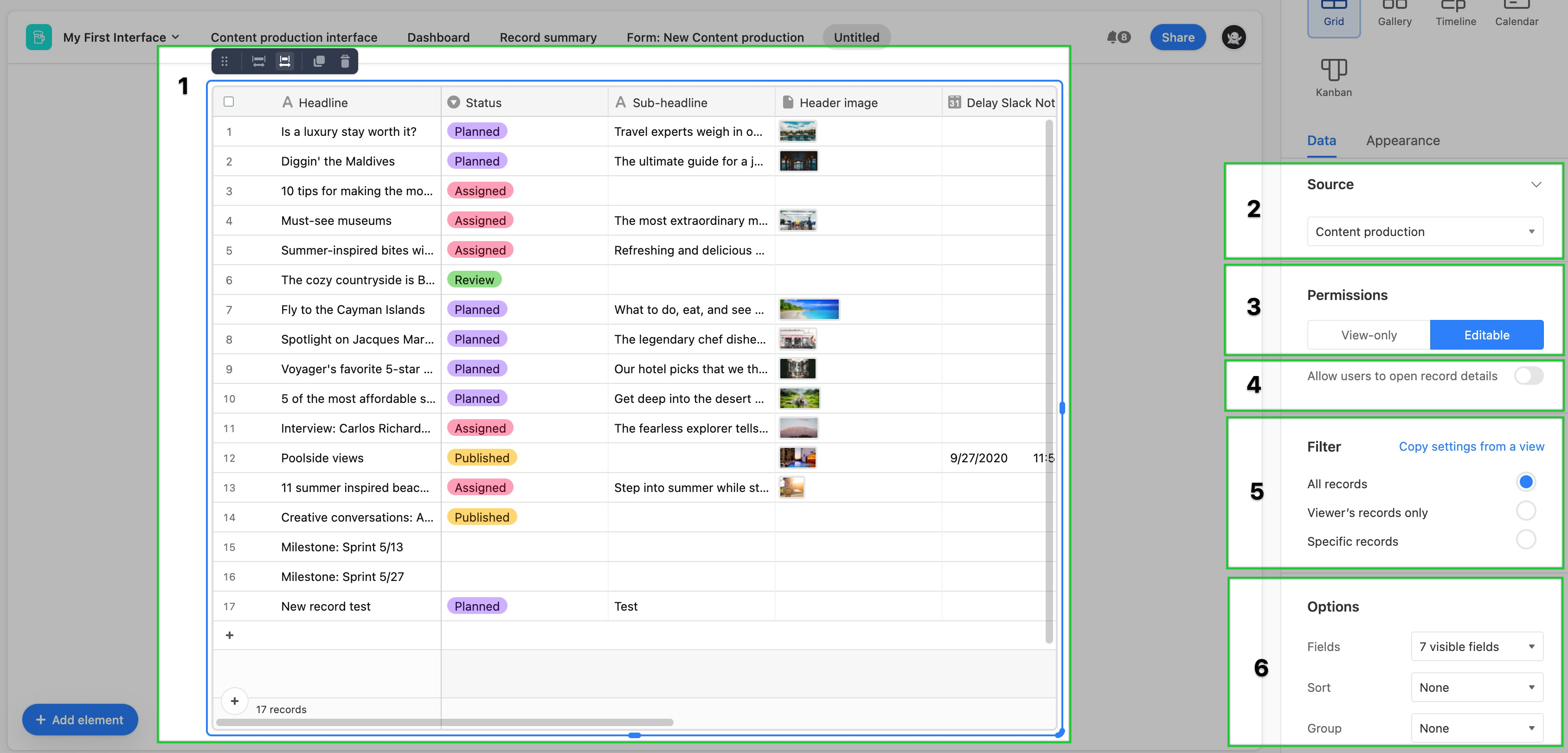
The last thing to do is click the Appearance tab. Here you can set the Row height, Color records by a single/multi select field or conditions, and toggle on/off the grid element's name/label.
.jpg)
Kanban element
Adding Kanban elements
If this is the first time you've added elements to an interface, please consult this help article first.
Find the Kanban element by clicking + Add element in the lower left portion of the interface editor.
You'll then place the element somewhere in the layout of your interface page. Don't worry if it isn't in perfect positioning yet, as you can always move the element later.
Next move on to configuring the Data and Appearance of the Kanban element.
Configuring Kanban elements
After placing a Kanban element, you'll see the configuration panel appear on the right side of the editor.
Choose a source for the Kanban. Usually, this is a table from the underlying base.
Set the permissions to be View-only or Editable. More on permissions here. The Editable setting allows users interacting with the interface to add, edit, or delete records in the view element.
The record details toggle lets you configure the way an expanded Kanban record will appear to interface collaborators. In short, you can think of this as another interface page that is hidden from view unless a user presses the space bar to open a record. This is similar to the functionality of expanded records in a base.
Set the filters for the Kanban element. If you already know of a view from the underlying base that uses the same filters you would like to see used in this Kanban element, then choose the Copy settings from a view option. Otherwise, choose from the other three filter options. By default, the All records option will keep the Kanban element unfiltered. The Viewer's records only option will only show records related to the interface viewer if their name (or a group they belong to) has been added to a user field in the underlying base. You can specifically set one, and only one, user field for this option. Finally, you can set Specific records by condition(s) or condition group(s) to filter the underlying records/Kanban cards.
In the Options section, you will choose which fields are visible, the sort behavior of records in the Kanban element, as well as which field will be used to stack the Kanban cards/records.
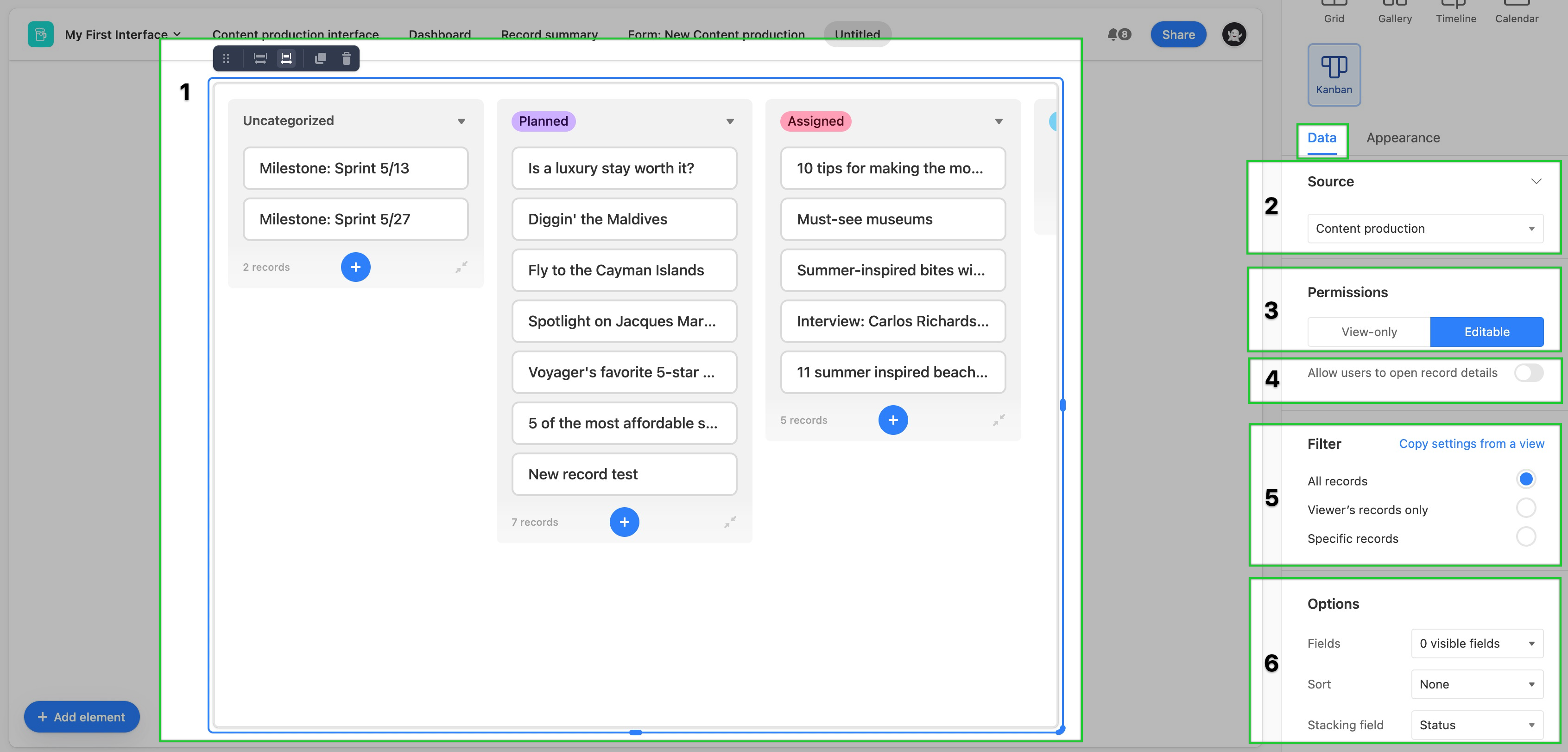
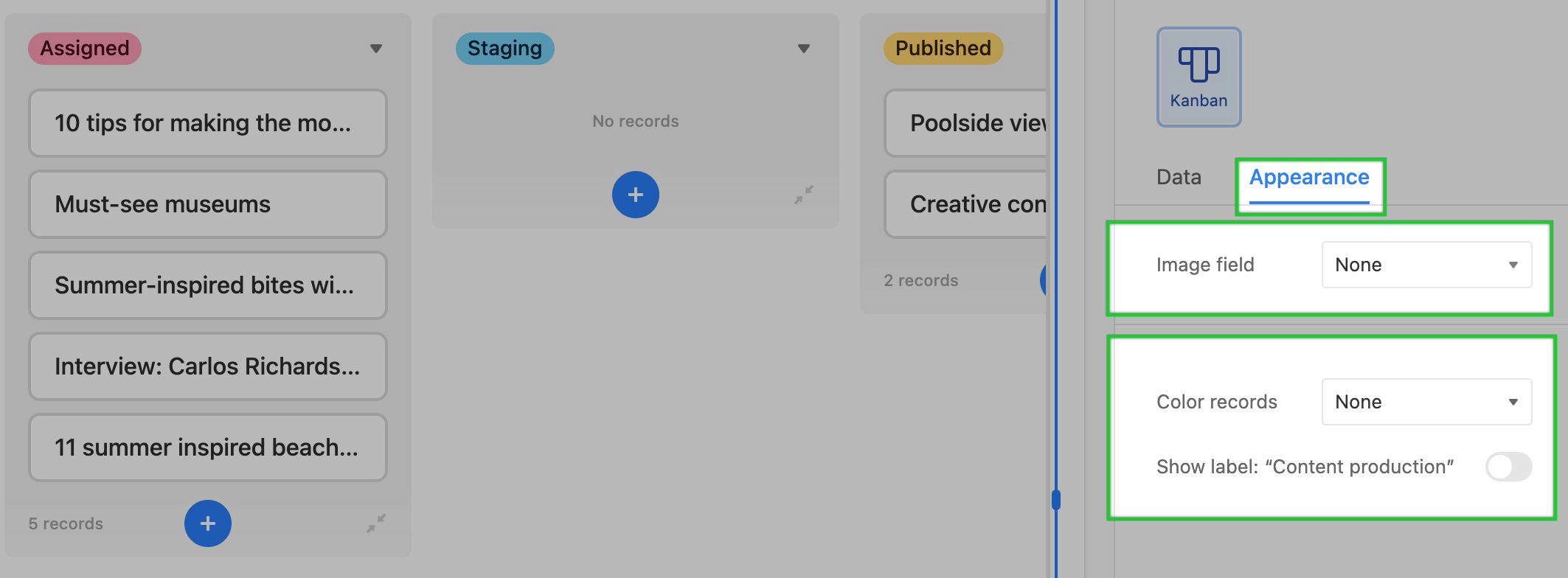
The last thing to do is click the Appearance tab and configure the available options. Here, you can set the Image field (pick a specific attachment field from your base that contains images. If you include an image field, then you'll also see a toggle appear that will allow you to fit the image on each Kanban card. Finally, you can Color records by a single/multi select field or conditions, and toggle on/off the Kanban element's name/label.
Number element
Adding number elements
If this is the first time you've added elements to an interface, please consult this help article first.
Find the Number element by clicking + Add element in the lower left portion of the interface editor.
You'll then place the element somewhere in the layout of your interface page. Don't worry if it isn't in perfect positioning yet, as you can always move the element later.
Next, move on to configuring the Data and Appearance of the number element.
Configuring number elements
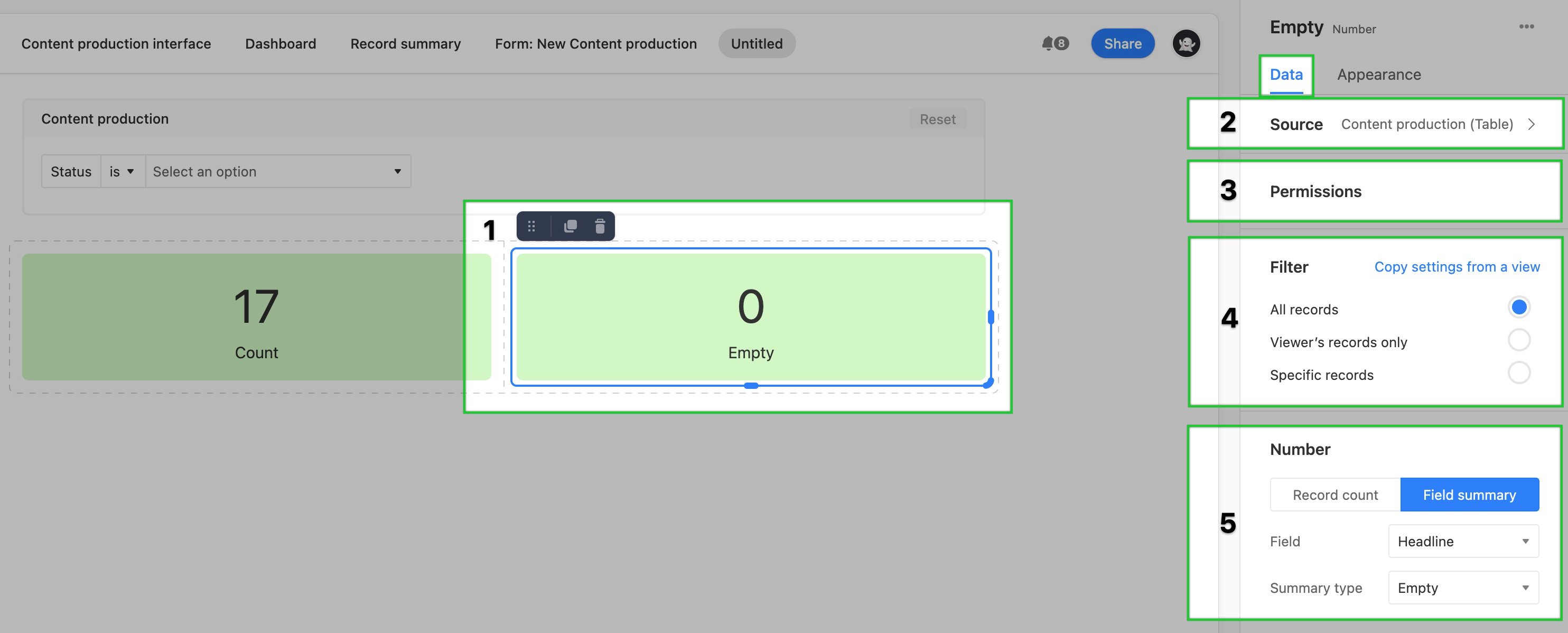
After placing a number element, you'll see the configuration panel appear on the right side of the editor.
In the Data tab, you'll choose a source for the number. Usually, this is a table from the underlying base.
Number elements can't be edited/set to be editable. However, it's important to know that number elements may expose raw cell data from the underlying base. This is why filtering the data may be important for your use case.
Set the filters for the number element. If you already know of a view from the underlying base that uses the same filters you would like to see used in this number element, then choose the Copy settings from a view option. Otherwise, choose from the other three filter options. By default, the All records option will keep the number element unfiltered. The Viewer's records only option will only show a count or summary of records related to the interface viewer if their name (or a group they belong to) has been added to a user field in the underlying base. You can specifically set one, and only one, user field for this option. Finally, you can set the number to count or summarize Specific records by condition(s) or condition group(s).
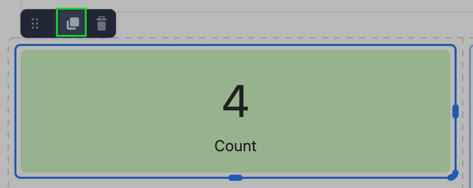
In this step, you will choose to have the number element perform a Record count or Field summary. The Field summary option includes two additional options. First, choose the field for which you would like the number element to summarize. Second, choose the Summary type for the chosen field. Summary type options include:
Empty - Number of records that are empty in the field
Unique - Number of record that contain unique values in the field
Percent empty - Percentage readout of records that are empty in the field
Percent filled - Percentage readout of records that are filled in the field
Percent unique - Percentage readout of records that contain unique values in the field
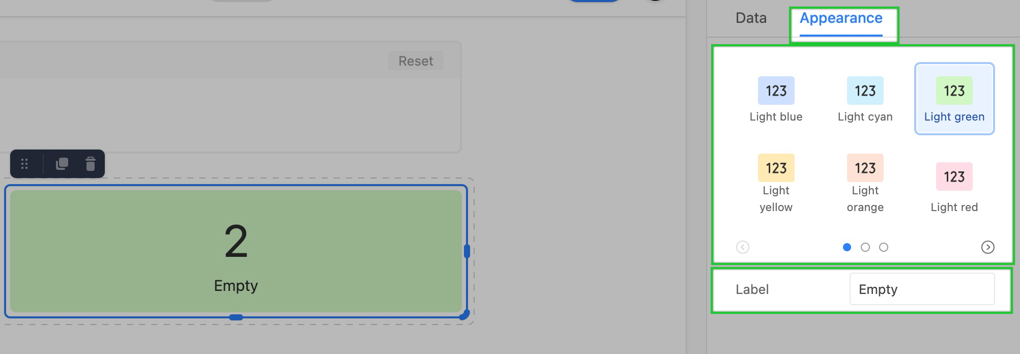
Finally, you can adjust the appearance of the number element. First, choose a color option. Click the arrows in the menu to navigate through the available coloring options. Then, you can change the Label of the number element to give interface collaborators a better understanding of what the number means.
Record picker element
Adding record picker elements
If this is the first time you've added elements to an interface, please consult this help article first.
Find the Record picker element by clicking + Add element in the lower left portion of the interface editor.
You'll then place the element somewhere in the layout of your interface page. Don't worry if it isn't in perfect positioning yet, as you can always move the element later.
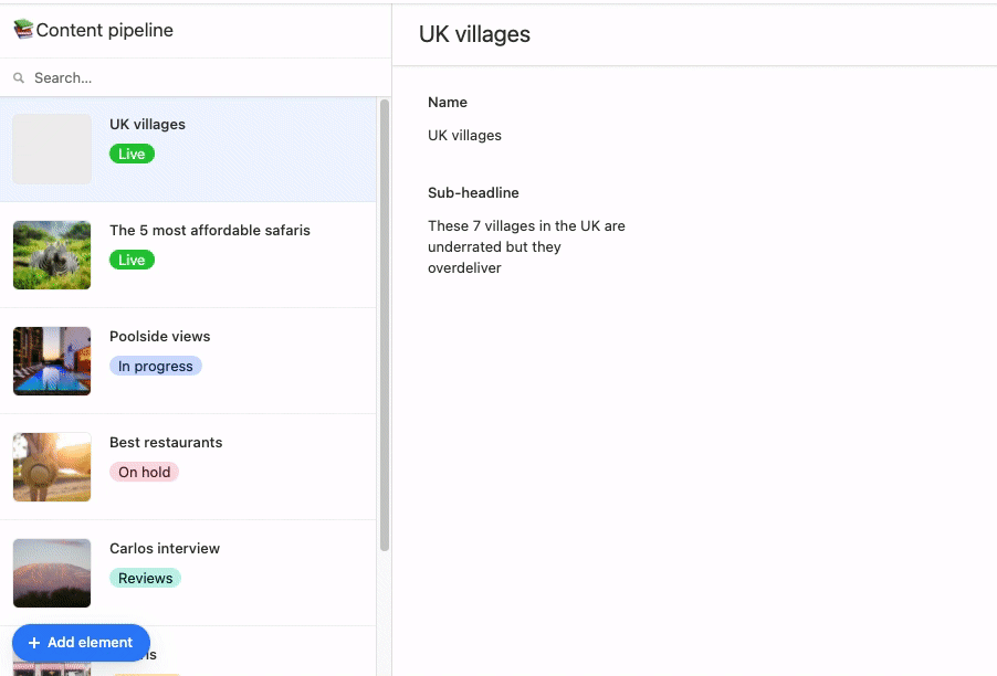
You'll then want to pick which fields from the underlying base to display on the interface page. First, make sure you are pulling in fields from the record picker element 1. Next, choose which fields you want to have displayed when a record is picked. You can see in the image below that Record comments 2 as well as the Status field 3 have been added to the interface page. Next, we'll cover additional configuration options.
Configuring record picker elements
Once placed, you'll be able to configure the element.
As always, you'll need to pick a source for the record picker to pick from.
Then, set a filter type 3 for the record picker. Choose from the three general filters. By default, the All records option will keep the record picker unfiltered. The Viewer's records only option will only show records related to the interface viewer if their name (or a group they belong to) has been added to a user field in the underlying base. You can specifically set one, and only one, user field for this option. Finally, you can set Specific records by condition(s) or condition group(s) to filter the underlying records.
Next, set the sorting order of the records when the record picker drop-down is clicked. The options here are to either sort None or set up one or more fields and conditions for the picker to sort by.>
Paid plan customers will be able to choose whether or not to allow users to create new records from the picker. More on permissions here.
Lastly, choose whether or not to show a label for the record picker.
Text element
Adding and configuring text elements
Open your Airtable homepage.
Open the base you where you want to add text elements.
Click Add… in the lower-left corner.
Click Interfaces, and choose your interface.
Complete the interface setup process and click Finish.
Click Add element, then All elements.
Click Text.
After selecting the text element, you'll see some formatting options appear, including a dropdown menu on the left where you can choose from the available options.
Adding dynamic field values to text elements
In legacy element-based layouts (Blank, legacy Record review, or legacy Record summary), you can insert dynamic field values into text elements using the blue plus icon.
Open the interface in Edit mode.
Click on a text element or add a new text element to the page.
Position the cursor where you want to insert a field value.
Click the blue + icon in the text formatting toolbar.
Select the field you want to insert from the dropdown menu.
The field value will update dynamically based on the record being viewed.
Note
Dynamic field insertion using the blue plus icon is only available in legacy element-based layouts. Newer interface layouts (List, Gallery, Kanban, Calendar, Timeline, Grid, Record detail, Form, and Dashboard) use field elements instead.
Timeline element
Adding timeline elements
If this is the first time you've added elements to an interface, please consult this help article first.
Find the Timeline element by clicking + Add element in the lower left portion of the interface editor.
You'll then place the element somewhere in the layout of your interface page. Don't worry if it isn't in perfect positioning yet, as you can always move the element later.
Next move on to configuring the Data and Appearance of the timeline element.
Configuring timeline elements
After placing a timeline element, you'll see the configuration panel appear on the right side of the editor.
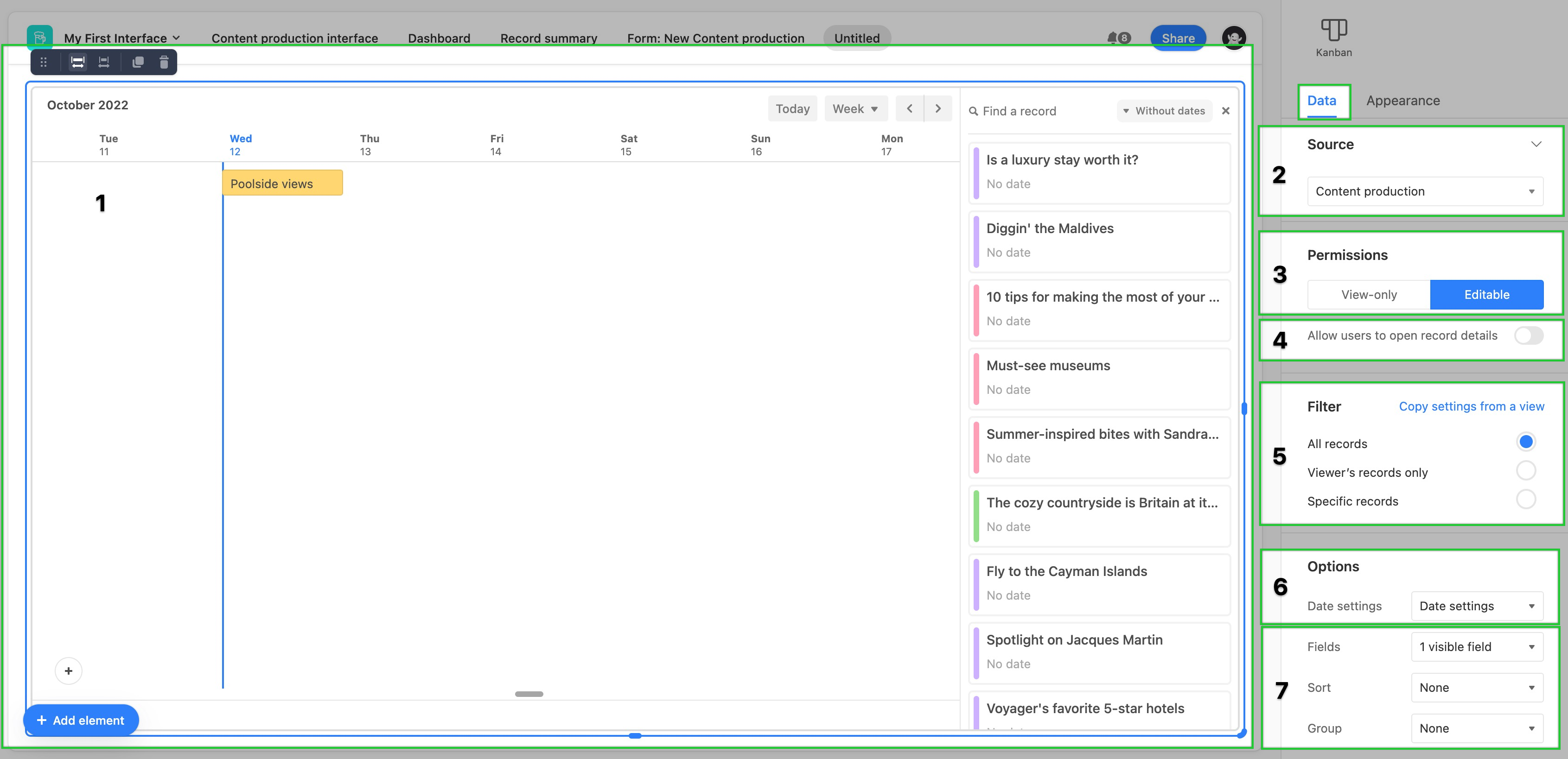
Choose a source for the timeline. Usually, this is a table from the underlying base.
Set the permissions to be View-only or Editable. More on permissions here. The Editable setting allows users interacting with the interface to add, edit, or delete records in the view element.
The record details toggle lets you configure the way an expanded timeline record will appear to interface collaborators. In short, you can think of this as another interface page that is hidden from view unless a user presses the space bar to open a record. This is similar to the functionality of expanded records in a base.
Set the filters for the timeline element. If you already know of a view from the underlying base that uses the same filters you would like to see used in this timeline element, then choose the Copy settings from a view option. Otherwise, choose from the other three filter options. By default, the All records option will keep the timeline element unfiltered. The Viewer's records only option will only show records related to the interface viewer if their name (or a group they belong to) has been added to a user field in the underlying base. You can specifically set one, and only one, user field for this option. Finally, you can set Specific records by condition(s) or condition group(s) to filter the underlying records.
In the Options section, you will configure Date settings that will have a big impact on the configuration of the timeline element. We cover this more extensively below.
At the bottom of the Data configuration options, you will choose which fields are visible, the sort behavior of records in the timeline, as well as any groups you'd like the records to appear in.
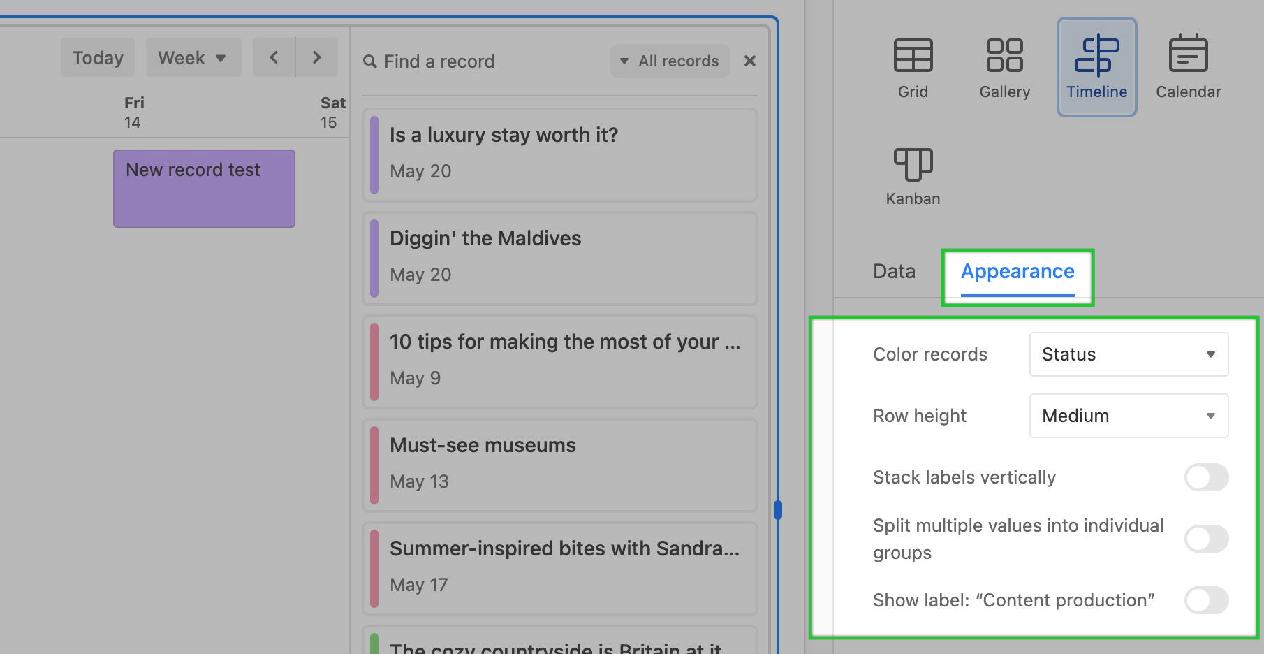
The last thing to do is click the Appearance tab and configure the available options. Here, you can:
Color records by a single/multi select field or conditions
Set the Row height for timeline records
Toggle whether or not to Stack labels vertically. Note that this option isn't possible if the row height is set at Short.
Toggle the option to Split multiple values into individual groups. For a more comprehensive understanding of this feature, please read the section at this link.
Finally, you can toggle on or off the name/label of the timeline element.
Configuring date settings in a timeline element
To configure the Date settings for a timeline element:
Click the Date settings dropdown in the Data tab of the timeline element configuration sidebar.
Set which date field from the underlying base will act as the Start date field in the timeline element. Optionally, you can also choose another date field from the underlying base to be the End date field.
Set the Date visibility on the timeline. If you choose to show only workdays (Monday through Friday), then you'll see the additional option to set up a comma-separated list of holidays to hide within the timeline element.
Last you'll set the initial view when the interface containing the timeline element first loads. This includes setting the Position the timeline will appear. There are three options to choose from:
Closest record to today (Whichever past or future record is closest)
Today (Will navigate to the day that the user is loading the interface)
Exact date (A static date of your choosing)
Then, you can set the timescale of the timeline element. Options include: Day, Week, 2 weeks, Month, Quarter, and Year. Interface collaborators can always adjust this timescale later while they are interacting with the timeline interface element.
Finally, choose whether the Initial view will only show the first time the interface is loaded (Toggle off) or reset each time the interface page containing the timeline element is reloaded (toggle on).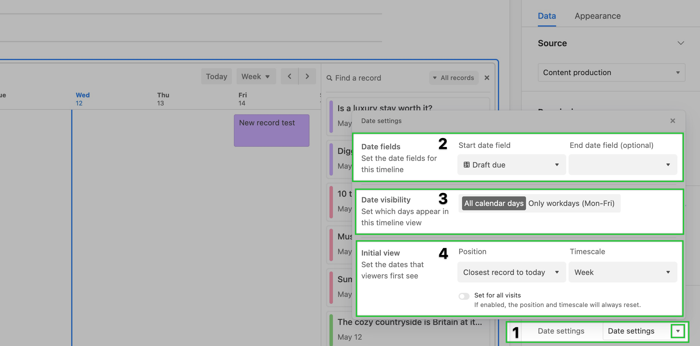
FAQs
Can I port view configurations into Interface Designer?
Yes! You can port view configurations directly into your elements by using the Copy from view button.
Can I port extension configurations into an element?
At this time, we only support copying over a view’s configurations.
Can I duplicate an element?
Yes, you can. Click on the element of your choice and press CMD and D to duplicate the element.
Can I duplicate an element from one interface to another?
No, however, you can duplicate an interface to its own group or another group attached to the same base.
If a base collaborator has “Commentor” or “Read-only” base permissions, can they edit an interface’s “Editable” fields?
No, a base collaborator with “Commentor” or “Read-only” permissions on a base will not be able to edit or modify a base’s records through an interface.
Can an element-based interface be connected to a shared view?
Yes, but maybe not in the way you might first think. You can add a Grid element to your interface and copy the view configuration of the shared view you are looking to showcase from the base where the interface is being built. If the shared view resides in another Airtable base, then you would need to create a synced table from that shared view and then add a Grid element to your interface connected to that synced table.
I'm seeing (empty) on some or all of my calendar element events, what does that mean?
When you see the (empty) tag it means that a field that has been set to visible in the appearance settings is blank in the table where you are sourcing the information from. To resolve this, either add information to that field in the base or toggle that field to not show in the element.
What is the difference between a chart extension and a chart element?
Chart interfaces do share some similarities with chart extensions. However, interfaces were created with granular permission flexibility in mind. For that reason, chart extensions are better served for workflows where everyone on your team has access to the underlying base. In instances where most end-users are using interfaces instead, we recommend you build charts in interfaces so that more of your team is able to visualize the data you are presenting in the interface.
How can I resize images that are cut off in a gallery element?
In edit mode, navigate to the “Appearance” menu for the gallery element of your choice and then toggle on the “Fit image size” option.