Plan availability | All paid plans |
Permissions |
|
Platform(s) | Web/Browser, Mac app, Windows app, and some basic functionality on iOS and Android mobile apps |
What are summaries useful for?
Timeline views allow you to organize tasks, projects, or other trackable events in an easy-to-understand and visually pleasing way. With Timeline view summaries you are now able to show helpful summary metadata related to the records and fields in your base, leveraging our summary bar feature. There’s even a utilization function covered in this article that will help you and your team better manage resource allocation. Read through the information below to learn more about these features.
The Summarize option's purpose is to show calculated outputs from the data in your Airtable base in a way that helps you and your colleagues view vital insights. Within a timeline view, this is very powerful as it can help inform decisions related to:
Resource allocation management
Task tracking and prioritization when there are competing priorities.
Counting interactions between customers and employees on any given day.
Average time spent on projects each week by team or individual.
The examples above are just some ideas to get you thinking about how you can leverage this feature to improve your team’s efficiency.
NOTE
It’s important to understand that the summary bar’s calculations are metadata that cannot be interacted with in the same way that data in a record can be. For example, you cannot lookup or create automations based upon the calculations performed in the summary bar. However, the calculations that appear in the summary bar can usually be reproduced with formula fields.
Finding the summarize feature
To find the Summarize feature:
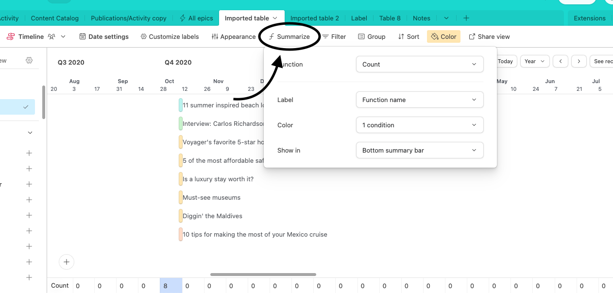
In the view toolbar, click the Summarize option.
This will bring up a menu of functions to choose from. Individual functions are outlined further below.
The summarization may appear in several places within a timeline view. Sometimes it may only appear at the bottom of the view. However, if you’ve set up groupings in your timeline view, then the summary bar may appear at a group level and may or may not include the bottom, view-level summary bar.

Note
The summary bar in timeline views differs slightly from grid views. In a grid view, each field (column) can have its own summary function. In a timeline view, each “column” is a specified amount of time, therefore only one summary function can be chosen per timeline view.
Timescale splits
Timescale splits might also be referred to as customizable time buckets. This feature allows you to visualize timelines in the way that your organization prefers, from hour-by-hour granularity all the way up to 5-year, long-term visibility. The timescale option can be found in the upper right corner of a timeline view. Depending on the timescale you choose, different split options will appear.
.png)
Note
If your timeline view includes summary values, then those values are likely to be affected by the timescale chosen.
Supported timeline summary functions
The following functions are supported in the timeline view’s summarize feature:
Count
Sum
Average
Min
Max
Range
Median
Utilization
Depending upon the function chosen, different options may appear. The simplest summary utilizes the count function and will include 4 options:
Function: The function that the summary bar is performing.
Label: By default, this will match the name of the function you have chosen. However, the label can also be hidden or customized to match your needs.
Color: Conditional summary bar coloring.
Show-in: One or more toggles that allow you to show or hide the summary bar in various areas of the product. This will depend upon how the timeline view has been set up.
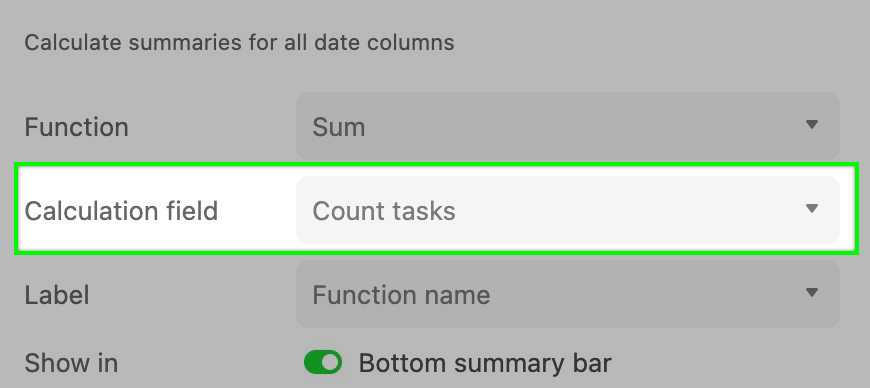
The Sum, Average, Min, Max, Range, and Median fields require a field with numerical information stored in the table your Timeline view is referencing. This is because a “Calculation field” is added to the Summary bar’s setup process. In the example below, we want to sum all of the open tasks related to a project in the bottom summary bar. So we set the “Calculation field” to the “Count tasks” field, a Count field that only shows the number of linked tasks that are not yet complete.

The last option is the “Utilization” function. It’s important to note that to get full use of this function, you’ll want both numerical and linked record fields set up in the table you are referencing. We cover this function more extensively in this support article.
Conditional coloring in timeline summaries
If all of the above weren’t enough, we’ve also added the functionality to conditionally color summarized outputs based on configured conditions. Some common use cases for this include coloring that:
Alerts your team when utilization is near or over capacity.
Is based on how many tasks or projects are due each week.
Highlights upcoming due dates.
To set up conditional coloring:
Click the summarize option to open the configuration window.
Next, click the drop-down next to the “Color” option.
From here you can begin to configure a color scheme based on the conditional output of your summary’s function.
You can add multiple conditions and multiple colors. In the example below, you can see that the number of tasks being worked on in a day creates a colored “heatmap” indicating times in which your team/colleagues will be head-down working on those tasks.

To delete color conditions, simply click the trash can icon next to the color you would like to remove.
FAQs
Can conditional coloring be separated from group-level summaries?
No. Conditional coloring will apply to both group and bottom-level summaries.