Plan availability | All plan types/levels
|
Permissions |
Review our Interface Designer permissions article for additional details. |
Platform(s) | Web/Browser, Mac app, Windows app (Limited functionality is also available on our mobile apps) |
Related reading |
Why use Airtable Interface Designer?
Suppose you are familiar with the data layer of Airtable or any relational database’s backend. Even a well-organized data set can be tedious or overwhelming in that case. Most end users in an organization do not need to interact with every piece of information in that data layer to do their work. Interface Designer can help here because there are ways to section out that data into smaller portions that individuals or working groups can manage more easily. By creating an interface for your team, you can likely simplify repeatable processes in a more visually pleasing way.
Common use cases: Items up for review, data dashboards, end-user-specific record filtering
Common Airtable benefits: Data from multiple tables on one screen, efficient and robust filtering options for end users, data security via more granular access permissions
How do people and organizations typically use interfaces?
Repeatability and data consistency
Example 1: Stakeholders who need to review and approve assets to unblock their teams.
Example 2: An interface for working in sprints
Granular permissions, including access and security to only certain data
Example 1: End users who need to make individual updates to certain information, like statuses
Example 2: Giving access to a set of data that only corresponds to a subset of Airtable users, like a marketing team
Simplifying collaboration and insights for users across an organization
Example 1: Leadership and cross-functional partners who need to check in on progress updates and results.
Example 2: Processes that involve action items or assigned tasks.
There are two general user roles in interfaces:
Builder - Creating, editing, publishing, and sharing interfaces.
End user - Interacting within published interfaces. This can involve viewing, editing, or commenting on records within an interface. Keep in mind that Interface Designer was created for flexibility. End users should provide feedback on editing options, filtering, visual layout, etc. to interface creators helping to evolve their team’s interfaces as needs change.
Adding interfaces in Airtable
Note
Older legacy, element-based layouts such as Record review and Blank utilize different setup options. Consult the articles in this section for more information. Consult the articles in this section for more information.
Step 1: Add an interface
There are three potential entry points where builders can add a new interface:
From within a base (AI-enabled workspaces) - Ask Omni to build you an interface customized to your particular needs in order to hit the ground running. Find more information about Omni here.
From within a base (Manual) - Inside a base where you would like to build a base click the Interfaces option in the upper portion of the screen.
If this is the first interface in the app, then you'll be brought to a screen where you can click Start building. Then, click the Build an interface option. To learn more about building forms, see this support article. Name the interface and choose an icon (this can be edited later). Then, click Next.
Otherwise, you'll be brought to the interface editor where you will see previously created interface pages. From here, click the dropdown icon at the top left next to the name of the base and select the Edit option (Option 1 shortcut). Then jump down to the " Editing previously configured interfaces" section below.
From the home screen - This option is covered in a separate support article that you can find here.
Choose a layout to create a new interface page.
Table layouts (recommended) - These full-page layouts are based on a visualization of a table in the underlying base, similar to an Airtable view. Layouts offer streamlined configuration controls and powerful features for interface users. There are several options to choose from (list, gallery, kanban, calendar, and timeline). You'll be able to change this later if needed. Click Next. After choosing the type, you'll choose the specific table you want to represent with the visualization. Click the dropdown menu to choose a different table from the underlying base. Then, click Finish.
Other supported layout styles include overview, form, dashboard, and record review. Click on the links provided to learn about configuring each of these layout options as the options below cover the table layout experience.
Under the "More" section you'll find the option to build an interface from scratch by choosing the “Blank” interface layout. We only recommend using blank layouts when other available layout types don’t fit your use case.
Note
Some interface layouts are now also supported on our mobile Airtable apps. In these cases, you’ll see the option to preview the layout as Desktop or Mobile in the preview window.
Step 2: Configure page, data, and appearance options
After clicking Finish, you are brought to the draft version of the interface you are building. From the properties panel on the right you'll see several options including:
Page
Title - Rename the page's title
Data
Source - Click the dropdown to choose the source table for the layout
Levels - If enabled, add or remove levels of hierarchy, adjust the order to the hierarchy. You'll also be able to toggle on/off the “Enable nested records below Level 1” option.
Levels can be enabled for the page whenever the page is not using tabs. Enabling this feature moves any existing list configuration to the page, allowing dropdown filters to be created for any of the tables within the hierarchy.
Filter by - Add conditions or conditional groups that will filter the records shown on the interface page. These are hard set by you, the interface builder, and are not able to be changed by end users. One use case example is the ability to filter records to only show the "viewer's records."
Appearance
Show description - Toggle the ability to show a description of what kind of data the visualization shows so that end users have a better understanding when they interact with the interface you are building.
Visualizations - Click the cogwheel icon to change the layout visualization. You can also enable more than one visualization per interface page by clicking the eye icon. When multiple visualizations are enabled, they will appear as a dropdown for end users to choose from on the interface page.
Step 3: Configure end-user filter tabs or dropdowns
User filters
Elements - Filter elements allow end users to filter records on the layout page using predefined tabs or interactive dropdowns. Only one of these options can be used per interface page. 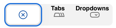
Tabs- This option allows interface builders to configure and name tabs that act as predefined filters on the interface page. Click the cogwheel to add/delete a previously configured tab to use or click the blue + button on the canvas next to the "All records" to configure a new tab.
For end users, tabs function as quick filters that allow for switching to another "view angle" within the same interface visualization. For example, in a project tracking interface a builder might set a tab that filters records by each individual stage of project tracking that corresponds to a specific status field (i.e. "Todo", "In progress", "Complete").
Dropdowns- This option allows end users more flexibility to choose what information they want to see. Click the cogwheel to add/delete a previously configured dropdown to use or click the blue + button on the canvas next to the "All records" to configure a new dropdown.
Configuring 2 or more dropdowns will allow end users the flexibility to drill down into the data.
Supported field types for dropdowns include date, single select, multiple select, linked record, user, created by, and checkbox.
Additionally, any lookup, rollup, or formula fields that format their results in a way that matches any of these field types are supported.
Step 4: Configure user actions
User actions
Sort - Toggle whether to allow end users to sort the records shown on the interface page.
Search - Toggle whether to allow end users to search records.
Filter - Toggle whether to allow users to set up their own conditions or conditional groups to filter records in the interface.
Group - Toggle whether to allow end users to group records.
Add records through a form - Toggle on whether to allow interface end users to add a record via form.
End users will click the “Add record” button. As a builder, you'll need to configure the form that the end users will utilize when they click this button.
Buttons - This option can be used to add additional buttons to the interface page such as adding a link to another interface page, a link to an external URL, or additional record creation forms. Each button has slightly different settings, but they can all be labeled to provide end users with additional context. More about buttons in another section below.
Step 5: Configure advanced options
Advanced
Allow users to export data as CSV - Allow end users the ability to export the data set shown in the interface as a CSV file.
Allow users to print - Toggle whether to allow end users to print record details that are currently shown on the interface page.
End users will click the ... icon near the top right corner of the screen. Then, they will click the Print all records option. This will cause a new menu to show where end users can toggle the option to "Format for printers" and click Continue. This will open your computer's print dialog where more options can be configured. It's important to note that this also allows end users to save the interface page as a PDF. More on printing in another section below.
Allow users to import data as CSV - Allow users with editor permissions to add new data via the interface by importing a CSV.
Step 6: Publish and share
Once you are done building, click Publish near the top-right portion of the screen. You can also click Done to continue building the interface at a later time.
Once published, the interface can be shared with other users. The first time an interface is published, you will see a share dialog where you can invite other users. After that, you'll want to click Share in an open interface to add more interface users in the future.
Understanding interface visualization properties
Note
User actions can be set up from the properties panel. It’s important to note that:
We recommend consulting the interface permissions article to learn how permissions in interfaces can be expected to work.
Remember that field and table editing permissions set in the backend base will overrule any settings made in the interface you are building. However, it's worth pointing out that in field permissions, enabling the option to Allow this field to be set in records created through forms will allow users to add information to fields that are otherwise locked for creation and editing.
Within the same interface, these record-creation forms are reusable. So, if you need to add the form in multiple places throughout the interface you are building, then you can simply pick a previously configured form and use it again.
When choosing a table layout's visualization (List, Gallery, Kanban, Calendar, Timeline, Grid), there are more options to configure for each visualization type that you have decided to use on the interface page. Generally speaking, there are 4 main buckets of properties to configure in the properties panel on the right: Data, Filters, Appearance, and User actions. That said, options can vary depending on the visualization type.
To reach a visualization's properties:
Click on the interface page containing a table layout from the left sidebar. Click the Pages button on the upper left portion of the screen if you don't see the sidebar.
If your interface page contains several visualizations, click the dropdown on the canvas showing the visualization type and choose the visualization you want to configure.
Then, click on the canvas where the visualization appears so that a blue square highlights that area. You'll see the properties panel on the right populate with the settings that pertain to that visualization.
Consult the resources below for more about each visualization's properties.
List visualization properties
Hierarchy
Levels - Levels help to show relationships between data across different tables. Click the cogwheel icon to set up or adjust levels. If you are unfamiliar with the setup for this, consult the following article.
Data
Filter by - You'll see any filters that have been configured for this visualization and modify the settings. Filters are initially configured in the main page's properties.
Sort by - Set the way that records will be sorted in this visualization. Choosing a Manual sort field from this menu will allow users to drag and drop records when "Edit records inline" is enabled.
Group by - Configure up to 2 fields to group the records by in the visualization.
Prefix field - Set a field that will give end users more details to get their work done. Popular choices are status fields or checkboxes that denote completion.
Fields - Pick which fields are visible in the visualization. In the list visualization, you can also optionally make certain fields “View-only” by clicking the cogwheel icon, hovering over an individual field, clicking the … option, and then clicking Make view-only.
Appearance
Color by - Set up record coloring based on a Select field or Conditions.
Field text color - Learn more about field text color settings here
Row height - Change the height for each record to be short, medium, tall, or extra tall.
Wrap headers - Toggling this option on will automatically size the headers so that the entirety of a every field name is shown. This is particularly helpful for fields with long names.
Note that you can also adjust header height manually by hovering over the line below the field names so that a ↕ icon appears. Click and drag the line to your preferred height.
Show field descriptions - End users will see an i icon on any fields that contain a description, allowing them to click to see that field's description.
Collapse all by default - This will collapse all levels each time the interface is open.
User actions
Edit records inline - Allow end users (with the appropriate permissions) to edit those records from the visualization page.
Add/delete records inline - Allow end users (with the appropriate permissions) to add or delete records from the visualization page.
Click into record details - Allow end users to open up more details about a record. Learn more about configuring record details here.
Gallery visualization properties
Data
Source - Not configurable from visualization properties, but you can view the source table from the underlying base.
Filter by - You'll see any filters that have been configured for this visualization and modify the settings. Filters are initially configured in the main page's properties.
Title field - Configure which field will appear as the title on the cards in the gallery.
Image field - Configure which attachment field will be used as the card's image. You may also use a URL field if the URL links to a publicly-available image hosted elsewhere.
Sort by - Set the way that cards will be sorted in this visualization.
Fields - Pick which fields are visible in the visualization.
Appearance
Color by - Set up record coloring based on a Select field or Conditions.
Fit image size - This option will resize images from the chosen image field to fit into the card's available space.
Display field names - Choose whether cards will show or hide field names.
User actions
Click into record details - Allow end users to open up more details about a record. Learn more about configuring record details here.
Allow users to export data as CSV - Allow end users the ability to export the data set shown in the interface as a CSV file.
Kanban visualization properties
Data
Source - Not configurable from visualization properties, but you can view the source table from the underlying base.
Filter by - You'll see any filters that have been configured for this visualization and modify the settings. Filters are initially configured in the main page's properties.
Stacking field - Choose a single select, user, or created by field to "stack" records together.
Sort by - Set the way that cards will be sorted in this visualization. Choosing a Manual sort field from this menu will allow users to drag and drop records when "Edit records inline" is enabled.
Fields - Pick which fields are visible in the visualization.
Image field - Configure which attachment field will be used as the card's image.
Appearance
Color by - Set up record coloring based on a Select field or Conditions.
Wrap long cell values - Toggling this option allows values to look more natural and take up less space. Experiment with this option to your liking.
Hide empty stacks - If there are no records associated with a value in the “Stacking field” configured in the Data section, then toggling this option on will hide that stack or stacks.
User actions
Edit records inline - Unlike other interface visualizations, this action is not supported. You may see "An error has occurred" when clicking on the toggle next to this setting, which is expected behavior since this action is not currently fully supported.
Add/delete records inline - Allow end users (with the appropriate permissions) to add or delete records from the visualization page.
Click into record details - Allow end users to open up more details about a record. Learn more about configuring record details here.
Calendar visualization properties
Data
Source - Not configurable from visualization properties, but you can view the source table from the underlying base.
Filter by - You'll see any filters that have been configured for this visualization and modify the settings. Filters are initially configured in the main page's properties.
Date settings - Configure a date field to be used for the start and optional end date in the visualization. Also, configure the "Initial view" settings by setting the "Position," "Timescale," and optional "Set for all visits" toggle.
Sort by - Set the way that cards will be sorted in this visualization.
Fields - Pick which fields are visible when clicking on a calendar event shown in the visualization.
Label - Configure which fields will be shown in a calendar event’s label. Due to space constraints, this option doesn't always show all fields.
Label image - Add an attachment field that will be used as the calendar event's label image.
Appearance
Color by - Set up record coloring based on a Select field or Conditions.
Fit image size - This option will resize images from the chosen image field to fit into the calendar event label’s available space.
User actions
Edit records inline - Allow end users (with the appropriate permissions) to edit those records from the visualization page.
Add/delete records inline - Allow end users (with the appropriate permissions) to add or delete records from the visualization page.
Click into record details - Allow end users to open up more details about a record. Learn more about configuring record details here.
Roadmap visualization properties
Note
The Roadmap visualization is only available for Business or Enterprise Scale customers.
Data
Source - Not configurable from visualization properties, but you can view the source table from the underlying base.
Records
Image field - Configure which attachment field will be used as the card’s (record’s) image.
Title field - Configure which field will appear as the title on the roadmap cards.
Fields - Choose which fields are visible on each roadmap card.
Footer - Choose a single field to show information as a “footer” on the card.
Sort by - Set the way that cards will be sorted in this visualization.
Appearance - Configure the appearance of the cards. This includes Color by which allows you to color cards by a select field or by conditions, Title size, Fit image size which will resize images on each card to fit, and a Compact layout toggle. If Compact layout is turned off, then you’ll see additional options to Show field names and/or Wrap long text values within each card.
Columns
Stacking field - Choose which field from your base that will organize the records into columns.
Sort by - Set the way that cards will be sorted in this visualization.
Show - Show or hide specific columns (and the records that nest under them) in the visualization.
Label size - Choose between Small or Large.
Uncategorized - Choose whether you Don’t show or manually show (and enter an optional label) for the uncategorized column.
Show empty columns - Show or hide columns that currently have no records nested under them.
Show number of records - Show or hide the number of records that make up each column.
Rows
Group by - Choose whether to group records together and if so, then configure how they are grouped.
Label size - Choose whether to show a small or large label for record names (or group names if Group by is enabled).
Show number of records - Whether toggle on or off, if no groupings are configured, then the number will not be shown
User actions
Edit records inline - Allow end users (with the appropriate permissions) to edit those records from the visualization page.
Add/delete records inline - Allow end users (with the appropriate permissions) to add or delete records from the visualization page.
Click into record details - Allow end users to open up more details about a record. Learn more about configuring record details here.
Timeline visualization properties
Note
The Timeline visualization is only available for Team, Business, and Enterprise Scale plan customers.
Data
Source - Not configurable from visualization properties, but you can view the source table from the underlying base.
Filter by - You'll see any filters that have been configured for this visualization and modify the settings. Filters are initially configured in the main page's properties.
Date settings - Configure a date field to be used for the start and optional end date in the visualization. Set "Date visibility" to be all days of the week or just Monday through Friday (When the "Only workdays" option is chosen you can also set custom holidays). Also, configure the "Initial view" settings by setting the "Position," "Timescale," and optional "Set for all visits" toggle. Finally, configure custom quarters that match your organization's calendar.
Sort by - Set the way that timeline events will be sorted in this visualization.
Group by - Configure up to 3 fields to group the records by in the visualization.
Summarize - Set customized summaries of the timeline events. The "Utilization" function is particularly useful and outlined in this support article.
Fields - Pick which fields are visible in the visualization. Due to space constraints, this option doesn't always show all fields on a timeline event.
Label - Configure which fields will be shown in a timeline event’s label. Due to space constraints, this option doesn't always show all fields.
Label image - Add an attachment field that will be used as the event's label image.
Appearance
Layout - Choose between Stacked or Gantt.
Color by - Set up record coloring based on a Select field or Conditions.
Record height - Change the height for each record to be short, medium, tall, or extra tall.
Width - Set the width styling for the timeline event. Options include “Precise” and “Expanded.”
Show all visible fields on left - If you choose the Gantt layout option, then you will see an additional “Show all visible fields on left” toggle. This is optional, but you can learn more about that feature here.
Stack labels vertically - Setting record height to Extra tall and toggling this option on will allow end users to see more information.
Wrap labels - Toggling this option allows values to fill the timeline event without spilling over. Experiment with this option to your liking.
Split multiple values into groups - This option changes the way that grouping behavior will work. Multi-value groups will appear as their own "pseudo" group.
Collapse groups by default - This option will collapse all groups of records when the interface page is loaded.
User actions
Edit records inline - Allow end users (with the appropriate permissions) to edit those records from the visualization page.
Add/Delete records inline - Allow end users (with the appropriate permissions) to add or delete records from the visualization page.
Click into record details - Allow end users to open up more details about a record. Learn more about configuring record details here.
Grid visualization properties
Data
Source - Not configurable from visualization properties, but you can view the source table from the underlying base.
Filter by - You'll see any filters that have been configured for this visualization and modify the settings. Filters are initially configured in the main page's properties.
Sort by - Set the way that timeline events will be sorted in this visualization. Choosing a Manual sort field from this menu will allow users to drag and drop records when "Edit records inline" is enabled.
Group by - Configure up to 3 fields to group the records by in the visualization.
Fields - Pick which fields are visible in the visualization. Due to space constraints, this option doesn't always show all fields on a timeline event.
Appearance
Color by - Set up record coloring based on a Select field or Conditions.
Field color - Learn more about field color settings here
Row height - Change the height for each record to be short, medium, tall, or extra tall.
Wrap headers - Toggling this option on will automatically size the headers so that the entirety of a every field name is shown. This is particularly helpful for fields with long names.
Note that you can also adjust header height manually by hovering over the line below the field names so that a ↕ icon appears. Click and drag the line to your preferred height.
Field descriptions - Options include Hidden from everyone, Visible to everyone, and Visible to base collaborators. End users will see an i icon on any fields that contain a description, allowing them to click to see that field's description.
User actions
Edit records inline - Allow end users (with the appropriate permissions) to edit those records from the visualization page.
Add/delete records inline - Allow end users (with the appropriate permissions) to add or delete records from the visualization page.
Click into record details - Allow end users to open up more details about a record. Learn more about configuring record details here.
Navigating published interfaces
When accessing a published interface, there's a navigation menu on the left side of the screen. Certain options will only appear for users with the appropriate permissions, such as the ability to edit the interface, but in general, most users will have a similar experience to the one discussed below.
.png)
Interface dropdown menu - From here you can:
View data - Navigate to the underlying Airtable base, so long as you have base access
Edit - Access interface builder if you have owner/creator permissions in the base. Editing previously configured interfaces is covered more extensively in the section below.
<- Back to home - Navigate back to your account's home screen.
Interface and interface page navigation - Clickable navigation to access the various interface groups and pages of the app. Some interfaces or interface pages may not appear if:
They have not yet been published.
Certain pages were hidden from the navigation by the interface builder.
Only one interface has been published. Once another interface has been published, both interfaces will appear in the navigation.
User account menu - Learn more about the Airtable home screen
Notifications - Learn more about Airtable notifications here
Interface share menu - Learn more about sharing interfaces here
Editing configured interfaces
First, navigate to the interface you want to edit.
If you have creator/editor permissions in the base connected to the interface, then you can navigate to the base connected to the interface and then click the Interfaces option. This will take you to a page where you can choose an interface.
You can also search or browse for interfaces you'd like to edit from the Airtable home screen.
At the top left portion of the screen, you'll find a dropdown menu located next to the name of the underlying base data layer. Click Edit.
From the Interface Designer editor, click on the Pages button shown in the upper left side of the screen. Clicking this button will reveal any previously configured interfaces and interface pages. Choose the one you want to edit and use the walkthrough guides throughout this article to alter settings for desired results. Remember that edits to interfaces will be saved as you work, and you will need to Publish your changes before end users can see them.
Renaming, duplicating, hiding, unpublishing, or deleting interfaces
From the interface Edit mode:
Click the Pages button in the upper left corner of the screen.
Click the ...three-dot icon next to the name of the interface or individual interface page that you want to rename, change icon, duplicate, hide, unpublish, or delete.
Note that interface pages can be hidden by clicking the eye icon next to the name of the interface page.
Click the option for your use case.
Printing interfaces or saving interfaces as PDFs
Note
The interface print feature is available to all users unless your organization has opted out of this feature. Please contact your Airtable representative if you are looking to have access.
For certain interface layouts, you can print interface pages or save them as PDFs. We recommend at least previewing interfaces as PDFs first, before printing, since it can help to guide you on how you might alter the configuration of the interface page to be more visually appealing in print form. Other export formats, like PNG or CSV, are not supported. The following interface layouts and elements support printing and saving as PDFs:
List
Timeline
Calendar
Record Detail
Individual record detail pages
Up to 100 record detail pages in one PDF
Charts
A user can print an interface by following these steps:
From an open interface, type Cmd (or Ctrl) + P.
Alternatively, Click the ... icon in the top right corner of the screen, then click Print this page.
Next, you can choose to toggle on the Format for printing option to help printouts be more legible. This will change the background and border colors of the records to make it a bit easier to read in print form.
Then, click Continue
Exporting interface data as a CSV
Enabling CSV exports in interfaces:
Enter an interface in “Edit” mode.
Click on an interface page built from a visualization layout.
Navigate to the properties panel on the right side of the page and find the “User actions” section.
Find the “Allow users to export data as CSV” setting and toggle it on.
Exporting data from a published interface page as a CSV:
Navigate to an interface page with the “Allow users to export data as CSV” option toggled on as described here. You may have to find someone else to toggle this option on if you don’t see the ability to export the interface page as a CSV as described below.
Click the … icon in the upper right corner of the page.
Click the Download data option.
The CSV file should download to your computer and the file name should match the name of the interface page that you are downloading.
Reordering interfaces or interface pages
First, open an interface that you can edit. Click the dropdown next to the name of the interface and choose the Edit option.
If the left sidebar isn't open, click the Pages option in the upper left corner of the screen.
From the sidebar find the interface or interface page that you want to move.
Click, hold, and drag the interface to reorder it.
You'll see the order change in the editor as you modify it. However, you will need to Publish the changes before end-users can see the new order appear.
Using buttons in Interface Designer
Button actions allow you to add buttons that appear at the top right corner of interface visualization pages, record detail pages, or groups of fields within record detail pages. The buttons allow end users to perform a certain, preconfigured action when clicked.
For more information on what is possible with button elements, see the Interface element: Button article.
In record detail pages, interface builders can additionally choose to set up conditional visibility of a button in the “Rules” section of the button’s properties.
In most cases, you can also add a confirmation step to your button to minimize unintended actions from being taken.
Interface coloring options in ProductCentral
Note
This feature is only available within ProductCentral. Additionally, you’ll need at least Creator permissions to adjust this setting.
In the base appearance settings, it’s possible to adjust interface coloring to be either accented (less prominent) or fill the background (more prominent). To adjust these settings:
Navigate to your ProductCentral instance at the Data layer.
Click the dropdown arrow next to the name of the app.
Click the Appearance dropdown.
Next to the “Apply color to Interfaces” setting click either Accent or Background to adjust this setting.
Interface Designer dependencies
Plan dependencies:
End users may not necessarily have access to the underlying base. If you haven't already consulted the Interface Designer permissions article, then now may be a good time to do so.
On Free plans, only base collaborators can see interfaces on a connected base. More on Interface Designer permissions here.
Sharing and publishing dependencies:
Users will be unable to see your new interface outside of editing mode until you publish that interface.
From the share menu, you can share an interface via email with an individual Airtable user or a user group.
FAQs
Who can create new interfaces/interface pages?
Collaborators with Owner or Creator collaborator permissions on a base/workspace can create new interfaces and groups of interfaces.
When should I create a new interface versus a new interface page?
The key here is understanding the audience that will ideally be interacting with the interface you are building. Since all interface pages in an interface are shared with users who have access, you can use different interfaces to provide granular permissions to the underlying information from a base. If you expect that an interface page would be best used by a different group of people, then that is often a sign you should create a new interface instead.
Are there any limits related to how many interfaces or interface pages I can create?
Yes. For functional reasons, we've capped the number of interfaces per base at 50. Additionally, there is a limit of 50 interface pages per interface.
Can I share an interface without sharing the base?
While interfaces are available to all customers on all plans, the ability to share interfaces separately from the base is restricted to paid plan workspaces only. Learn more in this article.
What happens if more than one collaborator is editing an interface at the same time?
Interface Designer will save the most recent changes to an interface. So, if more than one collaborator is editing the same interface, Interface Designer will reflect the last changes to both collaborators.
I updated an interface's appearance, why isn't the change visible to other users?
If you made a change to an interface or to the elements contained in an interface itself, you must first publish the changes for that interface in order for other collaborators in a base to see those changes.
Can I duplicate an interface into another base?
We do not support duplicating an interface or an interface page into another base because an interface’s configuration options rely on the underlying base’s structure (field names, source tables, etc.) to build the interface layer.
Which field types are supported in visualization layout filter dropdowns?
Single select
Multiple select
Linked record
User
Created by
Date
Checkbox
Additionally, lookup, rollup, and formula fields that format their results in a way that matches any of the types listed above are also available to use.
Is there a way to remove the preview box that appears when clicking on a record in a timeline or calendar visualization?
You can disable the preview box feature by hiding all the fields in the “Preview” portion of the properties panel on the right side of the interface visualization in “Edit” mode. Once you do this, the preview will no longer show and the record details will open automatically.
Is there a limit to the number of records in search results within layout interfaces?
Airtable Layout interfaces (List, Calendar, etc.) have a limit of 200 results (records), even if there are more than 200 records that match the query. If possible, we recommend narrowing the search with more keywords or accessing the underlying base and searching there if you need to sift through larger search results.
Can I make a field in an interface only visible when certain conditions are met based on another field's value?
Yes, but only in Record detail and Form layouts.
In the layout configuration you’ll find the “Visibility” properties below the Rules section. Here, creators can click the cogwheel icon to set up conditions for when to show a field. By default, the visibility rules will be set to “Always show field.” A few important callouts:
This functionality is only available on Business and Enterprise plans.
This functionality is not supported on iOS or Android interface experiences.
We don’t recommend using this for sensitive fields. Although visually hidden, underlying record/field values may still be exposed. Visibility should not be equated with security in this case.
I don’t see the + Add element button on my interface, why might that be?
The + Add element button feature is a part of a legacy version of Interface Designer. Only “Blank” layouts still support this experience of building out an interface page. If you are looking for the best and most well supported interface features, then we recommend using newer interface layout types covered in this article or interface layouts covered by articles in this help center category.
Why don’t I see the navigation sidebar on my interface?
If the published interface only contains a single interface/interface page, or if you are a user who only has access to a single interface page, then the navigation sidebar will not appear since you cannot navigate to another page.
If your interface should show multiple pages (and, hence, the navigation sidebar) then double check that the interface is published and that the appropriate interfaces have been shared with end users.
Is there a way to dynamically show/hide data based on the current logged-in user interacting with an interface page?
Yes, you can find more details about that functionality here.
When previewing an interface as another user, when I click on certain interface pages I get brought to another page. What might be occurring?
This is often the results of a permissions issue within the builder portion of Interface Designer. When previewing as a user without access to a specific interface, navigation attempts to that interface will automatically reroute to the first interface where the user does have permission to view. To access pages as a previewing user, navigation should be done using the interface nav bar, not the builder nav bar.
My interface page filters records and there is no option to add new records for users with permissions that should allow them to add records, what might be occurring?
This is expected behavior, though we understand it can be confusing. Interface pages can show two different "empty" messages depending on the situation:
"No records found that match current filters" - This appears when your filters don't match any existing records. End users can only remove filters from this screen, not add new records.
"No records yet" - This appears when there are truly no records in the view (after any filters are applied). From here, end users can add a new record.
The difference exists because the system processes filters first. If no records match your filters, it stops there and prompts you to adjust them rather than add new data.
I’m not seeing the plus button on a calendar visualization in interfaces even though I have the setting "Add/delete records inline” turned on, why might that be?
There are a few common reasons why users wouldn't be able to add a record to a calendar visualization in an Interface. We recommend checking the following to see if any of these settings are preventing you from adding records inline:
Add/delete records inline - check to see if this setting is enabled in your interface configuration menu. Note: This setting may only be enabled if the "Edit records inline" settings is on.
Computed fields - Is the date used to configure your calendar a computed field type? If so, you won't be able to add records inline.
Computed fields such as formula, created time, or the last modified time field do not allow for dragging records between dates or adding records inline. If you'd like to continue using a computed field to build your calendar, you'll need to instruct users to add records via a form instead.
Field permissions - Do users have access to edit the contents of the field in both the interface and the base?
For example, if an interface-only editor is trying to edit a field that has field permissions set to creators and up in the base, the interface-only editor wouldn't be able to edit the field in the interface.
Table permissions - Are table permissions restricting the user from adding/deleting records?
For example, a person navigating the interface may not see an Add Record button (even though the settings are configured to allow this) if the table permissions are set within the base to only allow certain users to add/delete records.
Synced tables - Is the source table synced? If so, the error may be coming from sync-related permissions.
For example, suppose a user attempts to create a record within the interface. This action would be restricted since the source is a synced table. Manual creation or deletion of records is not allowed for synced tables.